Designing a Modern EV Deals Website: A Fresh Approach Based on Real Work
Website
Apr 29, 2026
0 min
As the EV market continues to grow, platforms that help users explore incentives, pricing, and deals are becoming more important. But unlike typical cars web design, these websites deal with layered, constantly changing information that isn’t easy to present or understand.
And that’s exactly where most of them fall short.
From the outside, it may seem like a content problem. In reality, it’s almost always a structure problem.

Why EV Deal Platforms Are More Complex Than They Look
Electric vehicle incentives are not simple.
They depend on:
- state or region;
- eligibility requirements
- vehicle type;
- income thresholds;
- timing and availability.
What this means in practice is that users don’t just need information, they need help navigating it.
Most websites try to solve this by adding more explanations, more pages, more details.
But that approach usually backfires.
The more content you add without structure, the harder it becomes to use.
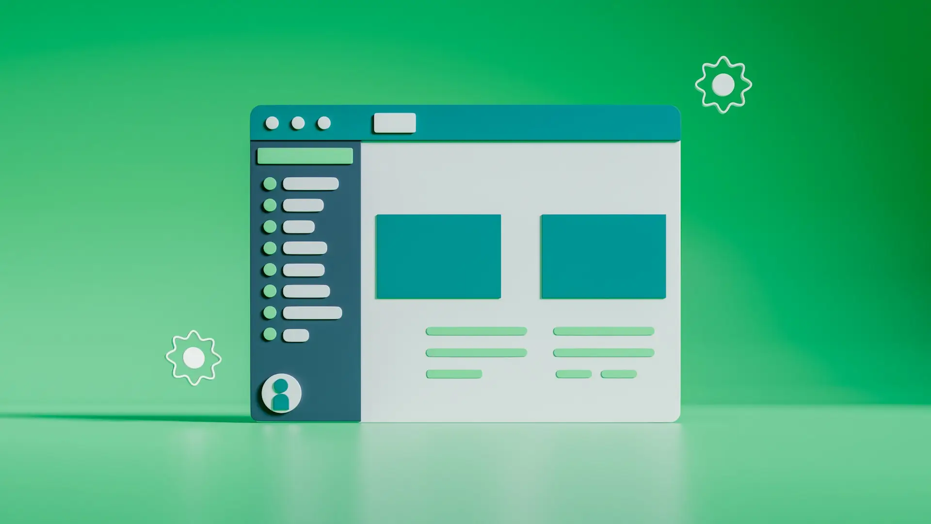
What I Focused On When Working on an EV Deals Platform
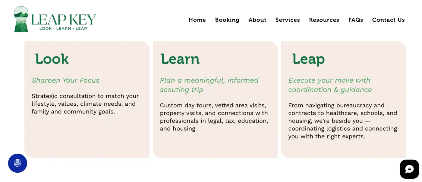
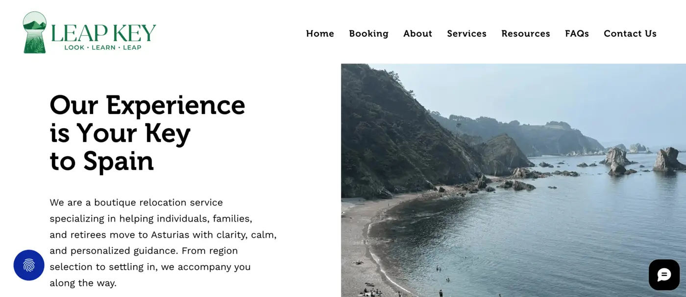
When I worked on Siffra, a platform that helps users discover EV incentives, rebates, and leasing deals based on their location and eligibility, the challenge was not just design — it was clarity.

Users come to platforms like this to make decisions, not to read through complex policy details. That’s what makes structure and usability so important.
So instead of approaching it as a “visual redesign,” I focused on:
- simplifying how content is grouped;
- defining a clear hierarchy of information;
- removing unnecessary friction in navigation;
- making key actions more visible.
One of the biggest improvements came from restructuring how information is introduced.
Instead of showing everything at once, I broke it down into:
- what users need first;
- what they might explore next;
- what helps them take action.
That shift alone changes how the entire experience feels.
The Difference Between Information and Usability
A common mistake I see, not just in EV platforms, is confusing information with usability.
Just because something is available on the page doesn’t mean it’s usable.
From a UX perspective, usability depends on:
- how quickly users understand what they’re seeing;
- how easily they can scan and compare;
- how naturally they can move forward.
This is especially important in niches like EV leasing web design, where users are already evaluating multiple options and conditions.

If the interface slows them down, they don’t continue exploring - they leave.
What Actually Makes an EV Deals Website Work
From experience, a few principles consistently make a difference:
Clear Content Hierarchy
I prioritize what matters first. Users shouldn’t have to search for key information - it should be obvious.
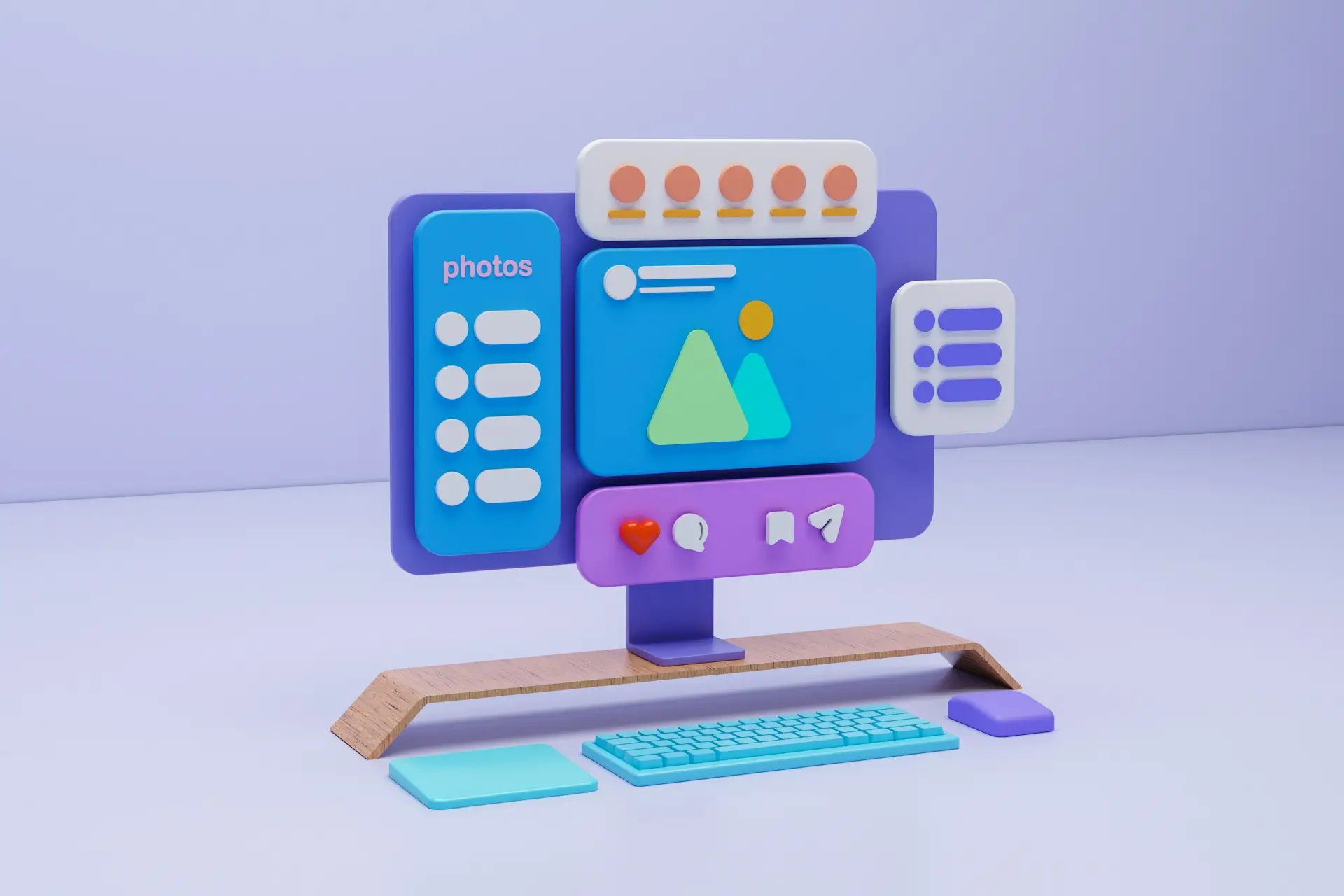
Scan-Friendly Structure
Instead of long explanations, I use:
- sections;
- visual grouping;
- short, digestible blocks.
This makes comparison easier.
Guided User Flow
Good design reduces decision fatigue.
Users should always feel like: “I know what to do next”
Mobile-First Thinking
A large part of discovery happens on mobile experience.
So I design layouts that:
- stay readable;
- don’t overload the screen;
- keep actions accessible.
Intentional CTAs
Calls to action should feel natural.
Not aggressive. Not hidden.
Just clear.
Whether it’s car dealership website design or a more niche EV platform, these principles stay consistent.
How Design Directly Impacts Performance
This is something many people underestimate.
When structure improves:
- users understand faster;
- navigation feels easier;
- engagement increases;
- conversion improves.
But more importantly - the experience becomes predictable.
Users don’t have to think.
And that’s what makes a website actually work.
The SEO Side That Often Gets Missed
Good structure doesn’t just help users, it helps search engines too.
When I work on projects like this, I also consider:
- how content is organized for indexing;
- how pages are structured for crawlability;
- how hierarchy supports keyword relevance.
Especially in EV-related platforms, where content can become fragmented quickly, structure plays a key role in visibility.
This is where design and SEO stop being separate things.

What Changed After Restructuring the Experience
Instead of adding new features or more content, the biggest improvements came from simplifying what already existed.
The result:
- cleaner navigation;
- more intuitive experience;
- better understanding of content;
- stronger engagement.
It didn’t feel like a “just a regular new website.”
It just felt easier.
“Mykola is a high-quality talent and made a 5x difference to our project. The key to the success from our experience is that he gets into a meeting and takes time to understand the requirements thoroughly. Hence the outputs always match the expectations.” - Founder @ Siffra
Final Thoughts
Designing EV deal platforms is not about adding more. It’s about removing confusion.
When information is complex, structure becomes the most important part of the product.
And getting that right early saves time, improves performance, and makes everything else easier, from UX to SEO.
If you're working on a platform where information is complex, whether it’s EV incentives, leasing, or anything data-heavy, I can help structure and design it so it’s actually easy to use.