YouTube’s New UI Design: Is It Really That Bad for Users?
News
Oct 21, 2025
0 min
When YouTube rolled out its new web interface this month, it didn’t take long for users to notice, and react. Social media filled up with posts, memes, and heated debates about the redesign. Some praised the cleaner, more “modern” layout, while others called it a step backward, describing it as “Apple-style minimalism” that stripped away YouTube’s familiar feel.
The update introduces rounded corners, floating playback controls, and a glossy transparency effect across the interface — all aimed at creating a more immersive viewing experience. But as often happens with major redesigns, not everyone is impressed. Many longtime users feel the new look sacrifices usability for aesthetics.
So, is YouTube’s new UI really that bad, or are users just struggling to adapt to change? Let’s take a closer look at what’s new, why it’s sparking backlash, and what designers can learn from one of the most talked-about interface updates of the year.
What Changed in YouTube’s UI
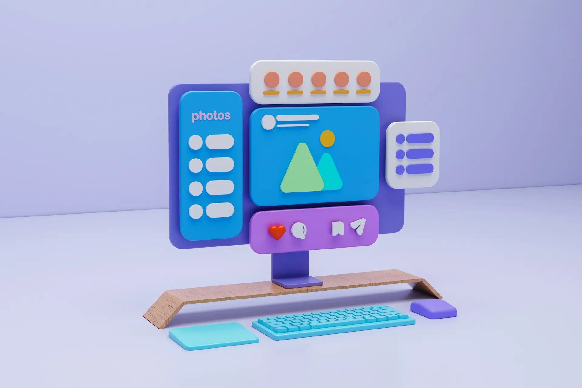
YouTube’s redesign focuses on creating a cleaner and more immersive experience that fits modern interface trends. The update introduces a softer visual language with rounded corners, transparent overlays, and more spacing between elements.
Here are the main design updates users are noticing:
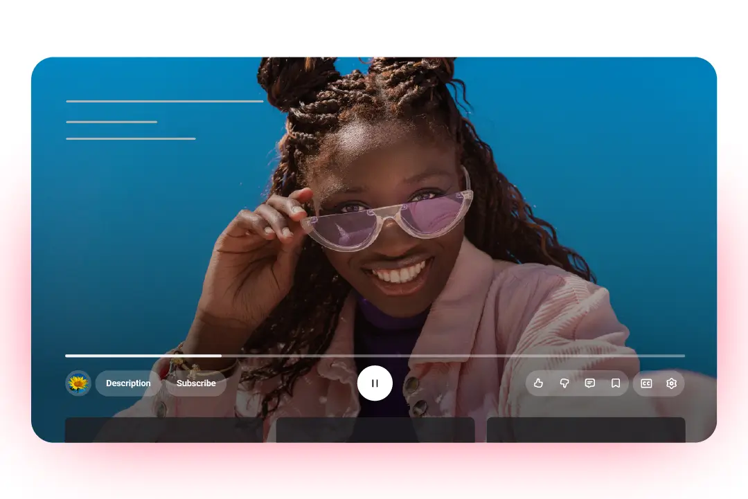
- Floating playback controls: The buttons for play, pause, and volume now appear as floating icons over the video instead of being fixed in the black control bar.
- Translucent backgrounds: Panels and buttons have a glass-like blur effect, making the interface look lighter and more fluid.
- Rounded corners and card-style sections: Video thumbnails, buttons, and even the player window follow a more rounded, unified shape.
- Simplified comment layout: The comment section feels more like a mobile app feed, with less separation between text and avatars.
- Consistent iconography and typography: The new typeface and icon style align with Google’s Material You design system, emphasizing minimal contrast and visual uniformity.
While the redesign clearly aims for a polished and unified aesthetic, it also changes how users interact with familiar elements. The new floating layout and transparency introduce a sense of depth, but some argue that they reduce visual clarity, especially in darker themes.
User Backlash: Why People Are Upset?
Despite YouTube’s intention to modernize its interface, much of the community response has been negative. Across Reddit, X, and design forums, users describe the update as “unnecessary,” “harder to navigate,” and “too glossy.” Many say it feels like a downgrade rather than an upgrade.
Here are the main frustrations users have shared:
- Loss of familiarity: Frequent viewers feel that the design no longer looks or feels like YouTube. Familiar button placements and contrast levels have shifted, creating confusion.
- Reduced readability: Transparent overlays and low-contrast icons make the interface harder to use, especially in dark mode or bright environments.
- Wasted space: Some complain about excessive padding and white space, which pushes useful content lower on the screen.
- Visual identity concerns: The “liquid glass” style resembles Apple’s and Google’s latest aesthetic, leading users to feel YouTube is losing its own unique brand character.
Beyond these visual issues lies a deeper emotional response. People grow attached to familiar interfaces because they become part of their daily routine. When that experience changes overnight, even small adjustments can trigger frustration. It’s not just about design preferences; it’s about user-centered design.
The Design Perspective: Why YouTube Might Be Right?
From a web design standpoint, YouTube’s update isn’t without logic. The platform has been moving toward visual consistency across devices, and this redesign aligns the desktop version with the cleaner, touch-friendly mobile interface.
The new layout focuses on minimal distractions, smoother animations, and visual depth that guides the user’s attention toward the content rather than the interface. Transparent layers and rounded edges give the site a softer, modern appearance that matches today’s design trends.
In essence, YouTube is trying to future-proof its interface. Whether users love it or hate it, the update reflects a broader industry shift toward simplicity and visual harmony.
Conclusion
YouTube’s new interface may not be perfect, but it is not a disaster either. The redesign reflects the ongoing tension between aesthetic innovation and user comfort. While many users miss the older look, others appreciate the refined layout and simplicity.
Over time, as people adapt, this update might feel less intrusive and more natural. For designers, it serves as a reminder that even small visual adjustments can spark strong emotional reactions, and that good design is not just about how it looks, but how it feels to the people who use it every day.