Blog
My blog01.

0 min
|
|
Moving to Spain: Why Local Guidance Matters More Than Ever
Every year, thousands of people choose Spain as a place to start a new chapter. Some are looking for a slower pace of life, others are seeking better weather, new opportunities, or a fresh environment for their families. Whatever the motivation, the decision to relocate often feels exciting at first.
Then reality sets in.
Moving to another country involves far more than choosing a destination. There are legal requirements, residency options, financial considerations, property searches, healthcare systems, schools, and countless administrative details that most people never think about until they are faced with them.

The challenge is not finding information. The challenge is understanding which information applies to your situation and knowing what steps to take next.
Why Relocation Is More Complex Than It Appears
Many people begin their relocation journey with online research. They search for visa requirements, housing costs, neighborhoods, schools, and tax considerations. Before long, they find themselves jumping between dozens of websites, forums, and social media groups, often receiving conflicting advice.
This creates uncertainty at a time when clarity is needed most.

Questions quickly start to pile up:
- Which visa is the right fit?
- Where should I live based on my lifestyle and goals?
- How does healthcare work?
- What should I know before purchasing property?
- Which schools are available for my children?
- How do I navigate local bureaucracy?
The more information available, the harder it can become to make confident decisions.
A Different Approach to Relocation Support
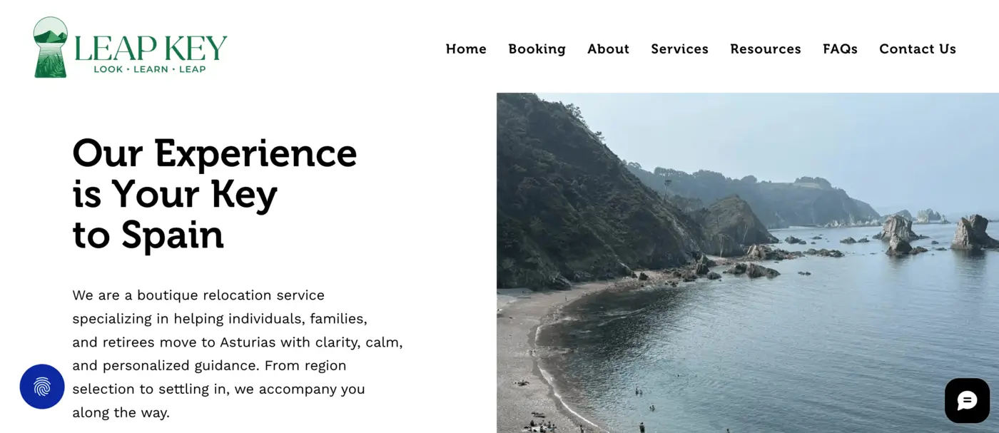
While working on Leap Key, I had the opportunity to learn more about the challenges people face when relocating to Spain and how personalized guidance can simplify what often feels like an overwhelming process.
Rather than offering one-size-fits-all advice, Leap Key focuses on helping individuals and families navigate their relocation journey with practical support and local expertise.
Their approach is built around three simple stages: Look, Learn, and Leap.
This framework helps transform a complex process into a clear and manageable journey.
Understanding the Leap Key Approach
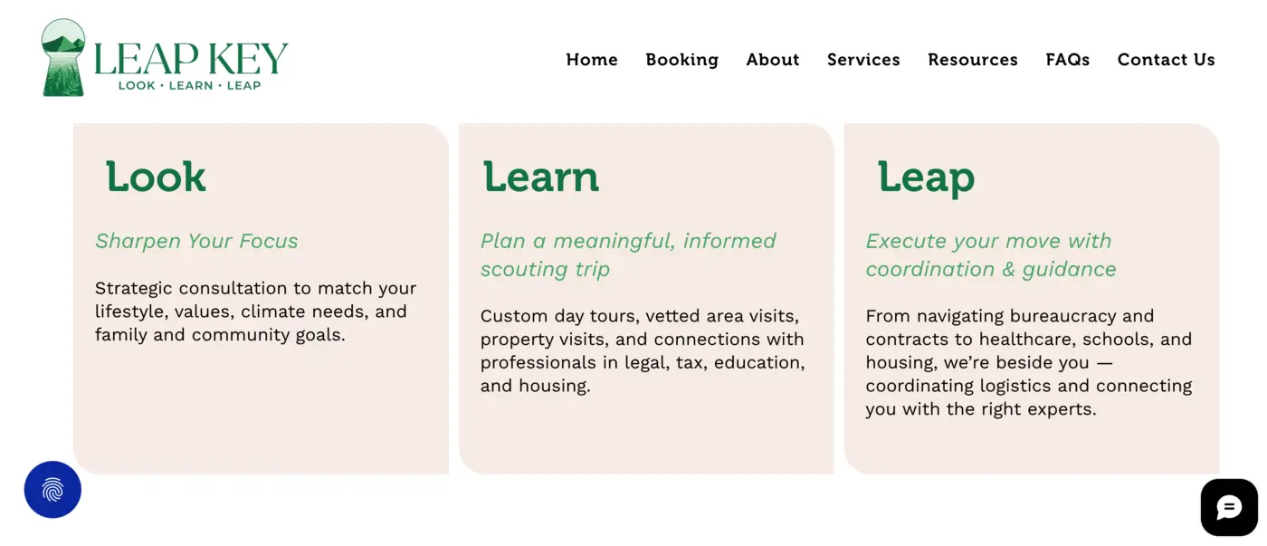
Look
The first step focuses on discovery.
Before making major decisions, it's important to understand personal priorities, lifestyle preferences, family needs, and long-term goals. Different regions of Spain offer very different experiences, and finding the right fit often requires more than simply comparing property prices.
Learn
Once goals become clearer, the next stage focuses on gathering the right information.
This may include relocation planning, visa options, education considerations, healthcare information, financial planning, and property-related guidance. Instead of navigating these topics independently, clients receive support tailored to their specific circumstances.
Leap
The final stage is where planning becomes action.
This includes practical support throughout the relocation process, helping clients move forward with greater confidence while coordinating the various elements involved in a successful transition.
Services That Support the Entire Journey
One of the things I found particularly interesting about the project was how comprehensive the support offering is.
Relocation rarely involves a single decision. It is usually a combination of interconnected steps that need to work together.
Leap Key assists with areas such as:
- Relocation planning
- Visa and residency guidance
- Property and location support
- Education and school planning
- Financial and practical relocation considerations
- Concierge services
- Local integration support
Together, these services help reduce uncertainty and provide a clearer path forward for individuals and families planning a move to Spain.
Building a Digital Experience Around Trust
When people are making life-changing decisions, trust becomes one of the most important elements of the experience.
Visitors arriving on a relocation website are often looking for reassurance, clarity, and direction. They want to understand what support is available and whether the team behind the service truly understands their situation.
This became a key consideration throughout the project.
Rather than overwhelming visitors with information, the goal was to create a clear structure that helps people quickly understand the process, the services available, and the value of working with experienced local professionals.
Designing for Confidence and Decision-Making
As the designer behind the Leap Key website, my focus was on transforming a complex service offering into an experience that feels approachable and easy to navigate.
I worked on organizing information into clear sections, simplifying the user journey, and creating a structure that reflects the company's Look, Learn, and Leap methodology.
The objective wasn't simply to create an attractive website. It was to create an experience that mirrors the guidance and support clients receive throughout their relocation journey.
Every design decision was made with clarity in mind, helping visitors understand their options, explore available services, and take the next step with confidence.

Final Thoughts
Relocating to Spain is an exciting opportunity, but it can also be a complex process filled with unfamiliar decisions and administrative challenges.
Projects like Leap Key demonstrate how valuable local guidance can be when navigating a major life transition. By combining expertise, planning, and personalized support, the relocation journey becomes more structured, more transparent, and ultimately less stressful.
And from a design perspective, creating digital experiences that simplify complex processes remains one of the most rewarding challenges to solve. Projects like Leap Key are a reminder that good UI/UX design is often less about visuals and more about helping people navigate complex decisions with clarity and confidence.
Popular articles02.
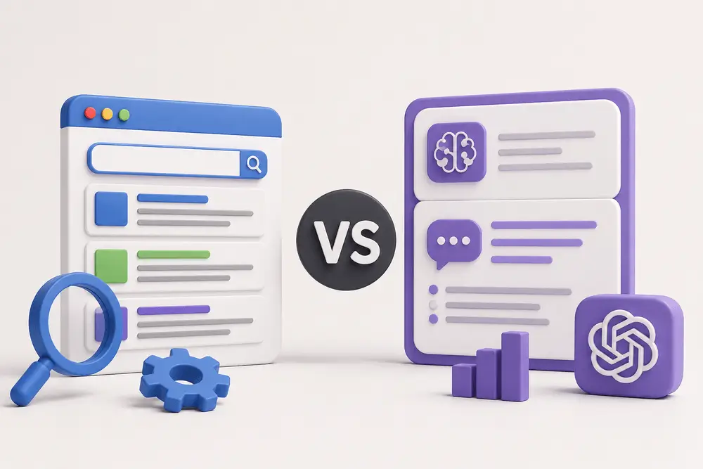
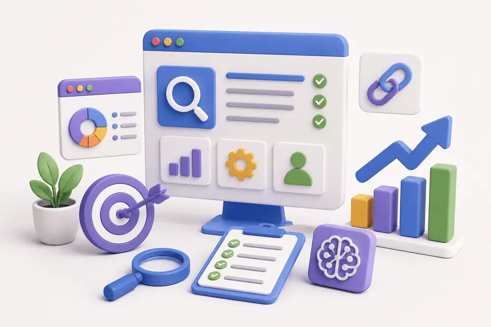
As a result, businesses are starting to explore the conversation around GEO vs SEO and how both strategies impact online visibility.
While SEO has been a core part of digital marketing for years, GEO is emerging as a newer approach focused on AI-driven search experiences. Understanding how they work together can help businesses create stronger content strategies and improve visibility across both traditional and AI-powered search platforms.
What Is SEO?
Search Engine Optimization (SEO) is the process of improving a website so it performs better in search engine results pages. The goal is to help search engines understand your content and rank it higher for relevant searches.

SEO strategy involves multiple strategies, including:
- Keyword optimization;
- Technical website improvements;
- Mobile responsiveness;
- Internal linking;
- Content creation;
- Page speed optimization;
- Backlink building.
For example, when someone searches for a service or product online, SEO helps determine which websites appear near the top of the results.
Strong SEO can help businesses:
- Increase organic website traffic;
- Improve brand visibility;
- Generate leads;
- Build authority online;
- Create better user experiences.
Traditional SEO remains one of the most effective long-term digital marketing strategies because it targets users actively searching for information.
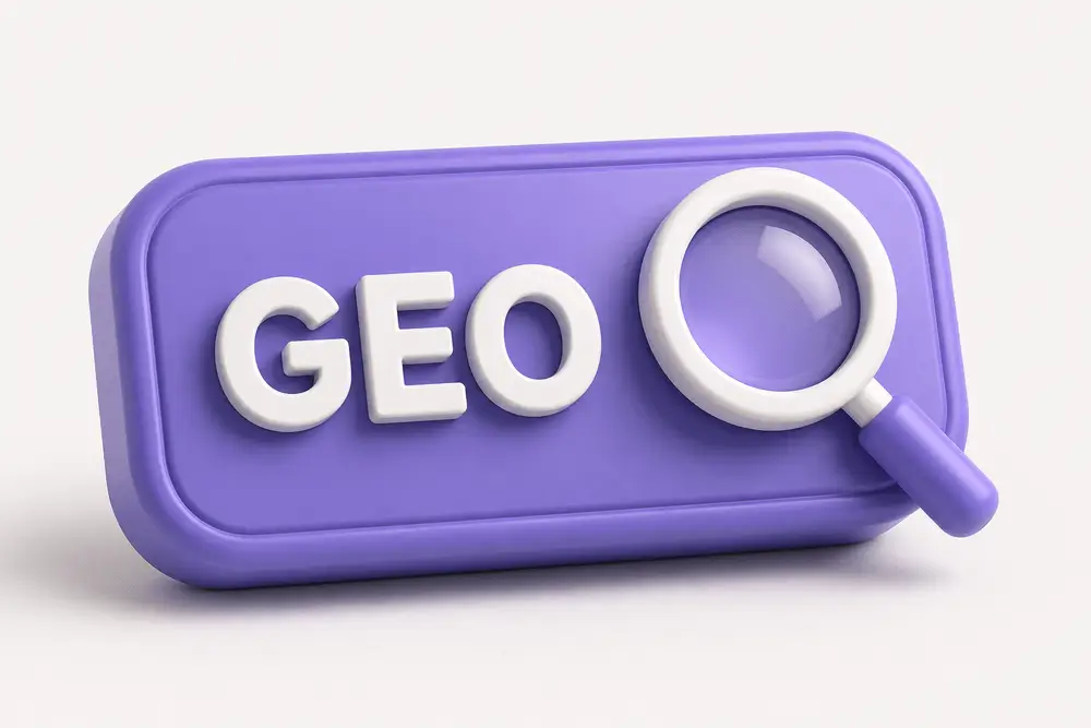
What Is GEO?
Generative Engine Optimization (GEO) focuses on optimizing content for AI-generated search experiences and conversational search tools.
Instead of simply ranking webpages in search results, GEO aims to improve how content is interpreted, summarized, and referenced by AI systems.
When users ask AI platforms questions like:
- “What are the best website design trends?”
- “How can businesses improve online visibility?”
- “What should I know about modern SEO strategies?”
AI tools generate direct responses using information gathered from multiple online sources.
This is where discussions around SEO vs GEO become important. GEO helps businesses improve the likelihood of appearing within those AI-generated answers and summaries.
As AI-powered search experiences continue growing, GEO is becoming an important extension of modern content strategy.
GEO vs SEO: Understanding the Main Difference
The primary difference between SEO vs GEO comes down to how content is discovered and presented to users.
SEO focuses on improving rankings in traditional search engines. It aims to attract clicks by helping webpages appear in relevant search results.
GEO focuses on helping AI systems understand and reference your content within generated responses.
With SEO, users typically browse through search results and choose which websites to visit. With GEO, users may receive summarized answers directly from AI tools before clicking any website at all.
That does not mean SEO is no longer important. In reality, GEO and SEO often support each other.
Many AI systems still rely on authoritative, well-structured, SEO-optimized content to generate accurate responses.
Why GEO and SEO Work Best Together
Rather than viewing GEO and SEO as separate strategies, businesses should treat them as complementary parts of digital visibility.
A website with strong SEO foundations is often better positioned for GEO success because AI systems prioritize content that demonstrates:
- Clear structure;
- Helpful information;
- Strong authority;
- Trustworthiness;
- Good user experience.
For example, content that includes organized headings, concise explanations, and valuable insights is easier for both search engines and AI systems to process.
Businesses that already invest in quality SEO practices are often building the foundation needed for GEO at the same time.

Why GEO Is Becoming More Important
Search behavior is evolving quickly. Instead of typing short keyword phrases, users are increasingly asking complete questions through AI-powered tools.
People now expect faster, more direct answers without having to browse multiple websites.
This shift is changing how businesses think about visibility online.
With GEO, brands can improve the chances of being referenced in AI-generated summaries, recommendations, and search experiences. That visibility can help businesses stay competitive as AI becomes more integrated into everyday search behavior.
At the same time, GEO encourages companies to create more valuable, well-structured, and user-focused content that benefits both traditional SEO and AI-driven discovery.
As AI-powered search experiences continue evolving, understanding how GEO works in practice is becoming increasingly important. The video below shares additional insights into how generative search and AI-driven visibility are influencing modern digital marketing strategies.
Benefits of SEO
Even as AI-powered search grows, SEO remains essential for long-term online success.
Some of the biggest SEO benefits include:
Increased Organic Traffic
SEO helps websites attract users who are actively searching for related products, services, or information.
Better Website Experience
SEO improvements often enhance website speed, navigation, mobile usability, and content quality.
Stronger Online Authority
High-quality SEO strategies help businesses build credibility within their industry.
Long-Term Visibility
Unlike paid advertising, SEO can continue generating traffic and visibility over time.
Businesses researching the GEO vs SEO difference should understand that SEO still forms the core foundation of digital visibility.

Benefits of GEO
GEO introduces new opportunities for businesses looking to adapt to modern search experiences.
AI Search Visibility
GEO helps improve the likelihood of appearing in AI-generated responses and summaries.
Improved Content Clarity
Optimizing for GEO often encourages more structured and user-friendly content.
Stronger Brand Recognition
When AI systems reference your content, it can increase trust and awareness around your brand.
Future-Focused Strategy
As AI-powered search continues evolving, GEO helps businesses prepare for the next generation of digital discovery.
Best Practices for GEO and SEO
Businesses looking to improve both GEO and SEO performance should focus on creating high-quality, user-focused content.
Some important best practices include:
Create Helpful Content
Content should answer real user questions clearly and accurately.

Use Clear Structure
Organized headings and logical formatting help both users and AI systems understand information more effectively.
Focus on Authority
Publishing consistent, trustworthy content helps improve visibility across both traditional and AI-powered search.
Improve Technical Performance
Fast-loading, mobile-friendly websites remain important for both SEO and GEO.
Write Naturally
Conversational, readable content aligns better with modern search behavior and AI interpretation.
Add Schema Markup
Structured data can help search engines and AI systems understand content relationships more clearly.
The Future of Search Includes Both
Search is no longer limited to traditional search engine rankings. AI-generated responses are becoming part of how users discover brands, services, and information online.
Businesses focusing only on SEO may miss opportunities in AI-powered search experiences, while businesses ignoring SEO foundations may struggle to build long-term authority and visibility.
The future of online visibility will likely depend on combining both strategies effectively.
That’s why conversations around GEO vs SEO are becoming increasingly important for businesses investing in long-term digital growth.
Final Thoughts
Understanding the relationship between GEO and SEO is becoming essential in modern digital marketing.
SEO helps websites rank in traditional search results, while GEO helps businesses appear within AI-generated answers and conversational search experiences. Together, they create a stronger and more adaptable visibility strategy.
As search technology continues evolving, businesses that invest in both SEO and GEO will be better positioned to reach users across multiple search experiences.
Looking to Improve Your Website Visibility?
Whether you want to strengthen your SEO foundation, improve user experience, or prepare your website for the future of AI-driven search, having the right digital strategy matters.
I create modern, user-focused websites designed to support visibility, engagement, and long-term business growth. Building the right online presence can help your business stay competitive in a rapidly changing digital landscape.

If you're managing a website, understanding how to identify and fix broken links is essential for maintaining both usability and SEO performance.
What Is a Broken Link?
Before fixing anything, it’s important to understand what is a broken link.
A broken link is any link that leads to a page that no longer exists or cannot be accessed. Instead of loading the expected content, users typically see a 404 error or similar message.
Common causes include:
- Deleted or moved pages
- Incorrect URLs
- Changes in website structure
- External pages being removed
From a user perspective, broken links interrupt the experience. From a technical perspective, they signal poor site maintenance.
Why Broken Links Matter
You might think one or two broken links aren’t a big deal, but they can have a real impact.
1. User Experience
When users click a link and land on an error page, it creates friction. Too many of these moments can reduce trust and increase bounce rates.
2. SEO Impact
If you're wondering if broken links affect seo, the answer is yes.
Broken links can interfere with how search engines crawl your website. According to Google Search Central, pages returning errors like 404s can affect how efficiently your site is crawled and indexed over time.
Search engines use links to crawl and understand your website. Broken links can:
- Disrupt crawling
- Waste crawl budget
- Signal outdated or poorly maintained content
While a few broken links won’t destroy rankings, a large number of them can negatively affect performance over time.
3. Site Credibility
A website with broken links feels outdated. Especially for business websites, this can impact how users perceive your professionalism.
How to Find Broken Links
Finding issues early is key. There are several practical ways to approach how to find broken links.

1. Use Online Tools
There are many tools that scan your website and highlight broken links automatically.
Popular options include:
- Ahrefs
- Screaming Frog SEO Spider
- Ubersuggest
- Semrush
- Google Search Console
These tools can detect:
- Internal broken links
- External broken links
- Redirect issues
If you're working on a larger site, using a crawler like Screaming Frog is one of the most efficient methods.
2. Manual Checks
For smaller websites, you can manually check key pages:
- Navigation menus
- Footer links
- Blog articles
- Landing pages
This isn’t scalable, but it helps catch obvious issues.
3. Regular SEO Audits
If you’re managing content regularly, broken link checks should be part of your routine technical SEO audits.
This is especially important if you frequently:
- Update content
- Remove pages
- Change URLs
Understanding how to find broken links on website consistently helps prevent long-term issues.

How to Fix Broken Links
Once you identify them, the next step is knowing how to fix broken links effectively.
1. Update the URL
If the page still exists but the URL changed:
- Replace the broken link with the correct one
2. Redirect the Old URL
If a page was moved or replaced:
- Set up a 301 redirect to the new page
This preserves both user flow and SEO value.
3. Remove the Link
If the content no longer exists and isn’t relevant:
- Remove the link entirely
- Or replace it with a more relevant resource
4. Fix Internal Structure
Sometimes broken links are a symptom of deeper structural issues:
- Poor URL management
- Lack of redirect strategy
- Inconsistent content updates
Fixing these at the system level prevents repeated problems.
Why Broken Links Are More Than a Technical Issue
From a UX perspective, broken links are not just errors, they’re friction points.
Every broken link is:
- A dead end
- A lost opportunity
- A break in user flow
When I audit websites, broken links often reveal bigger issues:
- Weak content structure
- Poor navigation planning
- Lack of long-term content strategy
Fixing the link is easy. Fixing the system behind it is what actually improves the experience.
Best Practices to Prevent Broken Links
Instead of constantly fixing issues, it’s better to prevent them.
Here are some practical habits:
- Keep URLs consistent
- Avoid unnecessary page deletions
- Always set up redirects when changing URLs
- Run regular link audits
- Monitor your site through SEO tools
These small steps help maintain a clean, reliable website.

Final Thoughts
Broken links may seem minor, but they affect both how users experience your website and how search engines evaluate it.
If you manage your site actively, learning how to find and fix broken links should be part of your ongoing process, not a one-time fix.
If you're not sure whether broken links are affecting your website, I can run a full website audit, fix existing issues, and make sure your site is clean, functional, and error-free.
Because a well-built website doesn’t just look good. It works consistently, without friction.

Put simply, experiential marketing is a strategy that uses branded experiences, both in person and online, to engage consumers in meaningful and interactive ways. Whether it’s a pop-up event, an immersive digital experience, or a hands-on product demo, the goal is to create moments people want to join and share.
In this article, I’ll explain what experiential marketing is, why it’s so effective today, and how you can use it in your own campaigns, with examples to inspire new ideas.

What Is Experiential Marketing?
Experiential marketing is a strategy that focuses on creating memorable, real-world interactions between a brand and its audience. Instead of just telling people about a product or service, it invites them to experience it firsthand, through events, installations, pop-ups, or even virtual activations.
So, what is experiential marketing in simple terms? It’s marketing that people can physically or emotionally participate in. The goal is to create a strong, personal connection that sticks long after the experience ends.
This approach goes beyond traditional advertising by encouraging audiences to actively engage with a brand. It’s not just about promoting a message - it’s about creating a moment that people want to be part of and share.
Brands use experiential marketing to:
- Introduce new products in interactive ways;
- Build emotional loyalty through hands-on experiences;
- Generate social buzz and user-generated content;
- Stand out in a crowded digital landscape.
Whether it happens in-person or online, the key is to make people feel something - curiosity, excitement, inspiration, or delight.
Why Experiential Marketing Works
In a world where audiences are bombarded with ads every day, experiential marketing stands out because it focuses on creating real, emotional connections. People don’t just see or hear about your brand - they experience it. And experiences, unlike ads, are remembered and shared.
Here’s why experiential marketing is so powerful:
It Builds Emotional Connections
At its core, experiential marketing is about creating an emotional response, not just delivering information. While traditional advertising focuses on features, discounts, or slogans, experiential marketing aims to make people feel something about a brand.
Emotions like joy, excitement, nostalgia, or even belonging are powerful triggers. When consumers experience these feelings firsthand, they naturally associate those positive emotions with the brand behind the experience.
For example, imagine attending an exclusive product launch event where you get to test a new product months before it hits the market. The excitement and sense of being part of something special create a bond that no static ad could ever replicate.
Emotional connections don’t just improve brand recall - they build loyalty. People are more likely to support and recommend brands they feel emotionally tied to, even when competitors offer similar products or lower prices. This is a major reason why experiential marketing succeeds where traditional campaigns often fall short.

It Turns Passive Viewers into Active Participants
Traditional marketing often asks people to sit back and watch. Experiential marketing takes a different approach by inviting people to actively engage. This shift from passive to active involvement creates a more meaningful and memorable brand experience.
When someone tries a product, interacts with a brand environment, or takes part in a branded event, they’re no longer just an observer. They become part of the story. That sense of participation builds ownership and trust. It also makes the experience far more memorable than simply seeing a banner ad or scrolling past a social post.
Here’s why this matters:
- Participation builds trust by involving the audience directly;
- Doing creates stronger memories than just watching;
- Interactive experiences demand attention and increase engagement;
- People are more likely to share what they’ve experienced firsthand.
It’s Highly Shareable
One of the biggest strengths of experiential marketing is its natural ability to inspire people to share their experiences. A well-designed brand event, interactive installation, or creative activation gives people something exciting to photograph, talk about, and post online.
When participants share their experiences on social media, they expand the brand’s reach far beyond the original audience. A single memorable moment can generate hundreds or even thousands of impressions through photos, videos, and personal stories.
Here’s why sharing matters:
- Authentic exposure: Real experiences feel more trustworthy than traditional ads;
- Wider organic reach: Participants amplify the brand by sharing with their networks;
- Emotional storytelling: People enjoy sharing moments that feel exciting, personal, or meaningful;
- User-generated content: Every shared photo or post reinforces brand awareness.
This kind of organic exposure feels more authentic than paid ads. People trust recommendations and real experiences shared by friends and peers more than branded promotions. By creating experiences that are visually striking, emotionally resonant, or simply fun to share, brands can turn participants into powerful advocates.

It Creates Lasting Impressions
Most advertisements are easily forgotten, but a powerful experience stays with people long after it ends. Experiential marketing focuses on creating moments that leave a deep and lasting impact on the audience.
When people interact with a brand in a meaningful way, they form stronger memories compared to when they simply view an ad. These memories are linked to real emotions, actions, and personal engagement, making them far more durable.
Here’s why meaningful experiences leave a stronger mark:
- Emotional memories are more durable than factual messages;
- Interactive moments build deeper connections with the brand;
- Positive associations strengthen brand loyalty over time;
- Hands-on experiences are easier to recall than passive content.
A great experiential marketing campaign does more than create a temporary buzz. It builds long-term brand loyalty by giving people something they truly remember and associate with positive feelings.
By focusing on creating genuine moments rather than just messages, experiential marketing helps brands make a real, lasting impression on their audience.
Experiential Marketing Examples
To truly understand the impact of experiential marketing, it helps to look at real-world campaigns that brought brands closer to their audiences.
Here are a few standout experiential marketing examples that show how powerful the right experience can be:

1. Airbnb’s Floating House on the River Thames
To promote its "Live There" campaign, Airbnb created a full-sized floating house that sailed down the River Thames in London. The house was fully functional, with bedrooms, a living room, and even a garden.
Contest winners got to spend the night, making it a once-in-a-lifetime experience that tied perfectly to Airbnb’s mission of offering more than just places to stay. The event generated major social media buzz and news coverage, highlighting how experiential marketing can turn brand values into unforgettable moments.
2. Spotify’s “Wrapped” Personalized Experience

Spotify turned data into a personal, shareable experience with its annual “Wrapped” campaign. By creating customized playlists and listening stats for each user, Spotify allowed millions of people to relive their favorite moments and share them with friends.
Although digital, this experiential marketing approach worked because it was interactive, emotional, and highly personalized. This interactive and emotional campaign strengthened user loyalty and encouraged widespread sharing across social media.
3. IKEA’s "The Dining Club" Pop-Up
In London, IKEA opened "The Dining Club," a pop-up restaurant where guests could host their own dinner parties, cook with IKEA chefs, and experience IKEA kitchen products firsthand. Rather than simply showing off their furniture in a catalog, IKEA invited people to live it.
This interactive campaign brought their brand promise, creating spaces for real life, into the spotlight and connected with customers on a personal level.
Frequently Asked Questions
Is experiential marketing only for big brands?
No. While large companies often run high-profile experiential marketing campaigns, small businesses can create powerful experiences too. Hosting local pop-up events, interactive workshops, or creative product demonstrations are great ways for smaller brands to engage audiences meaningfully.
Does experiential marketing always need to be in-person?
Not at all. While many experiential campaigns happen face-to-face, digital experiences can be just as powerful. Virtual reality tours, interactive online events, and personalized digital experiences also count as experiential marketing when they actively involve the audience.
How can brands measure the success of experiential marketing?
Success can be measured through a mix of metrics, depending on the campaign goal. These might include event attendance, social media engagement, user-generated content, brand sentiment analysis, email sign-ups, or direct sales increases following the experience.
What makes a good experiential marketing campaign?
A successful campaign feels personal, encourages participation, and ties clearly back to the brand’s identity. It should create an emotional connection while being easy to share and talk about afterward, helping the brand’s message spread organically.
Can experiential marketing be combined with traditional marketing?
Yes. In fact, experiential marketing often works best when integrated into a larger campaign. A live experience can be promoted through ads, email marketing, and social media to maximize reach and reinforce the brand message across different touchpoints.
Conclusion
Experiential marketing works by creating real emotional connections between brands and people. It goes beyond delivering messages to offer meaningful, interactive moments that audiences remember. By inviting participation instead of passive viewing, it fosters stronger loyalty and lasting impressions.
Whether through a live event, a creative installation, or an engaging digital experience, brands that focus on creating meaningful interactions stand out in a crowded market. By making audiences feel something real, experiential marketing turns customers into advocates and helps brands become part of the stories people want to share.
All articles03.
And that’s exactly where most of them fall short.
From the outside, it may seem like a content problem. In reality, it’s almost always a structure problem.

Why EV Deal Platforms Are More Complex Than They Look
Electric vehicle incentives are not simple.
They depend on:
- state or region;
- eligibility requirements
- vehicle type;
- income thresholds;
- timing and availability.
What this means in practice is that users don’t just need information, they need help navigating it.
Most websites try to solve this by adding more explanations, more pages, more details.
But that approach usually backfires.
The more content you add without structure, the harder it becomes to use.
What I Focused On When Working on an EV Deals Platform
When I worked on Siffra, a platform that helps users discover EV incentives, rebates, and leasing deals based on their location and eligibility, the challenge was not just design — it was clarity.

Users come to platforms like this to make decisions, not to read through complex policy details. That’s what makes structure and usability so important.
So instead of approaching it as a “visual redesign,” I focused on:
- simplifying how content is grouped;
- defining a clear hierarchy of information;
- removing unnecessary friction in navigation;
- making key actions more visible.
One of the biggest improvements came from restructuring how information is introduced.
Instead of showing everything at once, I broke it down into:
- what users need first;
- what they might explore next;
- what helps them take action.
That shift alone changes how the entire experience feels.
The Difference Between Information and Usability
A common mistake I see, not just in EV platforms, is confusing information with usability.
Just because something is available on the page doesn’t mean it’s usable.
From a UX perspective, usability depends on:
- how quickly users understand what they’re seeing;
- how easily they can scan and compare;
- how naturally they can move forward.
This is especially important in niches like EV leasing web design, where users are already evaluating multiple options and conditions.

If the interface slows them down, they don’t continue exploring - they leave.
What Actually Makes an EV Deals Website Work
From experience, a few principles consistently make a difference:
Clear Content Hierarchy
I prioritize what matters first. Users shouldn’t have to search for key information - it should be obvious.
Scan-Friendly Structure
Instead of long explanations, I use:
- sections;
- visual grouping;
- short, digestible blocks.
This makes comparison easier.
Guided User Flow
Good design reduces decision fatigue.
Users should always feel like: “I know what to do next”
Mobile-First Thinking
A large part of discovery happens on mobile experience.
So I design layouts that:
- stay readable;
- don’t overload the screen;
- keep actions accessible.
Intentional CTAs
Calls to action should feel natural.
Not aggressive. Not hidden.
Just clear.
Whether it’s car dealership website design or a more niche EV platform, these principles stay consistent.
How Design Directly Impacts Performance
This is something many people underestimate.
When structure improves:
- users understand faster;
- navigation feels easier;
- engagement increases;
- conversion improves.
But more importantly - the experience becomes predictable.
Users don’t have to think.
And that’s what makes a website actually work.
The SEO Side That Often Gets Missed
Good structure doesn’t just help users, it helps search engines too.
When I work on projects like this, I also consider:
- how content is organized for indexing;
- how pages are structured for crawlability;
- how hierarchy supports keyword relevance.
Especially in EV-related platforms, where content can become fragmented quickly, structure plays a key role in visibility.
This is where design and SEO stop being separate things.

What Changed After Restructuring the Experience
Instead of adding new features or more content, the biggest improvements came from simplifying what already existed.
The result:
- cleaner navigation;
- more intuitive experience;
- better understanding of content;
- stronger engagement.
It didn’t feel like a “just a regular new website.”
It just felt easier.
“Mykola is a high-quality talent and made a 5x difference to our project. The key to the success from our experience is that he gets into a meeting and takes time to understand the requirements thoroughly. Hence the outputs always match the expectations.” - Founder @ Siffra
Final Thoughts
Designing EV deal platforms is not about adding more. It’s about removing confusion.
When information is complex, structure becomes the most important part of the product.
And getting that right early saves time, improves performance, and makes everything else easier, from UX to SEO.
If you're working on a platform where information is complex, whether it’s EV incentives, leasing, or anything data-heavy, I can help structure and design it so it’s actually easy to use.

Running a proper robots.txt test is one of the simplest ways to avoid serious SEO issues.

What Is a Robots.txt File?
A robots.txt file is a simple text file placed in your website’s root directory (e.g., yourdomain.com/robots.txt).
Its role is to tell search engine crawlers:
- Which pages or sections they can access
- Which ones they should ignore
It doesn’t enforce rules, it gives instructions that most search engines follow.
Why Testing Robots.txt Matters
Even a small mistake in your robots.txt file can lead to:
- Important pages not being indexed
- Entire sections of your website being hidden from search
- Confusion for search engine crawlers
This is why running a robots.txt test regularly is important, especially after:
- Website updates
- Redesigns
- URL structure changes
- CMS migrations
Common Robots.txt Issues
Before testing, it helps to know what can go wrong.
Typical problems include:
- Blocking entire directories by mistake
- Incorrect syntax (missing slashes, wrong formatting)
- Disallowing pages that should be indexed
- Conflicts with sitemap or meta robots tags
These issues are often not visible unless you actively check for them.
How to Check If Robots.txt Is Working
Here are the most practical ways to check if your file is working correctly.
1. Check the File Directly
Open your browser and go to:
yourdomain.com/robots.txt
Make sure:
- The file loads correctly
- There are no obvious errors
- The structure looks clean and intentional
This is a quick first step, but not enough on its own.
2. Use Google Search Console
One of the most reliable ways to perform a robots.txt test is through Google Search Console.
You can:
- See if your file is accessible
- Identify blocked URLs
- Understand how Google interprets your rules
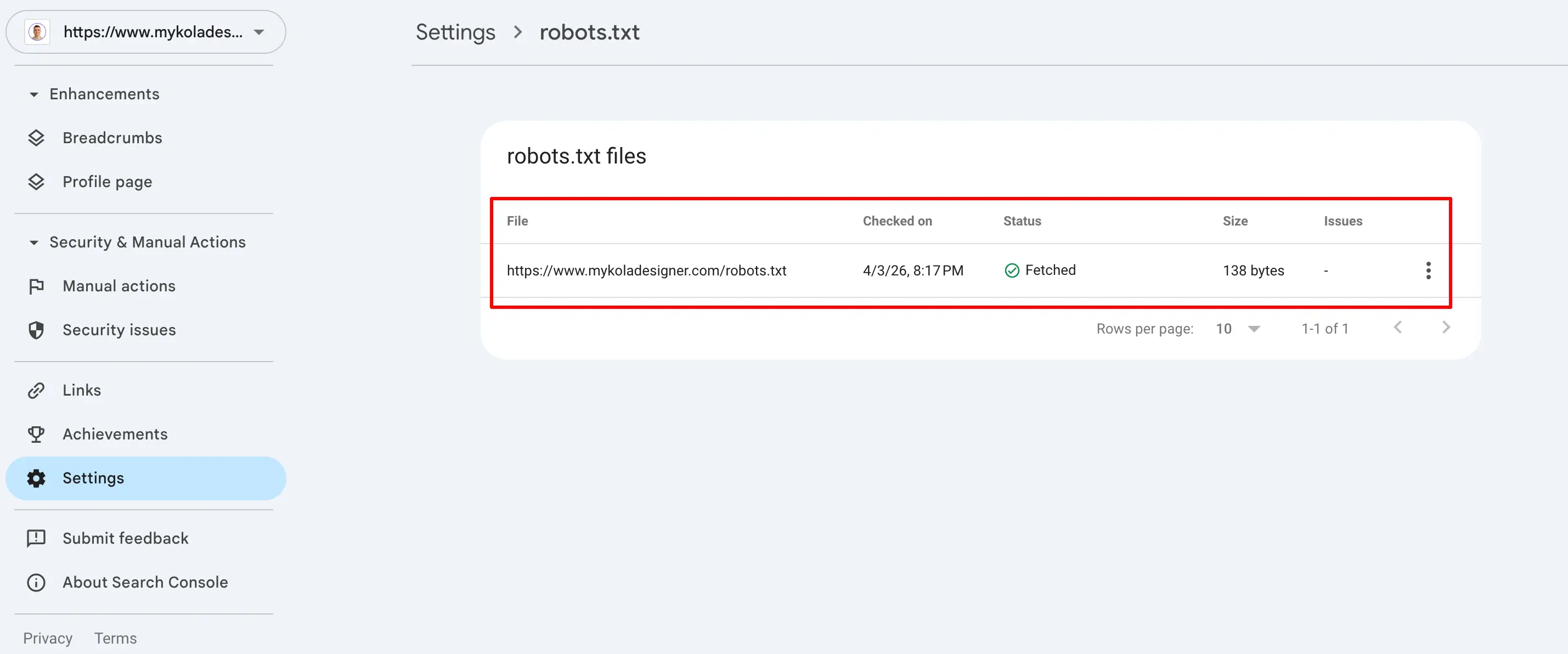
This gives real insight into how your robots.txt file affects indexing and supports a more accurate robots.txt analysis.
3. Test Specific URLs
Ask:
- Is this page allowed to be crawled?
- Is it accidentally blocked?
You can test URLs individually using tools or by reviewing your robots.txt rules.
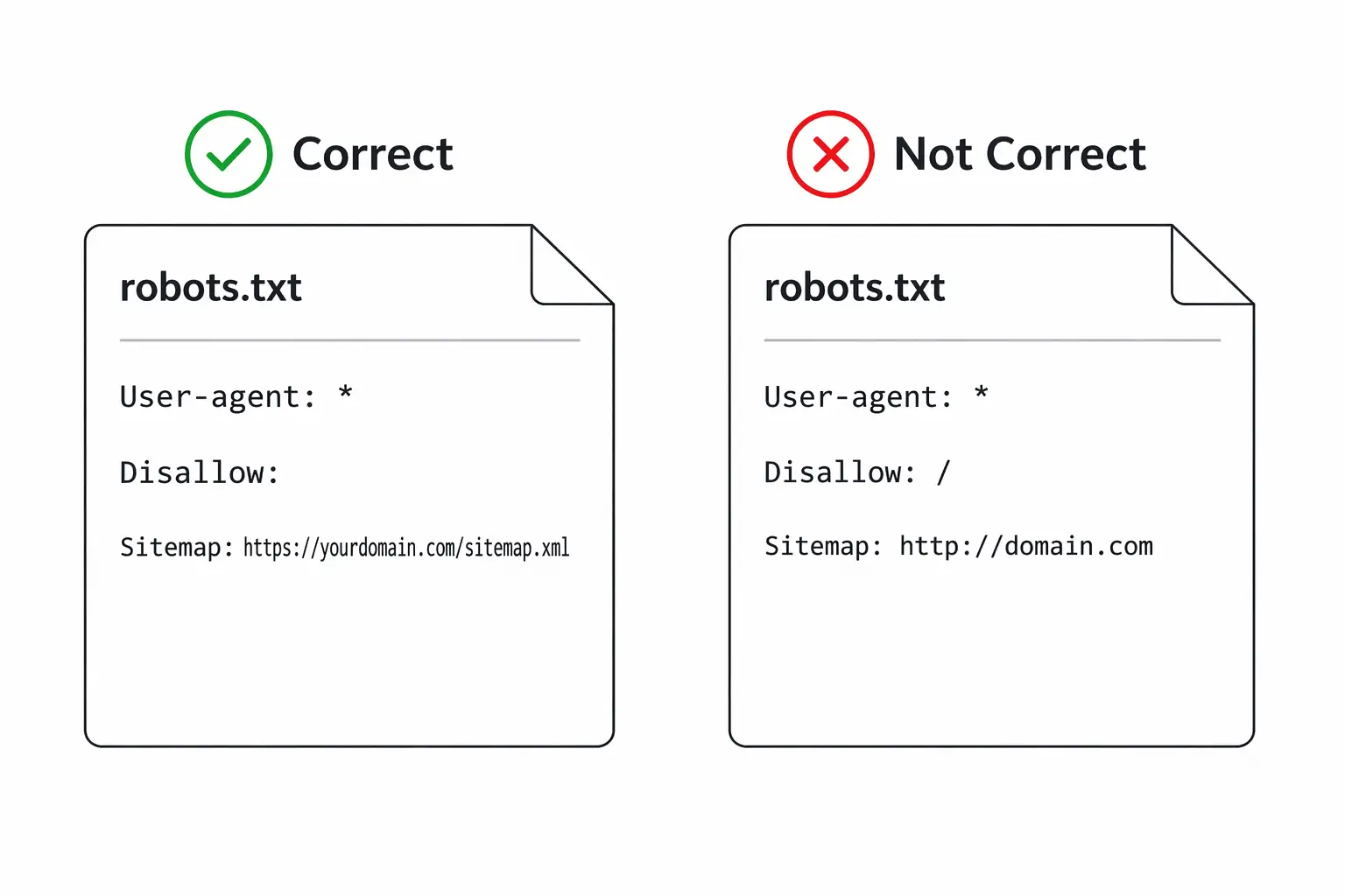
Robots.txt example file:
User-agent: *
Disallow: /admin/
This blocks everything inside /admin/.
Small details like this can have big consequences if applied incorrectly.
4. Use SEO Crawling Tools
Tools like:
- Screaming Frog SEO Spider
- Ahrefs

can simulate how search engines crawl your site and show:
- Blocked pages
- Crawl restrictions
- Indexability issues
This is especially useful for larger websites.
How to Know If Your Robots.txt Is Working
If you're wondering how to test robots.txt file, here’s what a correct configuration should include:
- Allow important pages to be crawled
- Block only what needs to stay private or irrelevant
- Not conflict with your SEO strategy
Signs everything is working:
- Key pages are indexed
- No unexpected drops in traffic
- No critical crawl errors
If something feels off, it’s often worth reviewing both robots.txt and overall site structure together.
Common Mistake: Blocking Too Much
One of the most frequent issues is over-blocking.
For example:
User-agent: *
Disallow: /
This stops search engines from crawling your entire website.
It’s sometimes used in staging environments, but if it goes live, it can remove your site from search results entirely.
Robots.txt vs Meta Robots
It’s important not to confuse these two:
- Robots.txt controls crawling
- Meta robots tags control indexing
A page can still appear in search results even if blocked in robots.txt (without full content visibility).
This is why testing both is important.
UX & SEO Insight
From a UX and SEO perspective, robots.txt is not just a technical file, it directly affects visibility.
If search engines are unable to access your content correctly:
- Your pages won’t rank
- Users won’t find your website
- Your design and content won’t matter
This is one of those behind-the-scenes elements that has a direct impact on performance.

Final Thoughts
Running a robots.txt test doesn’t take long, but it can prevent major issues. It’s one of the simplest checks you can do, and one of the easiest to overlook.
If you're unsure whether your robots.txt file is configured correctly or aligned with your website structure, it’s worth reviewing it as part of a broader audit.
I help clients with technical SEO audits, identifying issues like this and fixing them before they impact performance.
Because when search engines can’t access your website properly, everything else becomes harder to fix later.

The idea is not always to replace Google completely. In many cases, using a combination of search engines leads to better, more balanced results.
Why People Are Switching to Alternative Search Engines
Google’s dominance comes with trade-offs. Understanding these helps explain why users are actively looking for alternative search engines other than Google.
Privacy and Data Collection
Google personalizes results based on search history, location, and behavior. While this can improve relevance, it also means:
- Extensive data tracking;
- Ad targeting based on user activity;
- Limited anonymity.
Many alternative search engines position themselves around not collecting or storing personal data, which is a major reason users switch.
Filtered Results and Bias
Google’s algorithm prioritizes content based on relevance, authority, and personalization. However, this can lead to:
- Repetitive results from large websites;
- Less visibility for niche or independent sources;
- Reduced exposure to alternative viewpoints.
Some search engines avoid personalization entirely, giving more neutral results.
Increasing Ads in Search Results
It is common to see multiple paid results before any organic listings. This affects:
- Click behavior;
- Trust in top-ranking results;
- Overall user experience.
Alternative platforms often reduce ad placement or separate ads more clearly.
Desire for Different Search Experiences
Different engines use different ranking systems. This means:
- You may find content not visible on Google;
- Some engines specialize in certain types of searches;
- Results can feel less repetitive.
This is why many users explore the best alternative search engines to Google rather than relying on one platform.
Best Alternative Search Engines (Detailed Overview)
Below is a deeper look at the most relevant options and how they compare in real-world use.
DuckDuckGo
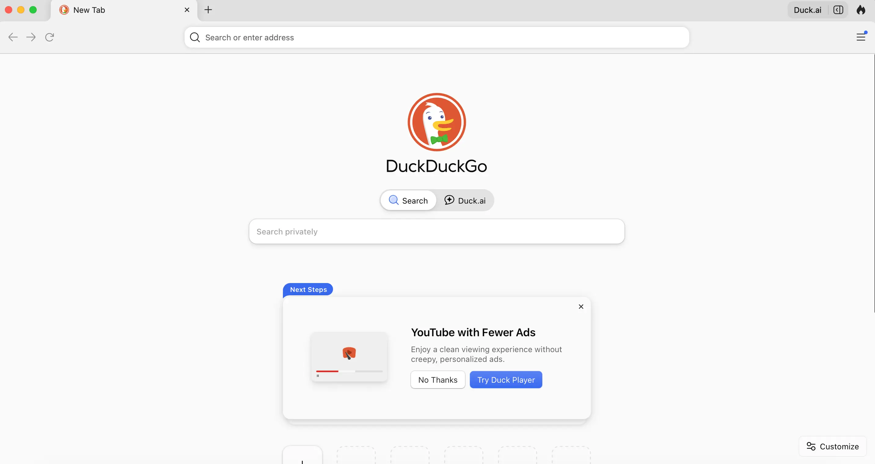
DuckDuckGo is one of the most recognized names when discussing alternative search engines better than Google for privacy. DuckDuckGo pulls results from multiple sources, including its own crawler and third-party providers, without building user profiles.
Strengths:
- No tracking or search history storage;
- Consistent, non-personalized results;
- Fast and lightweight interface;
- “Bangs” feature for quick site-specific searches (e.g., !amazon, !wikipedia).
Limitations:
- Results can be less refined for very specific or technical queries;
- Heavy reliance on external data sources.
Best use case: Daily browsing, general searches, and users prioritizing privacy over deep personalization.
Bing
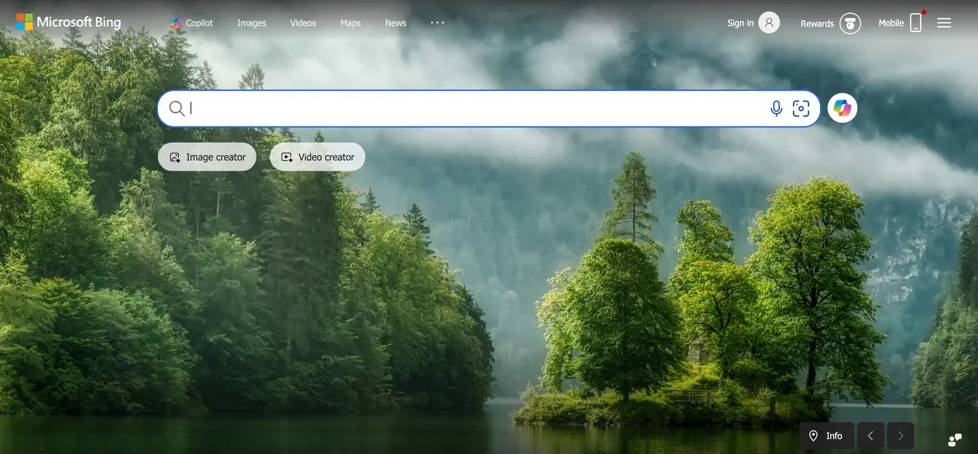
Bing is the closest direct competitor in terms of scale.
Powered by Microsoft, Bing uses its own indexing system and integrates AI features into search.
Strengths:
- Strong multimedia search (images and videos);
- Integrated AI and enhanced search previews;
- Rewards system that incentivizes usage;
- Often surfaces with different rankings than Google.
Limitations:
- Still collects user data;
- Less dominant index compared to Google.
Best use case: Users who want a Google-like experience but with slightly different results and features.
Brave Search
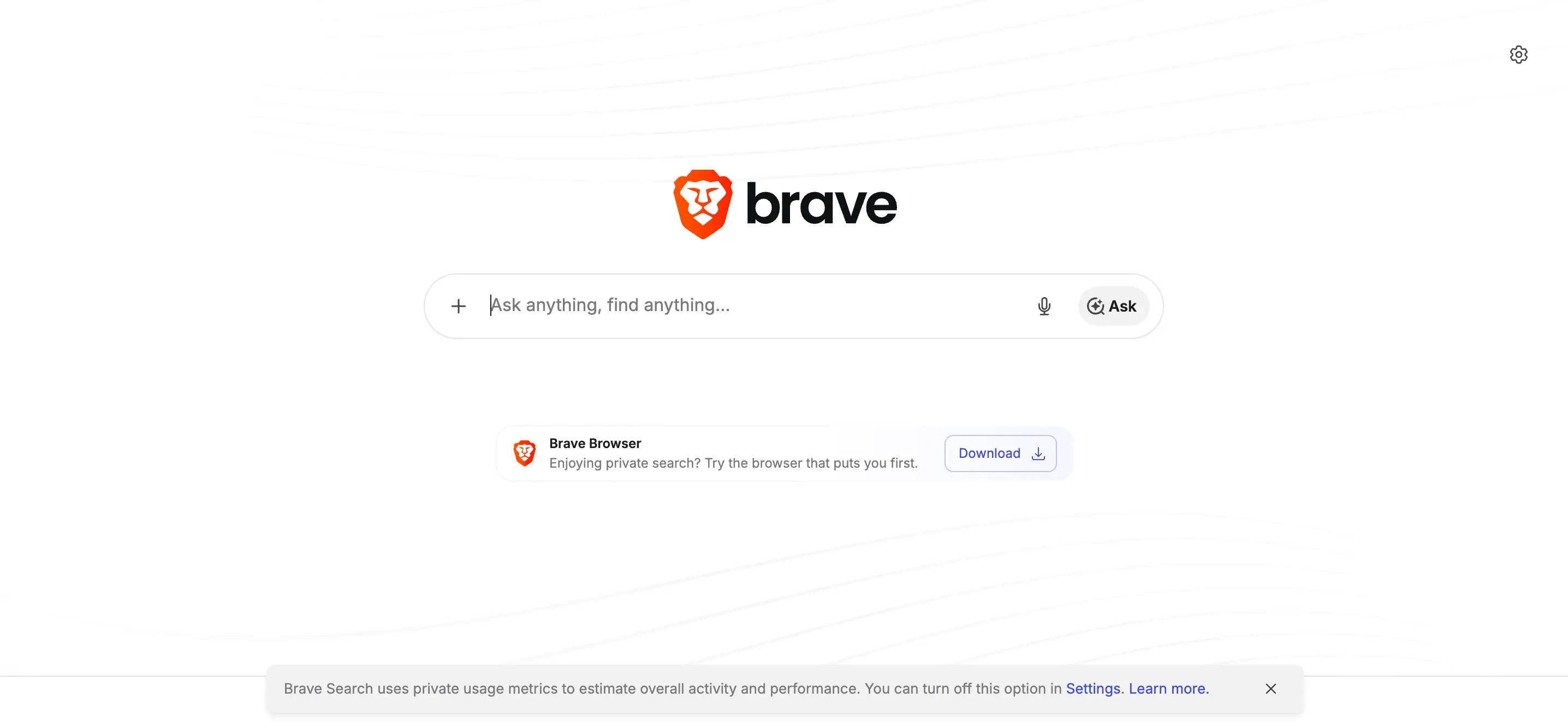
Brave Search stands out for its independence. Unlike many competitors, Brave Search uses its own index rather than relying heavily on Google or Bing.
Strengths:
- Independent search infrastructure;
- Transparent ranking approach;
- No tracking or profiling;
- Option to mix in results from other engines if needed.
Limitations:
- Smaller index compared to Google;
- May lack depth for niche queries.
Best use case: Users who want a truly independent and privacy-focused alternative.
Startpage
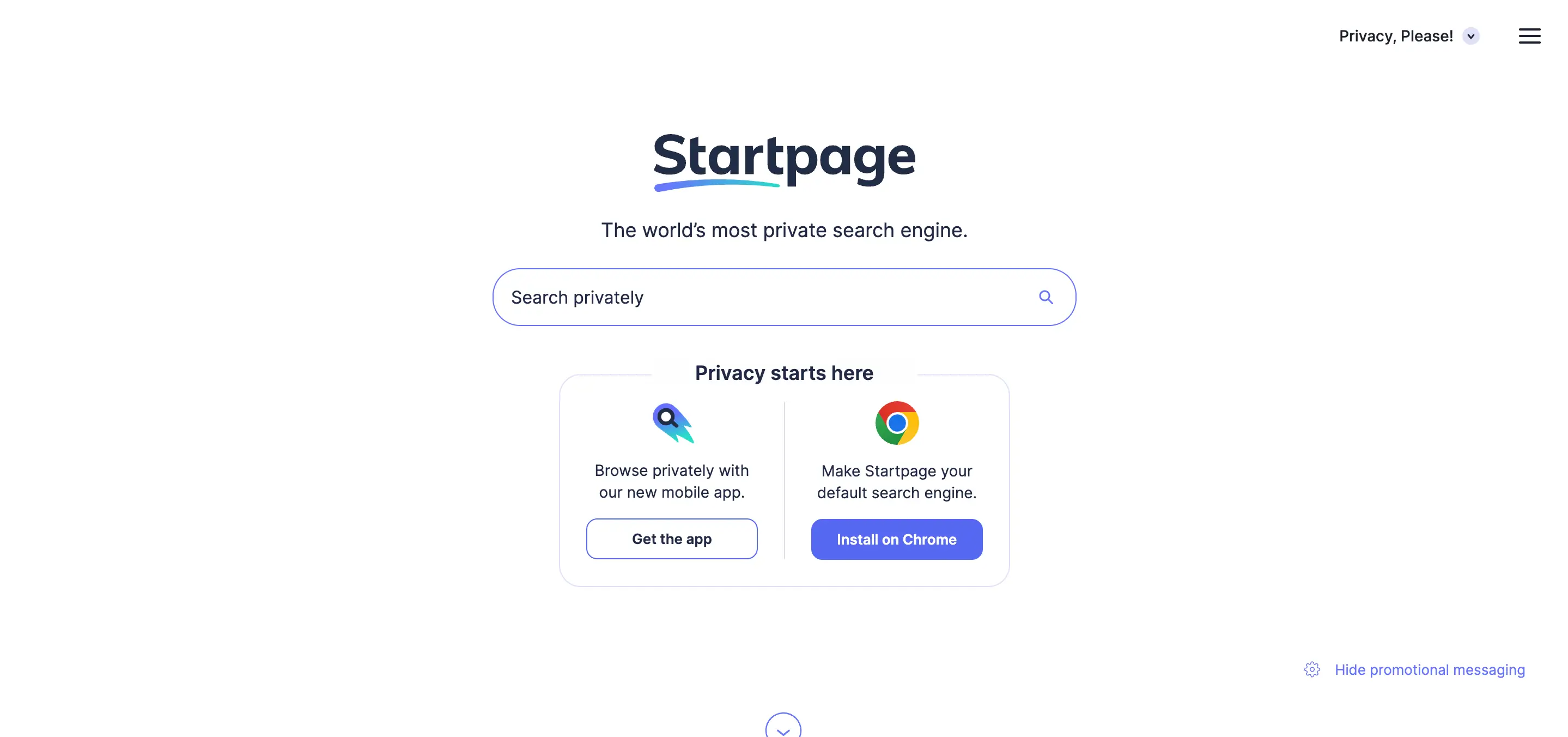
Startpage is often described as a “private version of Google.” It fetches Google results but removes all tracking and identifying data.
Strengths:
- Google-quality results without tracking;
- Anonymous browsing through proxy features;
- Strong privacy protections (based in Europe).
Limitations:
- Still dependent on Google’s index;
- Slightly slower due to privacy layers.
Best use case: Users who want familiar results but without data collection.
Ecosia

Ecosia adds a purpose-driven model to search. It uses Bing’s infrastructure and generates revenue through ads, which is then used to fund tree-planting projects.
Strengths:
- Clear environmental mission;
- Transparent financial reporting;
- Simple and easy to use;
Limitations:
- Results depend on Bing;
- Not focused on advanced search features.
Best use case: Users who want their daily searches to contribute to environmental impact.
Qwant
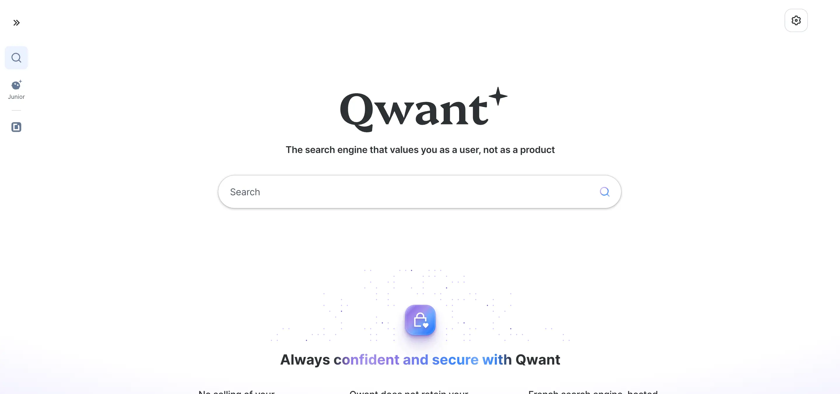
Qwant is a European alternative focused on neutrality and privacy. It combines its own indexing with external sources while avoiding tracking.
Strengths:
- No user profiling;
- Balanced and neutral results;
- Strong integration of news and trending content.
Limitations:
- Smaller index than major engines;
- Less effective for highly specific queries.
Best use case: Users looking for a privacy-first search engine with a different regional perspective.
Yahoo Search

Yahoo continues to function as a search engine, though it relies heavily on Bing. It aggregates search results while combining them with content like news and email.
Strengths:
- Familiar interface;
- Content-rich experience;
- Easy and intuitive navigation across services.
Limitations:
- Not an independent search engine;
- Results largely mirror Bing.
Best use case: Users who prefer an all-in-one web portal experience.
Are Alternative Search Engines Better Than Google?
The question is not whether one is universally better, but which is better for your needs.
Google excels in:
- Depth and accuracy of results;
- Speed and indexing scale;
- Handling complex and long-tail queries.
However, many alternative search engines outperform Google in areas like:
- Privacy protection;
- Reduced tracking;
- Simpler interfaces;
- Access to less-filtered content.
For example, DuckDuckGo or Brave may feel more transparent, while Startpage offers a balance between privacy and result quality.
When It Makes Sense to Use Alternatives
Instead of switching completely, many users adopt a hybrid approach.
Use alternative search engines when:
- You want unbiased or non-personalized results;
- You are researching sensitive topics;
- You want to avoid tracking;
- You are looking for different sources or perspectives.
Use Google when:
- You need highly accurate or technical results;
- You are searching for local businesses or real-time data;
- You want the fastest and most refined answers.
How to Choose the Right Alternative Search Engine
If you are asking what is an alternative search engine to Google that fits your workflow, focus on your priorities:
- Privacy-first: DuckDuckGo, Startpage;
- Independent index: Brave Search;
- Feature-rich experience: Bing;
- Sustainability focus: Ecosia;
- Neutral results: Qwant.
You can also set a default engine in your browser and switch when needed.
Final Thoughts
Exploring alternative search engines is less about replacing Google and more about improving how you search.
Each platform offers a different perspective on the web. Some prioritize privacy, others independence, and some focus on purpose-driven impact. By testing a few options, you can build a search experience that aligns better with your preferences and gives you access to a broader range of information.
But brands are not static. As markets evolve, businesses grow, and customer expectations shift, even strong brands can start to feel outdated or misaligned.
A brand refresh allows companies to modernize their visual identity, messaging, and digital presence while keeping the core brand recognition they have already built.
If you're unsure whether the time has come to update your brand, the following signs can help you evaluate your current position.

1. Your Visual Identity Feels Outdated
Design trends and digital standards evolve quickly. Elements that looked modern years ago may now feel visually heavy, cluttered, or inconsistent with current expectations.
Some common signals include:
- overly complex logos;
- outdated typography;
- inconsistent color usage;
- visual styles that don’t translate well to modern websites or mobile devices.
A brand identity refresh allows businesses to modernize these elements while keeping recognizable aspects of the original brand.
2. Your Brand No Longer Reflects Your Business
Many companies grow beyond the identity they originally launched with.
For example, your business may have:
- expanded into new services;
- moved into a different market segment;
- shifted from small clients to enterprise clients;
- evolved into a more specialized offering.
If your branding still communicates the earlier version of the business, it may be time to refresh your brand so it accurately represents where your company is today.

3. Your Brand Looks Inconsistent Across Platforms
Consistency is essential for trust and recognition. Customers interact with your brand across multiple touchpoints:
- your website;
- social media profiles;
- marketing materials;
- landing pages;
- digital advertisements.
If each platform uses slightly different styles, fonts, or messaging, the brand can start to feel fragmented.
A brand identity update helps unify these elements and establish a clear system that works across all platforms.
4. Your Website Doesn’t Reflect Your Brand
In many industries, the website is the primary environment where customers experience the brand.
However, it’s common to see businesses where the website feels disconnected from the brand identity.
This might include issues such as:
- unclear visual hierarchy;
- inconsistent design elements;
- messaging that doesn’t reflect brand positioning;
- poor UX structure.
A brand refresh often includes aligning the website experience with the brand so that design, content, and user experience work together.

5. Competitors Appear More Modern or Professional
Brand perception is always relative. Even if your brand once stood out, newer competitors may enter the market with:
- cleaner design systems;
- stronger digital experiences;
- clearer positioning;
- more modern visual identities.
When this happens, your brand may start to appear less competitive.
Refreshing the brand helps businesses reposition themselves visually and strategically within the market.
6. Your Brand No Longer Resonates With Your Audience
Target audiences evolve over time. The people you are trying to reach today may have different expectations compared to when the brand was first created.
Signs of misalignment may include:
- low engagement with your content;
- messaging that feels outdated;
- visual identity that doesn’t appeal to your audience segment.
A brand refresh can help recalibrate the brand to better resonate with current customers.
7. Your Brand Is Difficult to Scale
Many businesses realize their brand lacks structure when they begin expanding their marketing efforts.
Without a clear system, creating new materials becomes inconsistent and inefficient.
For example:
- each landing page looks slightly different;
- marketing assets lack cohesion;
- new campaigns require reinventing design elements.
Professional brand refresh services typically include creating scalable design systems, brand guidelines, and visual frameworks that support growth.

8. Your Brand Blends In With Competitors
In some industries, brands start to look almost identical.
Similar color palettes, identical messaging styles, and predictable layouts can make it difficult for customers to distinguish between businesses.
A brand refresh provides an opportunity to:
- refine visual identity;
- clarify brand positioning;
- strengthen differentiation.
This helps your business stand out more clearly in the market.
9. You're Unsure Whether You Need a Refresh or a Full Rebrand
Many companies assume they need a complete transformation when the real need is more strategic refinement.
Understanding brand refresh vs rebrand can clarify the right direction.
Brand Refresh
- modernizes visual identity;
- refines messaging;
- improves consistency;
- keeps existing brand recognition.
Rebrand
- changes brand name or positioning;
- replaces the visual identity entirely;
- introduces a new brand concept.
For many businesses, a refresh provides the improvements they need without losing brand equity.
10. Your Brand No Longer Reflects the Quality of Your Work
Sometimes the biggest signal is internal.
Your team knows the business has grown, improved, and developed deeper expertise, but the brand still communicates an earlier stage of the company.
When this gap appears, the brand can unintentionally undervalue the business.
A strategic brand refresh helps bring the brand presentation in line with the quality, experience, and professionalism of the company.
Final Thoughts
Brands evolve alongside businesses.
A well-executed brand refresh helps modernize identity, strengthen consistency, and improve how a company presents itself to customers.
Rather than starting from scratch, it builds on what already exists while refining the elements that need improvement.
If you're considering a brand refresh or thinking about how your current brand identity could be improved, I work with businesses to align digital branding with strong digital experiences.
Sometimes a thoughtful update is all it takes to transform how a brand is perceived.
Design the interface.
Build the interface.
Then redesign it once reality hits.
But in modern workflows, especially with AI-assisted development, interfaces often start in code. Developers prototype with real data. AI tools generate layouts instantly. Teams iterate directly in the browser.
And then comes the friction.
When it’s time to refine layouts, adjust hierarchy, explore variations, or align with a design system, designers frequently have to rebuild everything manually inside their design tool.
Screenshots aren’t editable.
Specs don’t capture nuance.
Recreating live UI wastes time.
What if working code could become the starting point for collaborative design, not the end of it?

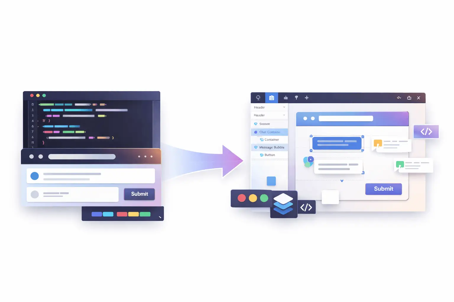
Introducing a Code-to-Canvas Workflow
The Code-to-Canvas workflow transforms live interfaces into fully editable design files.
Instead of exporting flat images, teams can capture production or staging UIs and convert them into structured design frames, complete with layers, auto layout behavior, spacing logic, typography hierarchy, and component groupings.
This means:
- Real layout structure, not static visuals;
- Editable text layers;
- Component-ready sections;
- Preserved spacing and alignment;
- A foundation for design system refinement.
It’s not about replacing design. It’s about eliminating duplication.
Why Traditional Handoff No Longer Works
The traditional “design → dev” pipeline assumed:
- Design is finalized first;
- Developers translate it into code;
- Iterations happen later.
But today, that model has shifted.
Interfaces are often:
- AI-generated;
- Rapidly prototyped;
- Iterated with real backend data;
- Adjusted based on real usage signals.
In many teams, the most accurate version of the product lives in the browser, not in the design file.
When designers are disconnected from that source of truth, misalignment grows:
- Spacing drifts;
- Typography changes;
- Components diverge;
- Documentation becomes outdated.
A Code-to-Canvas workflow reconnects design to reality.
How It Works
While implementation details may vary depending on tooling, the workflow generally follows four steps:
1. Capture a Live Interface
Select a running UI from local development, staging, or production. The system reads the rendered structure, layout hierarchy, and styling logic.
2. Convert Structure into Design Layers
Instead of flattening the UI, the tool reconstructs:
- Containers;
- Flex/grid layouts;
- Typography styles;
- Buttons and interactive elements;
- Spacing relationships.
The output becomes a structured design frame.
3. Make It Editable
Designer can:
- Modify layout using auto layout tools;
- Adjust spacing tokens;
- Swap typography styles;
- Convert repeated elements into components;
- Add annotations or variations.
It behaves like a native design file, not a static import.
4. Iterate and Refine
From here, teams can:
- Align UI to a design system;
- Explore alternative layouts;
- Improve hierarchy and visual rhythm;
- Prepare for documentation or stakeholder review.
The result is a continuous loop instead of a one-time handoff.

What This Unlocks for Teams
AI-First Product Development
AI tools can generate functioning UI quickly, but visual refinement still requires human design thinking. Instead of rebuilding AI output from scratch, teams can refine what already exists.
Faster Design Audits
Need to audit a production interface? Capture it and immediately analyze spacing consistency, typography hierarchy, and component alignment inside a design tool.
Living Design Systems
Instead of design systems drifting away from implementation, real UI can feed back into system updates. Components can be extracted directly from production patterns.
Reduced Redundancy
No more:
- Recreating already-built layouts;
- Measuring spacing manually;
- Guessing implementation behavior.
The browser becomes a design source, not just a development artifact.
Not a Replacement - A Bridge
This workflow doesn’t eliminate the need for original design thinking.
It enhances it.
Early-stage conceptual design still matters. Wireframes still matter. Exploratory layout systems still matter.
But once something exists in code, there’s no reason to start over.
Design and development shouldn’t be parallel tracks that occasionally intersect. They should be part of a shared feedback loop.
Technical Considerations
Turning code into editable design files isn’t trivial.
The system must:
- Interpret DOM hierarchy;
- Translate CSS layout logic into auto layout;
- Preserve typography scaling;
- Map reusable elements into component structures;
- Handle responsive variations.
The more accurately the structure is interpreted, the more useful the resulting design file becomes.
High-fidelity structure conversion is what separates a screenshot tool from a true collaborative workflow.
A Two-Way Future
The real opportunity isn’t just code → design.
It’s round-trip collaboration:
- Prototype in code;
- Convert to editable design;
- Refine and systematize;
- Sync improvements back into development.
That loop reduces friction, speeds iteration, and keeps teams aligned around a single source of truth.

The Bigger Shift
Modern product teams are no longer linear.
They are:
- AI-assisted;
- Cross-functional;
- Rapidly iterative;
- Data-informed.
Design tools and development environments must reflect that reality.
Code-to-Canvas workflows represent a broader evolution: tools adapting to how teams actually build products today.
Because the best interfaces aren’t created in isolation.
They’re shaped through iteration, between code and craft.
Ready to Bridge Design and Code?
If you're exploring a Code-to-Canvas approach or looking to better align design and implementation, I can help at every stage, from refining interfaces and structuring systems to improving how everything works together.
If you need support bringing this workflow to life, let’s connect.

If you're planning to launch your personal website, blog, portfolio, or business platform, understanding how each system works from a practical perspective will save you time, money, and frustration.
Let’s break it down clearly.
What Is the Core Difference?
At a high level:
- WordPress focuses on accessibility and ease of use.
- Drupal focuses on flexibility and advanced customization.
When comparing CMS Drupal vs WordPress, the real distinction lies in how much technical knowledge is required to manage and scale the website.
WordPress is designed for non-technical users. Drupal is built with developers in mind.
That difference affects everything, from installation to content editing.
Ease of Installation
WordPress
Most hosting providers offer one-click installation.Within minutes, you can log in, pick a theme, and start publishing content.
The interface is intuitive:
- Posts;
- Pages;
- Media;
- Plugins;
- Appearance.
Even without coding knowledge, you can navigate it comfortably.
Drupal
Drupal installation is not necessarily difficult, but configuration takes more effort.
You’ll likely need:
- Understanding of modules;
- Knowledge of content types;
- Familiarity with permissions and structure.
For a beginner, this can feel technical very quickly.
Verdict: If your priority is fast setup with minimal friction, WordPress wins.
Dashboard & Content Management
When evaluating Drupal vs WordPress, usability inside the dashboard matters most.
WordPress Dashboard
- Clean layout;
- Visual editors;
- Drag-and-drop builders available;
- Thousands of beginner-friendly themes.
You can create a page without touching code.
Drupal Dashboard
Drupal is structured differently. Instead of focusing on visual simplicity, it prioritizes structured content architecture.
You define:
- Content types;
- Fields;
- Taxonomies;
- Views.
This is powerful, but it requires a learning curve.
For beginners, Drupal may feel like you're building a system rather than simply creating a website.
Design Flexibility
WordPress
- Thousands of themes;
- Page builders (Elementor, Gutenberg, etc.);
- Easy visual customization.
It’s ideal if you want:
- Portfolio site;
- Business website;
- Blog;
- Landing pages.

Drupal
Drupal gives deeper structural control.
It’s strong for:
- Large platforms;
- Government websites;
- Complex permission systems;
- Highly customized content logic.
But achieving a polished UI usually requires developer involvement.
From a UX perspective, the platform is only as good as how it’s structured. I’ve seen both WordPress and Drupal websites perform extremely well, and extremely poorly, depending on how they were designed and implemented.
The CMS itself isn’t the final product. The strategy behind it is.
Pricing Considerations
Both platforms are open-source, meaning the core software is free. However, real-world costs differ.
When looking at WordPress pricing vs Drupal pricing, consider:
WordPress Costs
- Hosting;
- Premium themes (optional);
- Premium plugins (optional);
- Developer support (if needed).
You can start small and scale gradually.
Drupal Costs
- Hosting (often stronger server requirements);
- Developer setup;
- Ongoing maintenance;
- Custom module development.
Drupal projects typically involve higher upfront technical investment.
If you’re just starting, WordPress is usually more budget-friendly and scalable at your own pace.
Security & Performance
Drupal has a reputation for strong security architecture and is often used for enterprise or government websites.
WordPress is also secure, but because it's widely used, it requires:
- Regular updates;
- Quality hosting;
- Proper plugin management.
In reality, security depends more on implementation than platform choice.

So, Which Is More User-Friendly for Beginners?
If your goal is:
- Launching quickly;
- Managing content yourself;
- Minimizing technical complexity;
- Controlling budget.
then WordPress is generally the better starting point.
If your goal is:
- Building a large-scale structured platform;
- Handling complex permissions;
- Managing highly customized content architecture.
then Drupal may be worth considering - with developer support.
A More Important Question: Platform or Strategy?
Many beginners focus heavily on drupal vs wordpress, but the more important question is:
Is the website structured correctly from the start?
- Is the content hierarchy clear?
- Is the UX intuitive?
- Is SEO integrated properly?
- Is the system scalable?
I’ve worked on projects where WordPress outperformed complex Drupal setups, simply because the structure and UX were thoughtfully planned.
And I’ve seen Drupal power impressive platforms when the architecture required it.
The CMS is a tool. The outcome depends on how it’s designed and built.
Final Thoughts
For beginners, WordPress usually feels more accessible, affordable, and manageable.
Drupal offers depth and structural power, but expects technical understanding.
If you’re unsure which platform suits your project, the decision shouldn’t be based on popularity alone. It should be based on:
- Business goals;
- Content complexity;
- Long-term scalability;
- Budget;
- Internal technical skills.
If you're planning a new website and want help choosing the right platform, or making sure it’s designed and built properly from the beginning, that’s something I regularly help clients clarify before development even starts.
Reach out here and let’s look at your project together.
Choosing the right system is important. Designing it strategically is what actually makes it work.