A Beginner's Guide to Interaction Design and Its Value
UX Design
Feb 11, 2025
0 min
In today’s digital world, seamless interactions define the success of websites and apps. Whether it's tapping a button, swiping through a gallery, or filling out a form, every action a user takes should feel intuitive, efficient, and even delightful. This is where interaction design (IxD) plays a crucial role.
Interaction design focuses on crafting meaningful engagements between users and digital products, ensuring that every touchpoint is clear, responsive, and user-friendly. It blends usability, psychology, and visual design principles to create experiences that not only look good but also function smoothly.
In this guide, we'll explore the fundamentals of interaction design, its core principles, and why it’s essential for building products that people love to use. Whether you're a designer looking to refine your skills or a beginner curious about UX, this article will provide valuable insights into how interaction design shapes the digital experiences we rely on every day.

What is Interaction Design?
Interaction Design (IxD) is the practice of designing interactive digital products, systems, and services with a focus on how users engage with them. It ensures that every interaction, whether clicking a button, swiping on a screen, or navigating a website - feels intuitive, seamless, and efficient.
At its core, interaction design is about creating experiences that help users accomplish their goals with minimal effort and maximum satisfaction. It blends principles from user experience (UX) design, psychology, motion design, and technology to make digital interfaces more user-friendly and engaging.
Key Elements of Interaction Design:
Usability - Ensuring that interactions are easy to understand and navigate.
Feedback & Response - Providing clear visual, auditory, or haptic feedback for user actions.
Consistency - Maintaining uniform design patterns to reduce cognitive load.
Learnability - Making interfaces easy to understand, even for first-time users.
Goal-Driven Design - Aligning interactions with user needs and business objectives.
Whether designing a mobile app, website, or software interface, interaction design plays a crucial role in shaping how users experience and interact with digital products.
Why Is Interaction Design Important?
Interaction design (IxD) is essential because it directly influences how users experience and engage with digital products. A well-designed interaction can make an app or website intuitive, enjoyable, and efficient, while poor interaction design can frustrate users and drive them away.
Here’s why interaction design is important:
1. Enhances Usability and User Experience
A well-thought-out interaction design ensures that users can navigate a product easily and accomplish their goals without confusion. This improves usability and creates a smoother, more enjoyable experience.
2. Boosts User Engagement and Retention
When interactions feel natural and effortless, users are more likely to stay engaged with a product. Well-designed digital experiences encourage users to return, improving retention rates.
3. Reduces Errors and Frustration
Clear, intuitive interaction design minimizes user errors by guiding them through tasks efficiently. Providing feedback (such as error messages or success confirmations) helps users understand what’s happening and how to proceed.
4. Supports Accessibility and Inclusivity
Good interaction design ensures that digital products are accessible to all users, including those with disabilities. Designing with accessibility in mind (e.g., proper contrast, keyboard navigation, and screen reader support) creates a more inclusive experience.
5. Aligns with Business Goals
A seamless user experience leads to higher conversions and customer satisfaction. Whether it’s an e-commerce checkout process or a sign-up form, well-designed interactions can guide users toward taking desired actions, benefiting both users and businesses.
6. Creates a Competitive Advantage
In a crowded digital landscape, interaction design can be the differentiating factor between a product that thrives and one that fails. Companies that invest in interaction design stand out by offering smoother, more engaging user experiences.
7. Bridges the Gap Between Humans and Technology
Technology is evolving rapidly, but interaction design ensures that digital products remain human-centered. By focusing on how people naturally interact with interfaces, designers create experiences that feel intuitive rather than frustrating.

Core Principles of Interaction Design
Interaction design (IxD) revolves around creating intuitive and engaging experiences for users. To achieve this, designers follow key principles that ensure usability, efficiency, and satisfaction. Here are the core interaction design principles that shape effective digital experiences:
1. Usability - Making Interactions Intuitive
Usability ensures that a product is easy to use, understand, and navigate. Users should be able to complete tasks with minimal effort and confusion. Good usability includes:
- Clear and simple navigation
- Consistent design patterns
- Minimized cognitive load (reducing the number of steps required to complete tasks)
Example: Google’s search interface is simple, with a clear input field and minimal distractions, making it easy for users to get results instantly.
2. Feedback - Providing Clear Responses
Feedback helps users understand the results of their actions. Whether it’s a button changing color when clicked or an error message appearing after an invalid input, clear feedback reassures users and prevents frustration.
Types of Feedback:
- Visual (color changes, animations) - A button highlights when hovered over
- Auditory (sounds, beeps) - A message notification sound
- Haptic (vibrations, touch responses) - A phone vibrating when receiving a call
Example: When submitting a form, a success message ("Form submitted!") or error message ("Please enter a valid email") helps users understand the outcome.
3. Consistency - Creating Familiarity
Consistency ensures that elements behave predictably across an interface. When users encounter familiar design patterns, they spend less time learning and more time interacting.
- Consistent button styles, colors, and layouts
- Standardized navigation patterns (e.g., hamburger menu on mobile)
- Predictable responses (e.g., swiping left always deletes an item in an app)
Example: Social media platforms like Instagram and Twitter use the same icons for likes, comments, and shares, making it easy for users to switch between apps.
4. Affordance - Designing for User Expectations
Affordance refers to the clues in design that indicate how an object should be used. Users should be able to instinctively understand how to interact with an element.
- Buttons should look clickable (raised, highlighted, or underlined text links)
- Sliders should have handles that indicate movement
- Icons should match real-world objects (a trash bin icon for delete)
Example: A play button shaped like a triangle intuitively tells users they can tap it to start a video.
5. Discoverability - Ensuring Users Can Find What They Need
Users should be able to easily find features and functions without unnecessary effort. If an important action is hidden or unclear, users may not complete their intended tasks.
- Clearly labeled navigation menus
- Search functionality for large content-based platforms
- Logical grouping of related features
Example: E-commerce websites highlight "Add to Cart" buttons in bold colors to make the action clear and discoverable.

6. Learnability - Helping Users Master the Interface Quickly
The faster users can learn an interface, the more successful the design. Learnability is about reducing friction and making the product intuitive even for first-time users.
- Familiar UI patterns (e.g., swiping for navigation in mobile apps)
- Progressive disclosure (showing advanced features only when needed)
- Tooltips, onboarding, and hints for new users
Example: Apps like Duolingo introduce users to features gradually, making learning effortless.
7. Error Prevention & Recovery - Guiding Users Away from Mistakes
Mistakes happen, but great interaction design prevents errors and helps users recover quickly when they occur.
- Error messages should be clear and instructive (e.g., “Invalid password, must contain at least 8 characters.”)
- Undo options should be available for critical actions (e.g., Gmail’s "Undo Send" button)
- Preventive design should minimize potential mistakes (e.g., confirmation pop-ups before deleting files)
Example: Google Docs autosaves work in real-time, preventing accidental loss of content.
Error Prevention & Recovery in Website Design
Mistakes are inevitable when users interact with websites, whether they mistype a password, forget a required field in a form, or land on a broken link.
A well-designed website should not only guide users toward successful interactions but also provide solutions when errors occur. Thoughtful interaction design can prevent frustration, reduce bounce rates, and improve user satisfaction.
Preventing Errors Before They Happen
A well-structured website should minimize the chances of user mistakes by offering guidance at the right moments. One of the best ways to prevent errors is through real-time validation in forms.
Instead of allowing users to submit incorrect information and then displaying an error message, the website should flag mistakes as they type. For example, an email field should notify users immediately if they forget to include an “@” symbol, reducing frustration and the need for re-entry.
Auto-saving form inputs also plays a crucial role in error prevention. Users often navigate away from a page by accident or refresh the browser unintentionally. Without an auto-save function, they may lose all their progress, leading to unnecessary frustration. Checkout pages should also verify credit card details before submission to prevent failed transactions and unnecessary re-entry of information.

Examples of Error Prevention in Web Design:
- Real-time form validation: Highlighting incorrect fields as users type
- Auto-save for form inputs: Preventing loss of information after accidental refresh
- Disabled buttons until required fields are filled: Ensuring users complete all steps before proceeding
Helping Users Recover from Mistakes
Even with the best design, errors will still happen, and how a website handles them can greatly impact the user experience. Clear, descriptive error messages help users understand what went wrong and how to fix it. Instead of displaying a generic “Error” notification, a more effective message would be, “Your password must be at least 8 characters long and include a number.” This removes confusion and provides clear instructions for correction.
Websites should also offer undo options and confirmation prompts for critical actions. For instance, when a user deletes an item from their shopping cart, they should have the option to restore it immediately rather than needing to search for the product again. This small interaction can significantly improve usability and prevent frustration.
Examples of Good Error Recovery Strategies:
- Descriptive error messages: Clear explanations instead of vague “Error” notifications
- Undo options for important actions: Allowing users to restore deleted content
- Confirmation pop-ups: Preventing accidental actions before they are finalized
Handling Broken Links and 404 Errors
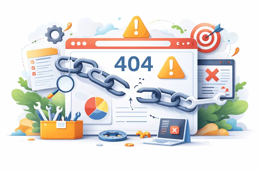
A common issue in website navigation is landing on a broken link or a missing page. Instead of leading users to a frustrating dead end, a well-designed 404 error page should guide them back to useful content. Including a search bar, suggested links, or a friendly explanation with a call to action can keep users engaged rather than abandoning the site.
For internal links, regular audits can help identify and fix broken links before users encounter them. Redirects should be implemented strategically to guide users to relevant content rather than an empty page.
Best Practices for Handling 404 Errors:
- Custom 404 pages: Offering search functionality and helpful links
- Automatic redirects: Sending users to an alternative page instead of a dead end
- Regular link audits: Checking and fixing broken links before users encounter them
Why Error Prevention & Recovery Matters in Website Design
A website that prioritizes error prevention and recovery creates a frictionless user experience, increasing engagement, reducing frustration, and improving conversion rates. When users feel guided and supported, they are more likely to complete tasks successfully and return to the website in the future. Designing with these principles in mind helps build trust, enhances usability, and ultimately leads to better business outcomes.
Conclusion
Great interaction design makes digital experiences effortless and engaging. Every tap, swipe, or click should feel intuitive, guiding users smoothly through websites, apps, and platforms. A well-structured interaction design process not only enhances usability but also drives engagement and conversions.
Whether you're launching a new website or refining an existing one, investing in interaction design ensures your product stands out in a competitive digital landscape.
Need a UX/UI expert? Let’s build something great together!

