Best Typography Examples in Web Design for Inspiration
Web Design
Mar 29, 2025
0 min
Typography is more than just picking fonts, it’s a powerful design tool that can shape a brand’s personality, set a tone, and guide user experience. From bold, rebellious serifs to clean, structured sans-serifs, the way text is styled and arranged can make or break a website’s first impression. In fact, it takes about 50 milliseconds (0.05 seconds) for users to form an opinion about your website - largely based on visual design, including typography.
In this article, I am highlighting standout examples of typography not just for readability, but as a central part of their visual identity. Whether you're a designer looking for inspiration or just a type lover at heart, these sites prove that great typography speaks louder than words.
What Is Web Typography?
Web typography is the art of thoughtfully choosing and arranging types to enhance how users read and interact with digital content. It includes selecting typefaces, adjusting size, weight, spacing, and styling - all with the goal of making text not only readable but also expressive. Typography can evoke emotion, reflect brand personality, and shape the way a message is perceived before a word is even fully read.
In the context of web design, typography plays an essential role in both visual storytelling and usability. It influences how content flows, how easily users absorb information, and how professional or approachable a site feels. Beyond aesthetics, good web typography must also take into account technical factors like page load speed, responsiveness, and accessibility.
That’s why designers must strike a balance, creating a visually engaging experience while ensuring that fonts are legible, consistent, and optimized for performance across all devices.
Why Is It Important?
- Enhances readability: Clear, well-styled text makes it easier for users to scan and absorb content, especially on small or mobile screens.
- Establishes visual hierarchy: Typography guides the user’s eye, helping them understand what’s most important on a page (e.g. headlines vs. body text).
- Reinforces brand identity: Fonts convey personality. The right typeface can make a site feel modern, friendly, elegant, bold, or trustworthy.
- Improves user experience: Good typography creates a seamless flow that keeps users engaged and encourages them to explore further.
- Supports accessibility: Thoughtful choices like font size, spacing, and contrast make content more usable for all visitors, including those with visual impairments.
- Impacts performance: Using optimized, web-safe fonts helps reduce load times and keeps your site running smoothly.
- Shapes how content is perceived: Before users even read a word, the typography sets the tone for how they’ll interpret your message.
Top 12 Best Examples Of Typography
United Network Studio

UNStudio’s website embraces a bold, modern typography approach that perfectly complements its architectural aesthetic. The homepage features large, high-contrast sans-serif text over full-screen imagery, ensuring readability while making a strong visual statement.
The sleek, rounded typography used in the logo and headings reinforces the brand’s innovative and forward-thinking identity, while the generous use of white space in the navigation enhances clarity and ease of use.
BeAr

BeAr Architects’ website takes a bold and experimental approach to typography, using overlapping text, vibrant colors, and high-contrast layering to create an immersive and dynamic visual experience. The interplay of serif and sans-serif fonts, combined with animated and flashing elements, adds to the futuristic, almost chaotic energy of the design.
While unconventional, this typography choice makes the site undeniably eye-catching and memorable, reinforcing the firm’s creative and boundary-pushing identity.
Magic John’s

Magic John’s Pizza embraces playful and bold typography to create a fun, nostalgic, and energetic brand experience. The use of curved, heavy, and slightly retro-style typefaces in bright red adds a dynamic feel, reinforcing the quirky personality of the brand.
The contrast between the soft pink background and the strong red typography makes key elements pop, guiding the user’s eye effectively. Combined with a vintage-inspired layout and custom illustrations, the typography plays a major role in crafting a memorable and engaging website.
Pizzeria Vetri

Pizzeria Vetri’s website embraces a modern and minimalist typography approach that perfectly complements its upscale, artisanal branding. The sleek, geometric sans-serif typeface in the logo and main headline exudes sophistication, while the smaller serif font used for descriptions adds a touch of warmth and tradition.
The generous white space, subtle contrast, and restrained color palette enhance the typography’s readability, making the site feel clean, refined, and effortlessly elegant; much like the handcrafted pizzas it showcases.
Plant Based Dough

Plant Based Dough Co. uses a warm and organic typography style that perfectly matches its vegan bakery brand making it one of the greatest examples of good typography. The playful, hand-drawn font for the headline adds a homemade and artisanal touch, reinforcing the brand’s natural and wholesome appeal.
The mix of rounded, friendly lettering and clean sans-serif text creates a balanced contrast, ensuring readability while maintaining a welcoming, down-to-earth feel. The color choices, soft greens and warm tones, enhance the fresh and inviting aesthetic, making the typography an integral part of the brand experience.
The Paper Mill

The Paper Mill’s website combines classic and modern typography to create a warm and inviting pub atmosphere. The elegant script font in "The" contrasts beautifully with the bold, all-caps sans-serif used for "PAPER MILL," adding a refined yet approachable feel.
The use of gold accents in buttons and headings enhances the upscale, rustic aesthetic, while the structured layout ensures readability. This thoughtful mix of fonts reflects the venue’s blend of tradition and contemporary hospitality.
Blume
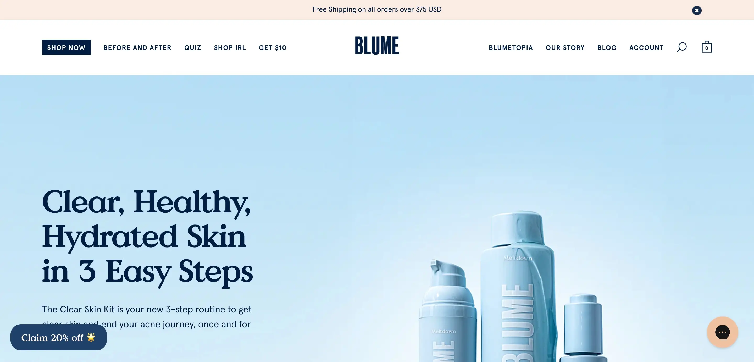
Blume’s website uses typography to convey a soft, clean, and trustworthy brand identity. The Value Serif font used for headings introduces a relaxed formality, giving the site a refined but approachable tone that aligns well with their natural, personal care products.
Paired with generous space and a calming color palette, the typography helps differentiate Blume from generic drugstore brands and reinforces the feeling of a gentle, human-centered skincare experience.
BASIC Moves®

BASIC Moves® embraces bold, oversized typography with a minimalist and high-contrast aesthetic, creating a striking and modern visual experience. The use of large, outlined sans-serif letters layered across the screen enhances the sense of movement, aligning perfectly with the theme.
The balance between light and heavy typography, combined with a dark background and subtle text elements, gives the design a sleek, editorial feel. This typography approach makes a strong statement while maintaining a refined and contemporary edge.
Eyewear

Evewear’s inspiration typography mirrors the softness and whimsy of its brand. The site uses a quaint serif font, likely a variation of Columbia Sans, that blends gentle curves with just the right amount of personality, perfect for a sustainable sleepwear brand.
The mix of pastel colors, playful illustrations, and elegant type gives the design a dreamy, approachable feel without sacrificing clarity. This typography choice enhances the brand’s mission of comfort and care, creating an experience that feels as cozy as the garments themselves.
Pink Chili

Pink Chili’s website grabs attention with its bold, expressive typography that feels unapologetically Gen Z. The chunky, red serif font used for the logo creates an immediate impact, mixing vintage flair with a fresh, rebellious twist.
With minimal imagery and a copy-driven layout, the site relies on typography to carry the brand’s tone - confident, playful, and full of personality. Careful typographic choices, including size, spacing, and color, allow the design to feel dynamic while maintaining clarity and ease of navigation.
Derek McKechnie

Derek McKechnie’s portfolio is a bold typographic experiment that turns conventional layout rules on their head. The site’s grid background sets the stage for a collage-style mix of serif and sans-serif typefaces, oriented in multiple directions to create a dynamic, immersive experience.
The serif font brings elegance and artistic flair, while the clean sans-serif labels maintain clarity and usability. Combined with motion effects and striking visual contrast, this “more is more” approach transforms typography into an expressive design element that doubles as navigation.
Dana Barkay

Dana Barkay’s portfolio is a showcase of bold, expressive typography used with intent and precision. As a font designer, she uses her homepage to highlight her type expertise, balancing chunky, custom letterforms with clean, geometric sans-serifs for contrast and legibility.
The grid layout provides clear visual hierarchy, while interactive scroll and hover effects bring the text to life. It’s a striking example of how typography can serve as both content and design, reinforcing personality without overwhelming the user.
Conclusion
Typography is one of the most overlooked yet powerful tools in web design. It influences how users read, feel, and interact with your content, often before they’ve processed a single word. From setting the tone of your brand to improving readability and accessibility, great typography can elevate your entire digital presence.
If you’re building a website or refreshing your brand, don’t underestimate the impact of strong typography examples choices. As a designer and developer, I specialize in creating thoughtful, visually compelling websites, with typography that not only looks great but also works for your audience.
Need help choosing the right fonts or designing a site that truly reflects your brand? Let’s connect and build something beautiful - one letter at a time.