Understanding Mobile Web Page Design: 9 Essential Tips
Web Design
Feb 18, 2025
0 min
A great mobile web page design is no longer optional - it’s expected. Users quickly abandon sites that are slow, cluttered, or difficult to navigate on smaller screens. On the other hand, a well-designed mobile page keeps visitors engaged, improves usability, and drives conversions.
Whether you're building a mobile website or optimizing an existing one, these 9 essential tips will help you create a mobile web page design that’s fast, intuitive, and easy to use. From responsive layouts to touch-friendly navigation, I’ll cover the key elements that make a difference.
The Importance of Good Mobile Web Page Design
Mobile web page design plays a crucial role in how users perceive and interact with your brand. A seamless mobile experience fosters trust and encourages engagement, while a poorly designed mobile site can deter potential customers.
Over 84% of visitors prefer mobile websites over desktop-centric ones. This statistic underscores the necessity of a responsive, fast, and user-friendly mobile web page design. By prioritizing mobile web page design optimization, you not only meet user expectations but also enhance your site's credibility and performance.
In the following sections, I'll delve into 9 strategies to help you craft an effective mobile web page design that captivates and retains your audience.

1. Responsive Design: Making Your Website Work on Any Screen
Have you ever visited a website on your phone and struggled to read tiny text, tap small buttons, or view cut-off images? This happens when a website isn’t designed to adjust to different devices. Responsive design ensures your site automatically adapts to any screen, whether it’s a phone, tablet, or desktop.
A non-responsive site can be frustrating. Users may need to zoom in, scroll sideways, or struggle to tap the right button, leading them to leave. A responsive site ensures text remains readable, images fit properly, and navigation is smooth, improving user experience and keeping visitors engaged.
To make a website responsive, use a flexible layout that adjusts based on screen size. Text should be at least 16 pixels for readability, buttons should be large enough to tap easily, and images should automatically resize.
Regular testing with tools like Google PageSpeed Insights helps identify areas to improve.
2. Fast Loading Speed: Keeping Your Website Quick and Efficient
Nobody likes waiting for a slow website. If a page takes too long to load, users often leave before seeing the content. A fast-loading website improves engagement, reduces bounce rates, and ranks higher on search engines.
A slow website frustrates visitors and affects business performance. Even a one-second delay can lower page views and conversions. If a site loads quickly, visitors are more likely to stay, explore, and take action.
To improve loading speed:
- Optimize images by compressing them and using modern formats like WebP.
- Minimize scripts and plugins that slow down performance.
- Use a Content Delivery Network (CDN) to load pages from the nearest server.
- Enable browser caching to store site elements locally for returning visitors.
3. Thumb-Friendly Navigation: Making Your Website Easy to Use
Most mobile users browse with one hand, relying mainly on their thumb. If buttons, menus, and links are too small or placed in hard-to-reach areas, navigating the site becomes frustrating.

A thumb-friendly website makes sure all interactive elements are easy to tap and access. When menus and buttons are positioned within natural thumb reach, users can browse effortlessly, improving their experience.
To optimize navigation:
- Place key elements like menus and call-to-action buttons in easy-to-reach areas.
- Use large tappable buttons (at least 48x48 pixels) with proper spacing to prevent misclicks.
- Keep menus simple with a collapsible format like a hamburger menu.
- Use sticky navigation to keep essential controls visible as users scroll.
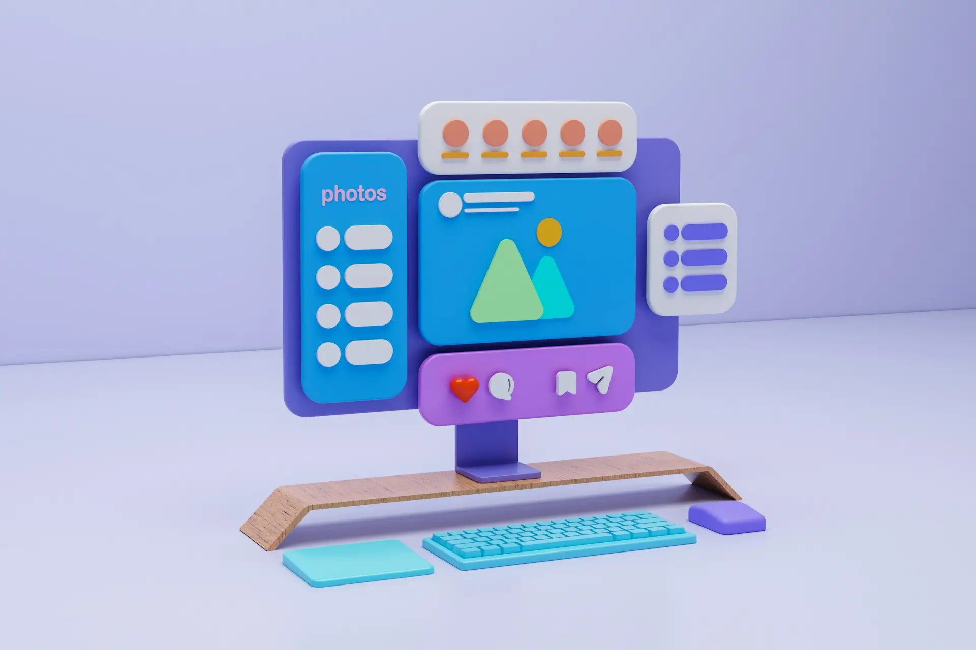
4. Simplified and Clear Layout: Keeping Your Website Easy to Use
A cluttered mobile web page design overwhelms users, making it difficult to find information or take action. A clean, simple layout enhances readability and usability.
Limited screen space means every element must serve a purpose. Too much content or too many design elements can slow the site down and confuse visitors. A well-structured page guides users to important information quickly.

To keep your layout simple and effective:
- Prioritize important content at the top. Keep text concise and break up large paragraphs.
- Use white space to separate elements and make content easy to scan.
- Limit colors and fonts to maintain a clean, professional look.
- Remove unnecessary elements like excessive animations or extra images.
5. Mobile-Optimized Website Forms: Making Input Easy and Fast
Forms are a key part of collecting user information, but on mobile, they can be frustrating if not designed properly. A mobile-friendly form should be simple, easy to fill out, and require minimal effort.
Typing on small screens can be difficult. If forms are too long or have tiny fields, users may abandon them. Keeping forms short and intuitive increases completion rates.
To optimize forms for mobile:
- Ask only for necessary information to keep forms short.
- Use large input fields and buttons for easy tapping.
- Enable autofill to let browsers complete common fields like names and emails.
- Minimize typing by using dropdowns and checkboxes where possible.
6. Readable Text and Fonts: Ensuring Easy Reading on Mobile
Text that is too small or hard to read discourages visitors from engaging with your content. A well-sized, legible font improves usability and makes your site more user-friendly.
On small screens, cramped text or decorative fonts can make reading difficult. Users should be able to scan content without straining their eyes. Readable text improves accessibility and keeps visitors engaged.
To make text easy to read:
- Use at least a 16px font size for body text.
- Choose simple, sans-serif fonts like Arial or Roboto.
- Ensure high contrast between text and background for visibility.
- Use proper line spacing (1.5x) and short paragraphs for easier scanning.

7. SEO and Mobile Usability: Making Your Website Easy to Find and Use
A mobile-friendly website isn’t just about design, it also needs to be search engine optimized (SEO). Google prioritizes sites that load quickly, are easy to navigate, and provide a great user experience.
If a site is slow or difficult to use, it may rank lower in search results, reducing traffic. If you want to rank higher, you must optimize website for mobile to meet search engine requirements and user expectations.
To improve SEO and usability:
- Use concise meta titles and descriptions that fit well on mobile screens.
- Optimize for Google’s Mobile-First Indexing, ensuring mobile content matches desktop.
- Improve page speed by compressing images and reducing scripts.
- Use structured data to enhance search visibility and rich results.
- Ensure simple navigation so users can find what they need quickly.
8. Testing Across Devices and Browsers: Ensuring a Seamless Experience
Even the best mobile web page design can have issues on different devices. What looks perfect on one phone may not work well on another. Regular testing ensures your site remains responsive and fully functional for all users.
The best approach is to design for web and mobile simultaneously, ensuring consistency and usability across all platforms.
Testing helps identify issues like broken layouts, unreadable text, and slow loading times. It’s important to check how your site appears on multiple screen sizes, operating systems, and browsers.

To ensure a seamless experience:
- Test on real devices and emulators to check layout and usability.
- Use tools like Google’s Mobile-Friendly Test, BrowserStack, or LambdaTest to catch compatibility issues.
- Check touch interactions to ensure buttons and links are easy to tap.
Final Thoughts
A great mobile web page design website isn’t just about looks, it’s about performance, usability, and user experience. A fast, responsive, and easy-to-navigate design keeps visitors engaged and improves conversions.
With more users relying on mobile devices, a poorly designed website can drive potential customers away. By focusing on speed, readability, touch-friendly navigation, and a clear layout, you ensure that users can easily find what they need without frustration.
Need help with mobile web page design? I create user-friendly sites that engage visitors and drive results.
Let’s build a better mobile experience together!