Blog
Our blog
0min
|
Website
|
Website Audit Checklist: What to Review for SEO, Speed & UX
Your website might look great on the surface, but what’s happening underneath often determines whether it truly performs. A slow load time, broken links, weak internal linking, or outdated content can quietly damage your visibility and user experience, and you might not even notice it until traffic drops or conversions start to decline.
That’s where a website audit checklist comes in. It’s a structured way to review your site from top to bottom, covering SEO, content quality, technical performance, and overall usability. Instead of guessing what’s wrong, a proper audit gives you measurable insights into how your website performs, where it falls short, and what to fix first.

Whether you manage a large e-commerce platform or a small business website, running an audit regularly ensures your site stays fast, search-friendly, and user-focused. In this guide, you’ll find a comprehensive checklist for website audit that breaks down everything you should review, from on-page SEO and content relevance to Core Web Vitals and UX design.
By the end, you’ll have a clear roadmap for improving your website’s performance and creating a smoother experience for your visitors.
Why a Website Audit Matters
A website audit is more than a technical checkup. It is a deep analysis that shows how well your website performs across search visibility, usability, and overall efficiency. When done correctly, it reveals what helps your site grow and what holds it back.
Regular audits are important because search engines and user expectations constantly evolve. What worked a year ago might not be enough today. Algorithms change, competitors improve, and design trends shift. A website audit checklist helps you stay ahead by showing where your SEO strategy, content, or technical setup might be falling behind.
Here are a few key benefits of conducting regular website audits:
- Improved Search Performance: By identifying technical SEO issues, missing metadata, or duplicate pages, you can strengthen your site’s ability to rank higher in search results.
- Better User Experience: A faster, easier-to-navigate website keeps visitors engaged longer and helps reduce bounce rates.
- Stronger Conversions: Fixing broken links, updating content, and improving structure often lead to more actions such as sign-ups, inquiries, or purchases.
- Data-Driven Decisions: An audit gives you real data instead of assumptions, helping you prioritize what to improve first.
SEO Audit Checklist
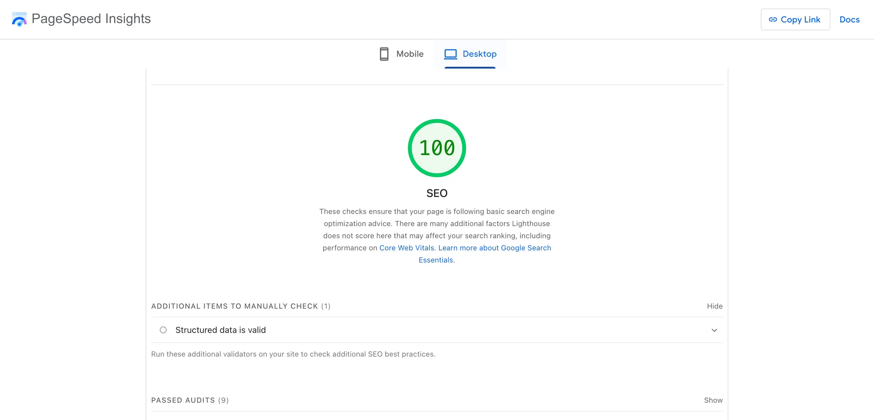
The first step in your website audit checklist is to review SEO. Search engine optimization affects how easily people can find your website, how your pages appear in search results, and how relevant your content looks to users and algorithms. A proper SEO audit helps you discover errors, missed opportunities, and outdated practices that could limit your visibility.
1. Technical SEO
Technical SEO forms the foundation of every successful website. Start by checking whether search engines can properly crawl and index your pages.
- Crawlability: Make sure your robots.txt and XML sitemap are correctly configured and updated.
- Indexation: Check that important pages are indexed and duplicates or outdated URLs are removed.
- HTTPS and Security: All pages should load securely with HTTPS.
- Structured Data: Add schema markup where relevant to improve how your pages appear in search results.
- Redirects and Broken Links: Scan for 404 errors or redirect loops that can waste crawl budgets and frustrate visitors.
2. On-Page SEO
Once your technical base is solid, focus on On-Page SEO, optimizing what users see.
- Review meta titles and descriptions to make sure they are unique, keyword-focused, and within character limits.
- Check that every page has a clear H1 and logical heading hierarchy (H2s, H3s).
- Make sure your primary keyword and relevant variations appear naturally throughout the page.
- Audit internal links to confirm they guide users toward related pages and distribute authority evenly.
- Optimize images with descriptive alt text and clean file names.
3. Off-Page SEO
Even though off-page SEO occurs outside your site, it still plays a role in your overall audit.
- Review your backlink profile to identify toxic or spammy links that might harm your rankings.
- Track referring domains, brand mentions, and external citations for quality and relevance.
- Consider outreach or partnerships to strengthen authority in your niche.
Website Content Audit Checklist
Your content is what connects your website to your audience. Even if your site is technically perfect, weak or outdated content can hurt performance and reduce trust. A website content audit checklist helps you evaluate not just what you say, but how effectively you say it, across every page, blog post, and product description.
1. Review Content Quality and Relevance
Start by analyzing whether your existing content aligns with your brand message and audience needs.
- Identify outdated, thin, or duplicated pages that no longer serve a purpose.
- Check if your content answers user questions clearly and fully.
- Look for tone and style consistency across all sections of your website.
- Refresh old articles with updated data, visuals, and internal links.

2. Analyze Keyword and Search Intent Alignment
Your content should attract the right audience through search.
- Ensure each page targets a specific keyword and search intent.
- Avoid keyword stuffing and focus on natural language that fits user queries.
- Add related terms where appropriate to support contextual relevance.
3. Evaluate Readability and Engagement
Readable, structured content performs better both for users and search engines.
- Use short paragraphs, bullet points, and clear subheadings.
- Check sentence length and readability using tools like Hemingway or Grammarly.
- Include visuals such as infographics or charts to make information easier to digest.
- Track metrics like time on page and bounce rate to gauge engagement.
4. Check Internal and External Links
Good linking enhances both SEO and user experience.
- Verify that all internal links work and lead to relevant pages.
- Add links from high-performing pages to those that need more visibility.
- Review external links to ensure they point to credible, up-to-date sources.
Website Speed & Performance Audit
A fast, reliable website keeps visitors engaged and supports better rankings. Search engines consider speed a ranking factor, and users quickly abandon slow-loading pages. That’s why every website audit checklist should include a detailed review of your site’s technical performance.
1. Test Website Loading Speed
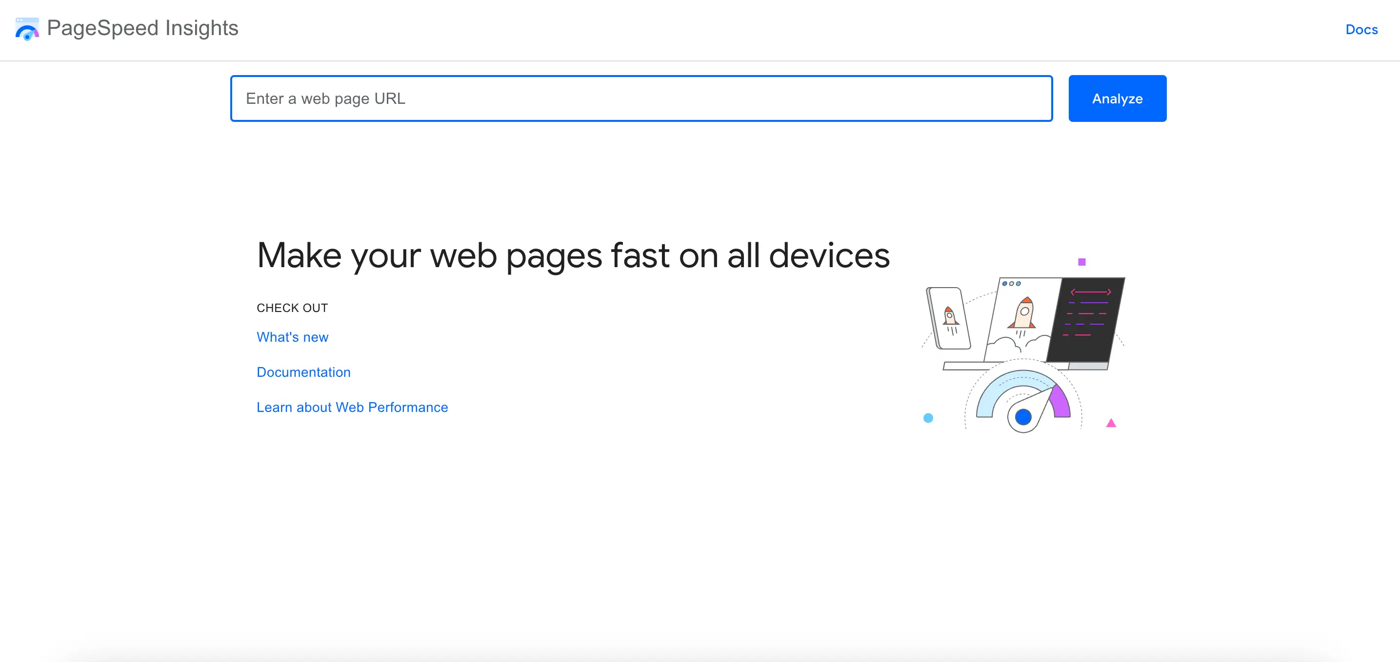
Start by measuring how quickly your pages load using tools like Google PageSpeed Insights, GTmetrix, or Lighthouse.
- Identify which pages have the longest load times.
- Compare performance across desktop and mobile devices.
- Focus on improving your Core Web Vitals: Largest Contentful Paint (LCP), First Input Delay (FID), and Cumulative Layout Shift (CLS).
2. Optimize Images and Media
High-quality visuals can easily slow your website if not optimized.
- Compress images without losing clarity using tools such as TinyPNG or Squoosh.
- Implement lazy loading for below-the-fold images.
- Use next-gen formats like WebP where supported.
- Ensure videos are embedded efficiently or hosted externally.
3. Reduce Code and Server Load
Your site’s backend plays a big role in speed.
- Minify CSS, JavaScript, and HTML files to remove unnecessary code.
- Limit the number of third-party scripts and plugins.
- Enable browser caching and use a Content Delivery Network (CDN) for faster global delivery.
- Review server response time and upgrade hosting if necessary.
4. Test Mobile Performance
Since most users browse on mobile, your audit should focus heavily on responsiveness.
- Make sure the design adapts properly to all screen sizes.
- Avoid oversized images and unresponsive buttons.
- Use Google’s Mobile-Friendly Test to identify and fix issues.
A performance-focused audit website checklist helps you identify where your site is losing speed and user attention.
Tools for Conducting a Website Audit
Performing a complete audit manually can take time. Choosing the right tools simplifies the process and gives you accurate data to act on. Below are some of the most effective platforms to include in your website audit checklist.
SEO and Technical Tools
- Google Search Console: Helps track indexing status, keyword performance, and crawl issues.
- Ahrefs or Semrush: Ideal for backlink analysis, keyword tracking, and competitor comparisons.
- Screaming Frog: A must-have for scanning your website structure, broken links, redirects, and metadata.
Performance and Speed Tools
- Google PageSpeed Insights: Tests speed and Core Web Vitals for desktop and mobile.
- GTmetrix: Provides waterfall reports that show which elements slow your pages down.
- Lighthouse: Offers detailed audits for performance, accessibility, SEO, and best practices.
Content and UX Tools
- Hotjar or Microsoft Clarity: Show heatmaps and user session recordings to visualize behavior.
- Grammarly and Hemingway: Improve writing clarity and tone consistency.
- Google Analytics 4 (GA4): Tracks engagement, traffic sources, and user actions to measure content effectiveness.
How Often to Audit Your Website
A website audit should never be a one-time task. The web evolves quickly, and small issues can grow into serious problems if left unchecked. The right audit frequency depends on your website’s size, traffic, and update pace.
- Quarterly Audits: Best for most businesses to catch SEO, speed, and UX issues before they affect performance.
- Monthly Mini Audits: A lighter review of content updates, new pages, and tracking setup.
- After Major Changes: Always audit after redesigns, platform migrations, or plugin updates to detect technical issues early.
Regularly following your website audit checklist ensures your site continues to meet modern standards for speed, security, and user satisfaction.
Conclusion
Your website is the core of your online presence. Keeping it optimized requires consistent attention to detail, not only in how it looks, but in how it performs. By following a structured website audit checklist, you can spot weaknesses before they impact your audience and turn your site into a stronger, faster, and more engaging platform.
If you need expert help analyzing and optimizing your website, I offer SEO services designed to improve visibility, speed, and user experience, ensuring your website performs at its best in every area.
0min
|
Website
|
Development
|
Squarespace vs WordPress: Which Website Builder Should You Choose?
Building a website today is easier than ever, but with so many platforms available, choosing the right one can feel overwhelming. Two names stand out in almost every comparison: Squarespace and WordPress. Both are powerful, both are popular, and both can help you build anything from a simple portfolio to a thriving online business.
But when it comes down to Squarespace vs WordPress, which is the better choice for you? Let’s dive deep into the differences, strengths, and drawbacks so you can make a confident decision.
What is Squarespace?
Squarespace is an all-in-one website builder that focuses on simplicity and design. It allows users to create professional-looking websites using drag-and-drop tools and beautifully designed templates. Everything, from hosting to analytics, is included in the platform, which means you don’t need to manage external plugins or worry about technical details.
Squarespace is especially popular with creatives, small businesses, and entrepreneurs who want a site that looks polished without requiring coding skills.
What is WordPress?
WordPress is the world’s most popular content management system (CMS), powering over 40% of all websites on the internet. Unlike Squarespace, WordPress is open-source software, which means it’s highly flexible and can be customized with thousands of themes and plugins.
Originally built as a blogging platform, WordPress has evolved into a versatile solution capable of powering everything from small blogs to enterprise-level websites. It’s the go-to choice for those who want complete control over their site’s design, features, and growth.
Ease of Use: Simplicity vs Flexibility
Squarespace has built its reputation on simplicity. Its interface is clean, beginner-friendly, and packed with stylish templates that look great without much effort. For someone who wants to launch a professional-looking site quickly, it’s hard to beat.
WordPress, by contrast, is more like a blank canvas. You’ll have more freedom, but with that comes responsibility. The dashboard may feel overwhelming at first, and getting the design you want can require experimenting with themes, plugins, or even a little coding.
- Squarespace = ready-to-wear fashion. Elegant, easy, but limited in choices.
- WordPress = tailor-made suit. It takes more work, but it fits exactly the way you want.
Design and Customization
When it comes to design, both platforms shine, but in very different ways.
Squarespace is known for its polished, modern templates. They’re designed by professionals, which means you can launch a portfolio, blog, or business site that already looks stunning. The downside? Customization has limits. You can tweak colors, fonts, and layouts, but only within the framework provided.

WordPress, on the other hand, offers thousands of themes, ranging from free minimalist designs to advanced, feature-packed templates. However, themes alone usually aren’t enough to achieve a truly unique or fully functional site.
That’s why many users extend their websites with page builders, plugins, or custom code. This combination of tools provides a high level of control, making WordPress ideal for people who want their websites to stand out and evolve over time.
- Squarespace: Great out-of-the-box designs, less flexibility.
- WordPress: Unlimited customization, but may require more effort.
Features and Functionality
The feature sets of Squarespace and WordPress reflect their overall philosophies.
Squarespace focuses on being an all-in-one platform. It includes blogging, scheduling, image galleries, and e-commerce right out of the box. Everything works smoothly without needing extra add-ons.
WordPress takes a different approach. It starts simple, but its true strength lies in plugins. There are over 60,000 available, covering everything from contact forms to membership systems. Need a podcast manager? A learning management system? A custom booking engine? WordPress has a plugin for it.
Here’s how they compare in functionality:
- Squarespace: Perfect for people who want built-in features that “just work.”
- WordPress: Ideal for those who need advanced, custom solutions.
Squarespace vs WordPress SEO
Search engine optimization (SEO) is a crucial factor for any website that wants to grow its audience. Here’s where differences become clear.
Squarespace offers built-in SEO basics: customizable titles, meta descriptions, SSL security, mobile-friendly templates, and automatic clean URLs. These features are enough for beginners and small sites, ensuring pages are optimized without much extra effort.
WordPress, however, takes SEO to another level. With plugins like Yoast SEO or Rank Math, you can fine-tune everything—XML sitemaps, schema markup, redirects, internal linking, and keyword optimization. This makes it the stronger option for content-heavy websites or businesses aiming for long-term organic growth.
In other words:
- Squarespace SEO is simple and effective for most small projects.
- WordPress SEO is powerful, advanced, and customizable for ambitious growth.
If SEO is your top priority, WordPress leads in the Squarespace vs WordPress SEO debate.

Blogging Experience
Both platforms can support a blog, but they feel very different in practice.
Squarespace blogs are straightforward. You can add posts, insert images, and schedule content easily. It’s ideal for someone who just wants a clean, simple way to share thoughts and updates.
WordPress, however, was originally built as a blogging platform, and it shows. Its editor (Block Editor/Gutenberg) supports rich formatting, media embeds, categories, tags, and custom taxonomies. For content creators who publish regularly and want maximum control, WordPress remains the gold standard.
E-commerce Capabilities
Squarespace includes e-commerce features natively. Adding a store is simple, and managing products, payments, and inventory is streamlined. It’s excellent for small businesses or entrepreneurs who want to sell a handful of products without fuss.
WordPress doesn’t come with built-in e-commerce, but it integrates seamlessly with WooCommerce, one of the most powerful e-commerce solutions on the web. WooCommerce supports everything from small online shops to large-scale marketplaces with advanced features.

If your goal is a simple online shop, Squarespace is faster to set up. If you’re building something scalable and customizable, WordPress with WooCommerce is hard to beat.
Scalability and Long-Term Growth
One of the biggest questions to ask is: Where do I see my website in 2–5 years?
- Squarespace is perfect if you want a site that stays relatively simple: a portfolio, small business website, or blog that won’t require complex features.
- WordPress is better if you expect your website to grow significantly. Whether it’s adding a membership area, an online course, or scaling to thousands of posts, WordPress can handle it.
In summary:
- Squarespace = quick, stylish, manageable growth.
- WordPress = long-term scalability and advanced capabilities.
WordPress vs Squarespace: Who Should Choose What?

To make things clearer, let’s break it down by user type.
Squarespace is best for:
- Creatives who need visually appealing portfolios.
- Small businesses that want a professional site without technical hassle.
- Beginners who value ease of use over deep customization.
WordPress is best for:
- Bloggers and content creators who publish frequently.
- Businesses planning to scale their websites with advanced features.
- Anyone who wants total control over design, SEO, and functionality.
Final Thoughts
The Squarespace vs WordPress debate doesn’t have a single winner; it depends on your goals.
If you want simplicity, style, and an all-in-one solution, Squarespace is a fantastic choice. But if you crave flexibility, advanced SEO, and long-term scalability, WordPress is the platform for you.
When considering WordPress vs Squarespace, think about your own comfort level with technology, your need for customization, and your vision for future growth. Choosing the right builder now will save you time, effort, and frustration later.
So ask yourself: Do you want a site that’s quick and polished, or one that’s fully in your control? Once you answer that, the decision between Squarespace and WordPress becomes much easier. And if you’re still unsure about the best path forward, a skilled web developer can help you create a website that’s both effective and aligned with your goals.

0min
|
Digital Marketing
|
10 Ways to Leverage Social Media as a Marketing Tool
Social media has evolved from a space for personal networking into one of the most powerful avenues for business growth. Companies of all sizes are now embracing social media as a marketing approach to reach audiences, drive traffic, and generate leads. When used strategically, these platforms can serve as cost-effective, high-impact marketing channels that not only build brand awareness but also foster lasting customer relationships.
If you’ve been wondering how to transform your online presence into a growth engine, here are 10 proven ways to leverage social media effectively.

1. Build a Strong Brand Presence
The foundation of success with social media as a marketing tool lies in creating a recognizable and trustworthy brand. A strong presence makes you memorable in a crowded feed.
To achieve this:
- Use consistent branding (colors, logos, fonts) across all platforms;
- Craft a clear bio that communicates your unique value;
- Post with a consistent tone of voice that reflects your brand personality.
Think of your social profiles as digital storefronts - first impressions matter. The more polished and consistent your presence, the more likely people are to follow and engage.
2. Engage With Your Audience
One of the biggest advantages of using social platforms is the ability to connect directly with your audience. Unlike one-way advertising, social platforms enable interactive dialogue with customers.
Here’s how to deepen engagement:
- Reply to comments and direct messages promptly;
- Ask questions in your captions to encourage interaction;
- Use polls, quizzes, and interactive stories to spark participation.
Customers are far more likely to support brands that make them feel heard. Consistent engagement nurtures confidence and deepens brand loyalty.
3. Leverage Paid Advertising
Organic reach is valuable, but paid campaigns take social media as a tool for marketing to the next level. Platforms like Facebook, Instagram, LinkedIn, and TikTok allow businesses to target specific demographics, interests, and behaviors.
Benefits of paid advertising include:
- Highly targeted audience reach;
- Detailed analytics to measure ROI;
- Opportunities to retarget people who already interacted with your brand.
Even a modest budget can yield strong results when campaigns are properly optimized.
4. Share Valuable Content
People don’t log onto social platforms to be bombarded with sales pitches. They come for content that educates, entertains, or inspires. That’s why sharing value-driven content is central to success with social media as a marketing strategy.

Content ideas include:
- Educational posts (how-tos, industry insights);
- Visuals like infographics, reels, or short videos;
- Behind-the-scenes content to humanize your brand.
A balanced content mix keeps your feed fresh and appealing while subtly showcasing your products or services.
5. Use Influencer Partnerships
Influencer marketing is no longer just for global brands, it’s an accessible and powerful tactic for businesses of all sizes. Partnering with influencers allows you to tap into pre-built communities that already trust their recommendations.
When thinking about how to use social media as a marketing tool through influencers, consider:
- Collaborating with micro-influencers (1k–50k followers) for higher engagement rates.
- Choose influencers whose audience reflects the market you want to reach.
- Creating authentic campaigns rather than forced promotions.
These partnerships can expand your reach and provide the social proof needed to boost conversions.
6. Run Contests and Giveaways
Contests and giveaways are excellent tactics to boost visibility and engagement in a short period. People love the chance to win something, and they’re often willing to share your page or tag friends to enter.
Effective giveaway strategies include:
- Asking participants to follow your page;
- Encouraging tagging of friends or sharing posts;
- Offering a prize that aligns with your brand (not just generic rewards).
This method not only increases followers but also generates buzz around your products or services.
7. Analyze and Optimize Performance
One of the major strengths of social media as a marketing channel is the ability to track performance in real time. Unlike traditional campaigns, you can measure exactly what works and what doesn’t.
Steps to optimize:
- Monitor engagement metrics (likes, shares, comments);
- Track reach, impressions, and click-through rates;
- Adjust posting times, formats, or targeting based on results.
Regular analysis allows you to refine your strategy, ensuring every post contributes toward your broader goals.

8. Leverage Social Listening
Social listening goes beyond analytics; it’s about understanding how your audience perceives your brand and industry. By monitoring conversations, you can gather insights to improve products, services, and customer experience.
Practical steps:
- Use tools like Hootsuite or Brandwatch to track mentions;
- Respond to both positive and negative feedback;
- Identify trending topics to create timely, relevant content.
This proactive approach helps you stay ahead of competitors and connect with your audience on a deeper level.
9. Drive Traffic to Your Website
While social platforms are great for brand visibility, your ultimate goal should be directing users to your website, where conversions happen.
Here’s how to do it effectively:
- Add CTAs to posts that link back to landing pages;
- Use link-in-bio tools to showcase multiple offers;
- Share blog posts, case studies, or product pages directly.
By aligning social media with your website, you create a seamless funnel that guides followers toward becoming customers. A well-designed website with strong user experience is essential here, it ensures that once visitors land on your site, they can easily navigate, find information, and complete actions without friction.
10. Create a Social Strategy Marketing Plan
Random posting isn’t enough. To maximize impact, you need a structured plan that aligns with your business goals. A well-designed social strategy marketing plan ensures you’re not just active but strategic.
Elements of a strong plan include:
- Defining clear objectives (brand awareness, leads, sales);
- Identifying your target audience and their behaviors;
- Establishing KPIs to measure success;
- Creating a content calendar for consistent posting.
This roadmap ensures that your efforts are intentional, measurable, and scalable.
Frequently Asked Questions
1. Why is social media important as a marketing tool?
Social media gives businesses direct access to their audience. Unlike traditional channels, it allows for real-time engagement, targeted advertising, and measurable results. By using social media as a marketing tool, companies can build brand awareness, drive traffic, and convert followers into loyal customers - all at a fraction of the cost of traditional advertising.
2. How do I start using social media as a marketing channel?
The first step is choosing the right platforms where your target audience spends time. Once selected, focus on building a strong brand profile, posting consistently, and engaging with followers. As you grow, you can expand into paid campaigns and influencer partnerships to maximize your reach with social media as a marketing channel.
3. What type of content works best on social media for marketing?
It depends on your audience, but generally:
- Short-form videos and reels for quick engagement;
- Educational posts, infographics, and blogs for value-driven content;
- Behind-the-scenes stories to humanize your brand.
The key is mixing formats and keeping your posts aligned with your brand’s goals.

4. In what ways can small businesses use social media as a marketing strategy?
Small businesses can use social media as a marketing approach to compete with larger companies by targeting niche audiences and creating authentic connections. Even with limited budgets, tools like organic posting, local hashtags, and micro-influencer collaborations can generate awareness and loyal customers.
5. How do I measure success when using social media as a marketing tool?
Success is measured through analytics. Look at key performance indicators such as engagement rate, click-throughs, follower growth, and conversions. Most platforms provide insights that help you understand what’s working. Combining this data with your business goals will show whether your social strategy is paying off.
Conclusion
Leveraging social media as a marketing approach is no longer optional; it’s essential. By building a strong presence, engaging with your audience, investing in advertising, and following a structured strategy, you can turn social platforms into growth engines for your business.
These tactics, ranging from influencer partnerships to analytics-driven decisions, provide a blueprint to maximize your results. The key is consistency: social media rewards brands that show up, deliver value, and connect authentically.
Begin with small steps, track your results, and adjust your approach as needed. Over time, these efforts compound, positioning your brand for greater visibility, stronger customer relationships, and measurable business growth.

0min
|
UX Design
|
Top 7 UX Design Principles Every Designer Should Know
Whether you’re building a website, app, or digital product, understanding UX fundamentals is key to creating an intuitive and effective experience.
In this beginner’s guide, I’ll walk through the most important UX design principles you need to know. You’ll learn how to think like a user, structure content clearly, and make smart design decisions that lead to better results.
Understanding UX in Digital Design
User Experience, or UX, refers to how people interact with a product or service, especially digital ones like websites or apps. It’s about more than just visuals. Good UX considers how intuitive, efficient, and satisfying the experience is for the user.
The principles of UX design serve as a foundation for creating digital products that meet user needs and reduce friction. When applied correctly, these principles help guide users effortlessly through a flow, whether it’s reading content, signing up, or making a purchase.
Designing with UX in mind means putting users first. It involves empathy, problem-solving, and constant testing. As you learn to follow strong UX design principles, your designs will become more accessible, effective, and enjoyable for real users.

UX Design Principles Every Beginner Should Know
1. Clarity
A clear interface makes users feel confident. When users land on a page, they should immediately understand what the site or app does and what action to take next. Confusing layouts, vague labels, or cluttered screens can quickly lead to frustration or drop-offs.
To improve clarity, use plain language, meaningful visuals, and intuitive layouts. Prioritize important information and make interactive elements (like buttons or links) easy to recognize. Remember, users shouldn’t have to think twice about where to go or what to do.
Quick ways to enhance clarity:
- Use familiar icons and patterns;
- Avoid jargon or technical language;
- Make calls-to-action stand out;
- Stick to a clean, visual hierarchy.
2. Consistency
Consistency helps users feel comfortable. When layouts, colors, and functions behave the same way across pages, users don’t have to re-learn the interface every time they interact with something new.
This applies not only to visuals (like buttons, colors, or spacing) but also to tone of voice and navigation patterns. A consistent design language helps build trust and keeps the user focused on the task, not on figuring out how your site works.
3. Feedback
Every action should have a reaction. Whether a user clicks a button, uploads a file, or submits a form, your interface should acknowledge that something happened.
Good feedback prevents confusion and helps users stay in control. Examples include micro-interactions like hover effects, confirmation messages, error alerts, and progress indicators. Even small details like a button changing color when clicked contribute to a smoother user experience.

4. Hierarchy
Hierarchy is about guiding attention. Users don’t read every word or look at every corner of the screen, they scan for what matters. Your job is to help them spot what’s important.
Use size, spacing, contrast, and grouping to establish a clear visual path. Headlines should be more prominent than body text. Primary actions should stand out more than secondary ones. Strong hierarchy leads users through your content smoothly and intentionally.
Hierarchy tips:
- Use larger font sizes for headings;
- Group related items visually;
- Make CTAs more prominent than navigation links;
- Use whitespace to separate content zones.
5. Accessibility
An inclusive product works for everyone. Accessibility ensures that users with visual, auditory, motor, or cognitive challenges can still interact with your site or app effectively.
Basic accessibility practices include providing alt text for images, ensuring good color contrast, supporting keyboard navigation, and using semantic HTML. By designing with accessibility in mind, you also improve the overall UX for everyone, not just those with disabilities.
6. User Control
Users want to feel in charge, not trapped by your design. That means allowing them to undo actions, exit popups easily, or navigate back without losing progress.
For example, include “Cancel” buttons alongside “Submit,” allow users to preview changes, and avoid auto-saving irreversible actions. Empowering users helps build trust and reduces the fear of making a mistake.

7. Simplicity
The best interfaces feel effortless. Simplicity is about stripping away the non-essential to help users complete their tasks without distraction.
Limit options, streamline workflows, and avoid decorative elements that don’t serve a purpose. A simple interface doesn't mean basic or boring; it means focused, purposeful, and user-friendly.
Mobile UX Design Key Principles
Designing for mobile requires a slightly different mindset. Smaller screens, touch-based interactions, and varying internet speeds all influence how users experience your product. While the core UX design principles still apply, there are specific considerations when it comes to mobile environments.
The mobile UX design key principles revolve around simplicity, speed, and accessibility. Users often engage with mobile apps or sites while on the go, so they expect fast load times, clear navigation, and minimal effort to complete tasks. A cluttered or unresponsive mobile design can quickly push users away.
Best practices for mobile UX design:
- Prioritize thumb-friendly navigation and tap targets;
- Use clear, concise copy and remove unnecessary steps;
- Optimize images and code for fast loading;
- Stick to a single-column layout for better readability;
- Make sure buttons are easy to see and press.
In mobile design, less truly is more. The fewer obstacles you place between the user and their goal, the better the experience. Always test designs on multiple devices and screen sizes to ensure they remain usable and intuitive no matter how they’re accessed.
UX Pitfalls Beginners Should Watch Out For
Even with a solid understanding of UX design principles, it’s easy to slip into habits that unintentionally harm the user experience. Recognizing and avoiding common UX mistakes is just as important as knowing what to do right.
Many beginners tend to overdesign, adding too many features, visuals, or options in an attempt to impress. This often leads to clutter, confusion, and decision fatigue for the user. Others might overlook accessibility or forget to test designs across different devices and screen sizes.
Here are a few common UX mistakes to avoid:
- Ignoring mobile responsiveness;
- Overloading users with too many choices;
- Using unclear or generic navigation labels;
- Failing to provide user feedback for interactions;
- Designing for aesthetics instead of usability;
- Neglecting real user testing and feedback.
Following UX design principles doesn’t mean your design has to be complex. In fact, the best experiences are often the simplest. Always aim to reduce friction, support user goals, and keep things intuitive.

Conclusion: Start Designing with UX in Mind
Strong user experience isn’t just a nice-to-have; it’s the foundation of any successful digital product. By applying these core UX design principles, you can create websites and applications that are clear, intuitive, and truly user-friendly. Whether you're designing for desktop or mobile, a user-first mindset leads to better engagement and long-term growth.
If you're looking for guidance from a user experience designer who understands how to combine strategy, usability, and clean design, I’m here to help. I create thoughtful, functional, and conversion-focused experiences that align with both user needs and business goals.
Ready to create a better experience? Let’s talk about how I can improve your product through smart, user-centered design.
0min
|
Website
|
Development
|
Webflow vs Wix: Which Is Better for Building a Scalable Website?
When it comes to building a modern website, two names often rise to the top of the list: Webflow vs Wix. Both platforms offer powerful no-code solutions for individuals, businesses, and creators looking to establish a professional online presence. But if your goal is long-term growth and scalability, the differences between them become much more important.
In this article, I’ll compare Webflow vs Wix across key areas like design flexibility, content management, SEO features, and scalability, helping you decide which platform best fits your current needs and future goals.
What Are Webflow and Wix?
Webflow and Wix are both website builders designed to help users create professional-looking websites without writing code. However, they cater to different needs and levels of experience.
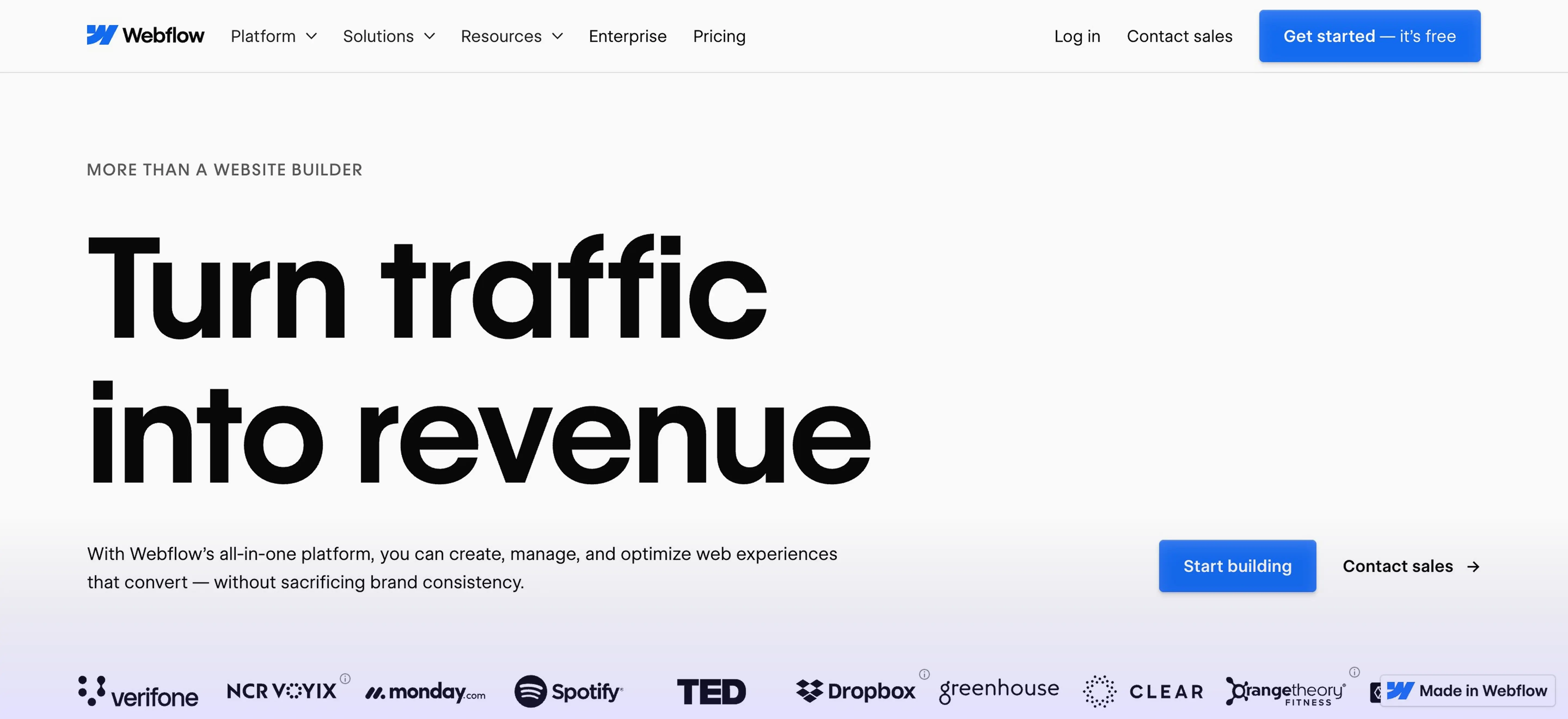
Wix is known for its user-friendly drag-and-drop interface that makes it easy for beginners to get started quickly. It offers a wide range of templates, built-in features, and automation tools, making it a go-to for personal projects, small businesses, and portfolios.
Webflow, on the other hand, is built with designers and developers in mind. It provides much more control over layout, animations, and site structure. With Webflow, users can create complex, custom designs that are cleanly coded and fully responsive. It's often chosen by businesses and agencies that need flexibility and scalability from day one.
While both platforms aim to simplify the website creation process, they differ significantly in their approach, capabilities, and long-term potential.
How Much Creative Freedom Do You Get?
One of the biggest differences between Webflow vs Wix lies in how much design control each platform offers.
Wix uses a drag-and-drop editor that allows users to move elements freely across the page. It's beginner-friendly and offers a wide variety of templates, but the customization options are limited once you go beyond the basics. Advanced layout adjustments or pixel-perfect design can be challenging, especially for users with a specific creative vision.
Webflow gives you far more freedom when it comes to design. It functions more like a visual development tool, letting you control every detail of your site’s layout, from grid systems to animations. If you have design experience or want to translate high-fidelity mockups directly into your site, Webflow makes it possible. You can also add custom code, giving you the ability to build highly tailored experiences.
If you want quick results with minimal effort, Wix may be enough. But for those seeking creative precision and a more scalable design system, Webflow clearly leads.
Which Platform Handles Content Better?
As your website grows, managing content efficiently becomes essential. This is where the differences between Webflow vs Wix become more noticeable.
Wix offers basic content management through its editor. You can create blog posts, product listings, and other static pages, but the CMS is not as flexible when it comes to custom content structures. For most small sites, it works well, but as your content needs become more complex, Wix can feel limiting.
Webflow includes a robust built-in CMS that’s ideal for dynamic content. You can create custom content types, define your own fields, and use the CMS to generate collections like blog posts, team profiles, case studies, or product libraries — all from a single database. It’s especially useful for content-heavy websites that require consistency, scalability, and dynamic filtering.
For content creators, marketers, or anyone managing more than a handful of static pages, Webflow’s CMS offers more flexibility and power.
SEO Features and Website Speed
Search engine visibility and fast load times are non-negotiable for websites aiming to grow. Both platforms offer built-in SEO tools, but there are clear differences in control and performance.
Wix provides a user-friendly SEO setup that works well for beginners. You can edit page titles, meta descriptions, and image alt text, and there’s a guided SEO checklist to help you get started. However, limitations exist when it comes to advanced settings like structured data or custom redirects.
Webflow offers much more granular SEO control. Users can customize every SEO detail, including canonical tags, open graph settings, schema markup, and 301 redirects. Because Webflow generates clean HTML and CSS without unnecessary bloat, websites tend to load faster and perform better in search rankings.
In terms of performance, Webflow’s hosting is optimized for speed and scalability. While Wix has improved its infrastructure, it may still struggle to match Webflow’s efficiency on larger, content-heavy sites.
For businesses that rely on organic traffic and fast user experiences, Webflow is the more SEO- and performance-friendly option.
Is It Built to Scale with Your Business?
If you’re building a site with long-term goals in mind, scalability should be a top priority. The ability to grow your content, features, and user base without rebuilding from scratch is what separates a good platform from a great one.

Wix is ideal for smaller websites that won’t require significant structural changes over time. It handles simple e-commerce, blogging, and service-based sites well, but when it comes to larger content libraries or complex user interactions, it can become restrictive. Custom workflows, team collaboration, and advanced integrations are limited unless you use third-party tools.
Webflow is better suited for long-term growth. It supports structured content, third-party integrations, custom code, and advanced design systems, making it a go-to choice for startups, agencies, and enterprise-level sites. Webflow also includes features like version control, staging environments, and team access — all of which help support larger-scale operations.
When it comes to growing with your needs, the edge clearly goes to Webflow. Its flexibility allows you to scale your site alongside your business without hitting roadblocks.
Use case comparison like Wix vs Webflow highlights these differences best: Wix works for quick, templated solutions, while Webflow supports customization and scalability from day one.
Key Advantages and Drawbacks
Webflow Pros
- Full design control with pixel-perfect precision;
- Robust CMS for dynamic content;
- Clean code output for better SEO;
- Scalable structure ideal for growing businesses;
- Advanced features like custom code, staging, and team collaboration.
Webflow Cons
- Steeper learning curve for beginners;
- Higher starting price compared to Wix;
- More technical setup for e-commerce and apps.
Wix Pros
- Easy-to-use drag-and-drop editor;
- Wide range of templates and built-in features;
- Affordable starter plans;
- Ideal for personal sites and small businesses.
Wix Cons
- Limited design flexibility;
- CMS is basic and not ideal for scaling;
- Slower performance on complex or large sites;
- Advanced features often require third-party apps.
Conclusion: So, Which Should You Choose?
Both Webflow and Wix are strong website builders, but they serve different needs. Wix is a great starting point for small websites, personal projects, and users who want a quick setup with minimal effort. Webflow, on the other hand, is built for those who need more design flexibility, control over content structure, and a platform that can scale alongside their business.
If you're looking to create a website that not only looks great but is also built to grow, investing in a more customizable and scalable solution can save time and effort in the long run.
Need help designing and developing a website that fits your goals? I can help bring your vision to life with a professional, high-performing site tailored to your brand and needs.
0min
|
Development
|
Framer vs Webflow [2026 Updated]: Which Builder Should You Use?
When it comes to building high-converting landing pages, speed, design flexibility, and scalability matter more than ever. Whether you're launching a new product or testing a campaign, your choice of site builder can directly impact how fast you go live, and how well your page performs.
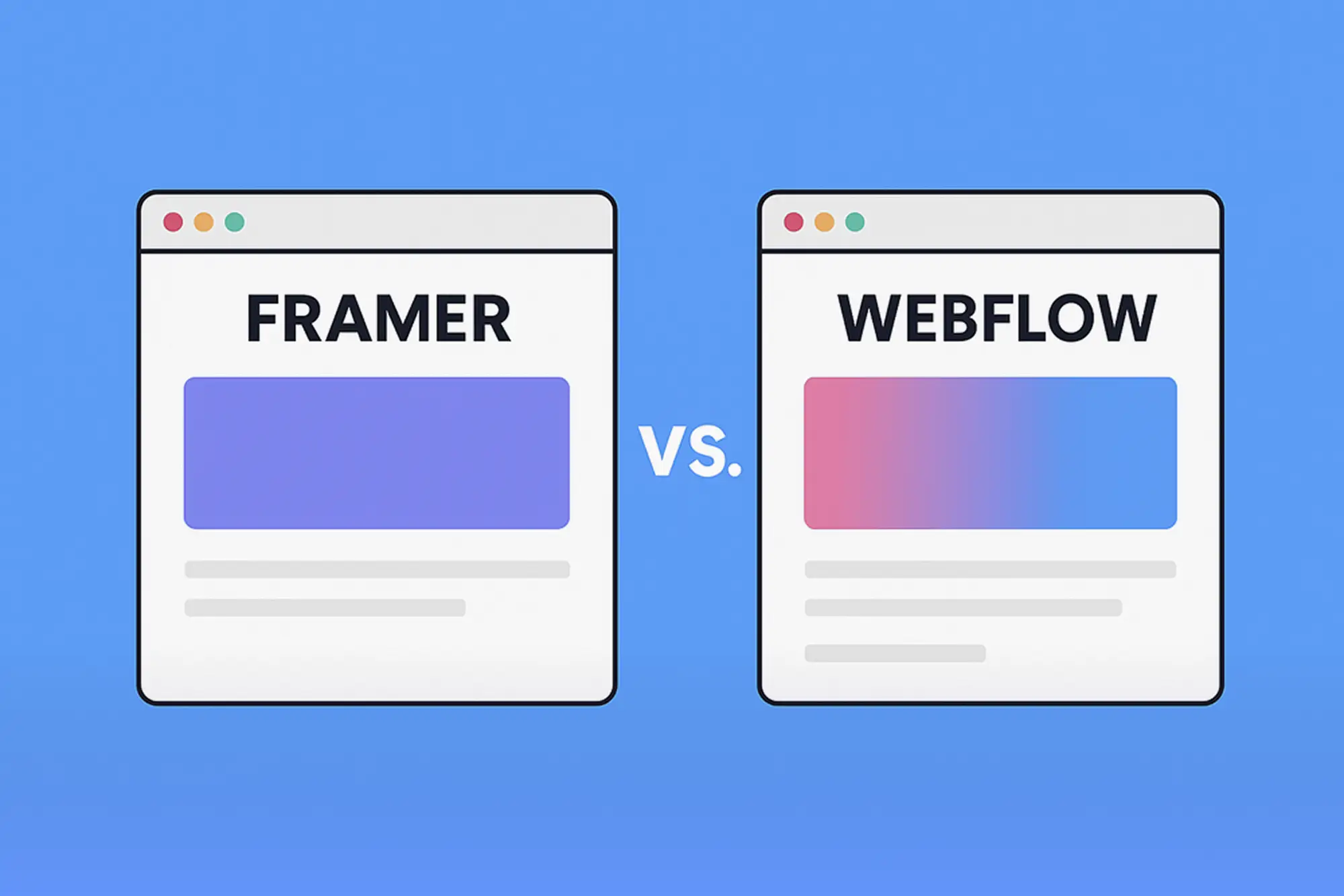
Framer and Webflow are two of the most widely discussed tools today. Both are powerful, no-code platforms designed for modern web design, but they approach the process differently. One prioritizes visual speed and ease, while the other offers structured control and scalability.
In this article, I’ll break down the debate of Framer vs Webflow - looking at what each platform is, how they compare in key areas like design, performance, and which one might be the right fit for your next landing page project.
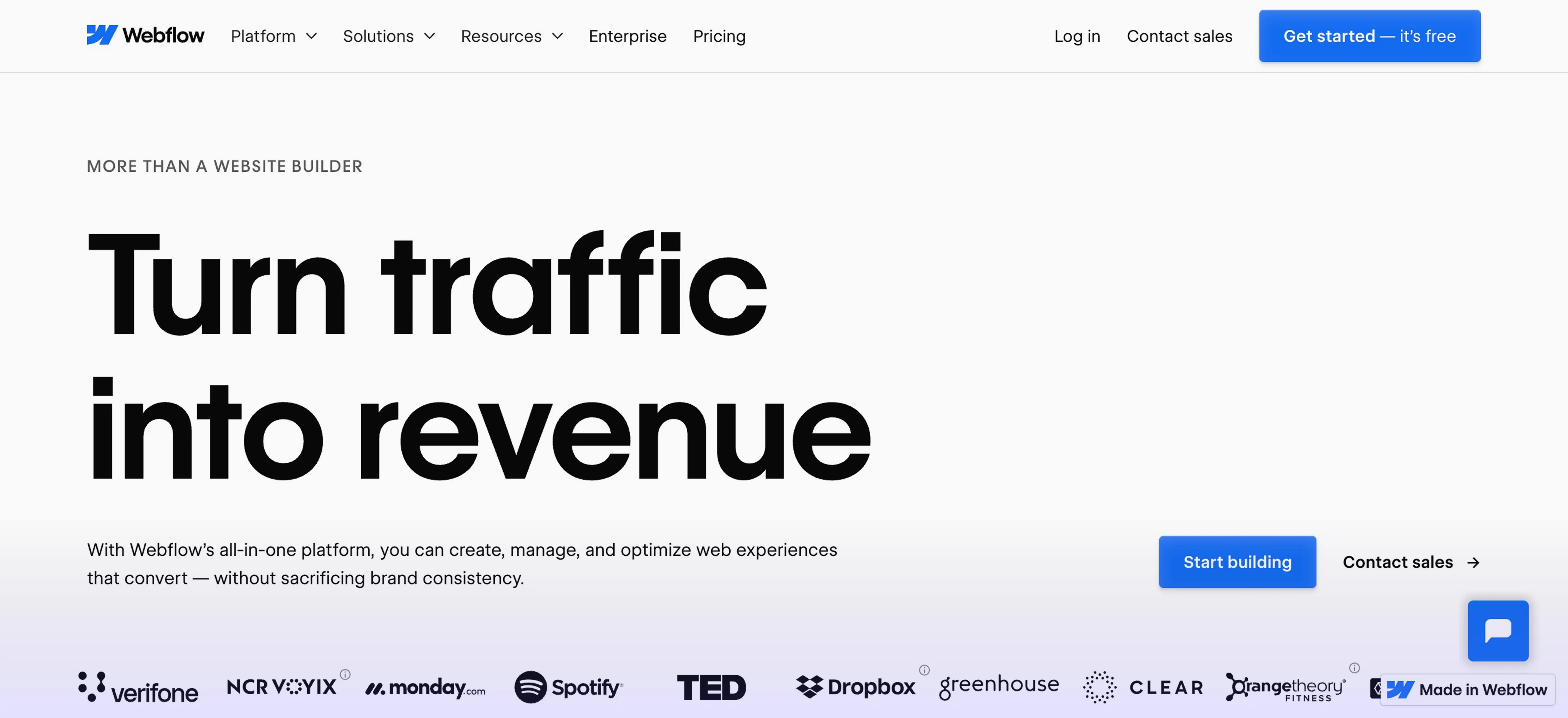
Webflow is a powerful no-code website builder that combines visual design, CMS functionality, and hosting in one platform. It allows designers and marketers to create custom websites without relying on developers, while still offering full control over structure, layout, and responsiveness.
Unlike template-based builders, Webflow gives users the freedom to create fully responsive and pixel-perfect layouts from scratch. It also includes built-in SEO tools, dynamic content through its CMS, and advanced animation capabilities.
Many agencies and startups use Webflow for launching landing pages, company websites, and even blogs or resource libraries. It’s especially popular among users who want design freedom without giving up scalability.
The platform also offers the popular Webflow University, a free platform packed with educational resources.
What Is Framer?
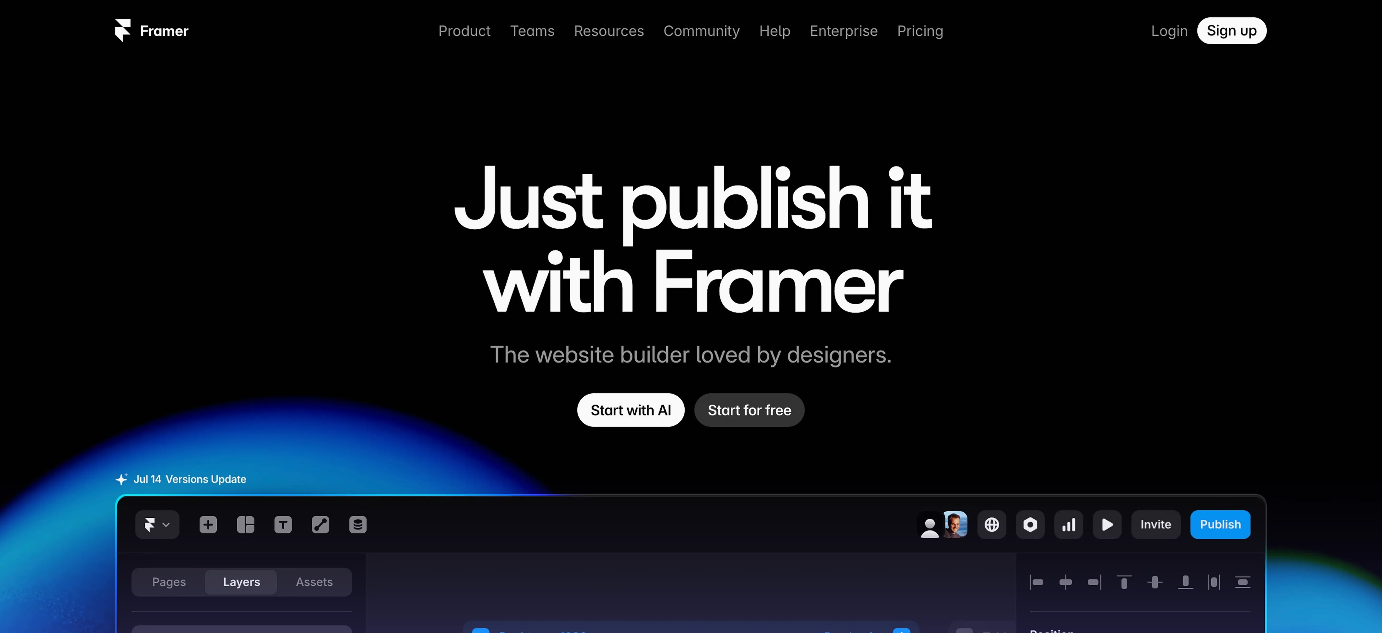
Framer is a modern website builder designed for speed, simplicity, and visual impact. Originally built as a prototyping tool for designers, Framer has evolved into a full no-code platform for creating production-ready websites, especially landing pages.
With Framer, users can design and publish directly on the canvas, using intuitive controls, smart layout features, and built-in animations. It’s known for its lightning-fast load times, clean design defaults, and a growing library of components and templates.
Framer also includes AI tools that help users generate page sections, write content, and style layouts automatically. This makes it a popular choice for startups, freelancers, and creators who want to launch quickly and iterate often.
Framer vs Webflow: Key Differences
Both Webflow vs Framer are powerful tools for building websites, but they offer different strengths depending on your needs. Below is a breakdown of how they compare across key areas:
Ease of Use
- Framer: Beginner-friendly with a clean interface and fewer settings to manage. Ideal for quick builds and real-time visual feedback.
- Webflow: Offers more granular control but has a steeper learning curve, especially for new users.
Design Flexibility
- Framer: Great for simple, stylish layouts with built-in spacing and animation defaults. Limited custom structure options.
- Webflow: Allows full layout and design customization, including complex grids, responsive breakpoints, and reusable classes.
Animation and Interactions
- Framer: Includes smooth, built-in animations and transitions. Easy to use for scroll effects and hover states.
- Webflow: Offers advanced animation control with triggers and timelines. Better for complex, custom interactions.
CMS and Blogging Capabilities
- Framer: Limited CMS functionality focused on static content. More suitable for single pages or small portfolios.
- Webflow: Full CMS with dynamic content collections, perfect for blogs, case studies, and resource hubs.

AI and Automation Tools
- Framer: Includes built-in AI features to generate sections, copy, and layout ideas.
- Webflow: No native AI tools, but offers strong integrations with automation tools like Zapier and Make.
Templates and Community
- Framer: Rapidly growing template library and a strong community of indie designers.
- Webflow: Larger ecosystem with thousands of templates, tutorials, and a mature community.
Scalability and Use Cases
While both Framer and Webflow can handle landing pages with ease, their long-term scalability differs depending on your project needs.
Framer
Framer is best suited for lightweight, visually engaging sites. It’s ideal for:
- One-page websites and product launches;
- Startup landing pages;
- Personal portfolios or resumes;
- Quick MVPs and design experiments.
Although Framer sites can grow with added pages, it’s not designed for content-heavy websites or complex structures. CMS features are limited, and large-scale site management may require workarounds.
Webflow
Webflow offers the flexibility and infrastructure to scale. It’s a strong choice for:
- Multi-page websites and marketing funnels;
- Blog or content-driven platforms;
- Agencies and design teams;
- Businesses needing CMS, forms, and third-party integrations.
With reusable components, CMS collections, and logic workflows, Webflow supports not just landing pages but full web ecosystems.
If you're planning to grow beyond a single page or manage multiple campaigns, Webflow may be the more scalable solution. For quick, stunning launches, Framer is often the faster path forward.
Which One Should You Use?
Both Framer and Webflow are excellent tools for building landing pages, but your choice should come down to long-term goals, design needs, and the type of site you want to create.
Choose Framer if you want:
- A fast, visually simple landing page;
- Built-in animations and modern design defaults;
- Quick publishing with minimal setup;
- AI-assisted layout and content tools;
- A lightweight solution for personal or single-page projects.
Framer is ideal for solo creators, MVP launches, and anyone who wants to move quickly without getting into technical details.
Choose Webflow if you want:
- Full control over layout, structure, and design system;
- A platform that scales from one landing page to a full marketing site;
- Built-in CMS for blogs, case studies, or product listings;
- Advanced animations and custom interactions;
- More SEO flexibility and integration options.
Webflow takes more time to learn, but it offers unmatched design freedom combined with production-grade infrastructure. If your project involves more than a static page, or may grow into one, Webflow is the better long-term investment.
Conclusion
Framer and Webflow each offer powerful solutions for building high-performing landing pages. Framer focuses on speed, simplicity, and modern design, making it ideal for creators who want to move fast. Webflow, with its deeper customization and CMS features, is better suited for businesses looking to scale and maintain more complex websites.
Your choice depends on your goals, timeline, and how much flexibility you need.
If you're exploring options or need guidance on building smarter with no-code tools, I offer no code development services tailored to your needs, whether it's launching a new landing page or creating a scalable web presence.
Let’s build something that works for your vision.
Design Your Next Success
Partner with me to create exceptional brand identity.