Web Design
Landing page headline examples from Mailchimp, HubSpot and Webflow show how the biggest brands can afford a vague line while a smaller company cannot, and a simple five-second test reveals whether your own headline actually tells a stranger what you sell. This guide walks through the examples, the reasoning behind them, and the templates you can use to rewrite your hero section today.
There is a test I run before I touch anything else on a landing page, and it takes less time than reading this sentence twice: cover everything with your hand except the headline, and then answer one question about what the product actually is, which means not what it promises but what it is. It sounds almost too simple to be useful, yet it is the fastest way I know to find out whether a page explains itself or quietly relies on the visitor to guess.
Here is the short version for anyone in a hurry: a good landing page headline, together with its subheadline, has to add up to two things, namely what the product is and who it is for, and if a stranger cannot work that out in about five seconds, the headline needs fixing before you spend another hour on buttons, images or colors.
In this guide I run the test on three companies everyone knows, Mailchimp, HubSpot and Webflow, and on one startup nobody has heard of yet, and then I explain why the market leaders can get away with things that smaller companies cannot, how to write a headline that works as a label, and how to check your own hero section with a handful of strangers. If you are already collecting data on a live page, it also helps to read my breakdown of conversion rate optimization tools and tactics alongside this guide, because the headline test tells you what to fix while analytics tell you where visitors give up.
What Is the 5-Second Headline Test?
The five-second test is an old usability technique in which people look at a page for a few seconds and then say what they remember, and the version I use is deliberately stricter because it looks only at the headline and subheadline, which are the first lines nearly every visitor reads and often the only ones. Visitors rarely read a landing page from top to bottom; they scan it for a reason to stay, so the opening lines carry far more weight than any other copy on the page, and the headline is only one of the essential website components that decides whether people keep exploring the rest.
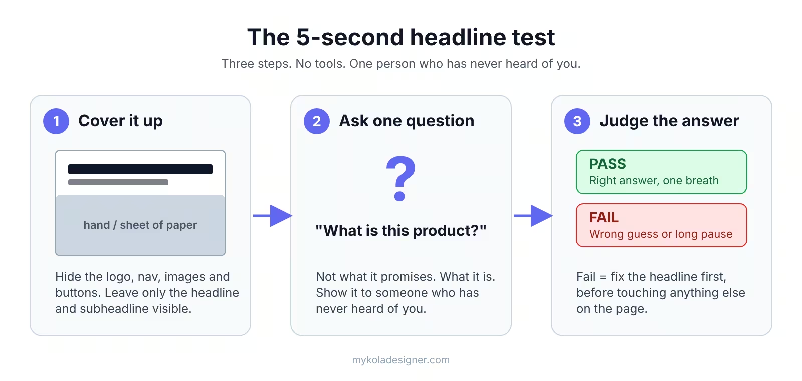
- Cover it up. Hide the logo, the navigation, the images and the buttons, so that only the headline and the subheadline remain visible on the screen.
- Ask one question. Show the cropped page to someone who has never heard of your company and ask them what they think this product is, without adding any explanation or hints.
- Judge the answer. If they name the right kind of product in a single breath, the headline passes, but if they guess wrong or hesitate for longer than a moment, it fails and becomes the first thing to fix.
I run this kind of quick check at the start of every UX audit, because it is cheap, it is fast, and it points straight at the part of the page that deserves attention first. If your headline fails the test, it is also worth reading my list of 10 signs you have a bad website to see whether the same confusion shows up elsewhere on your site.
Landing Page Headline Examples From Market Leaders
The four homepage headlines below were captured in October 2026, and the exercise is the same for each one: imagine the logo is covered, read only the headline and subheadline, and ask yourself whether you could say what the company sells and who it sells to.
Mailchimp: Pass
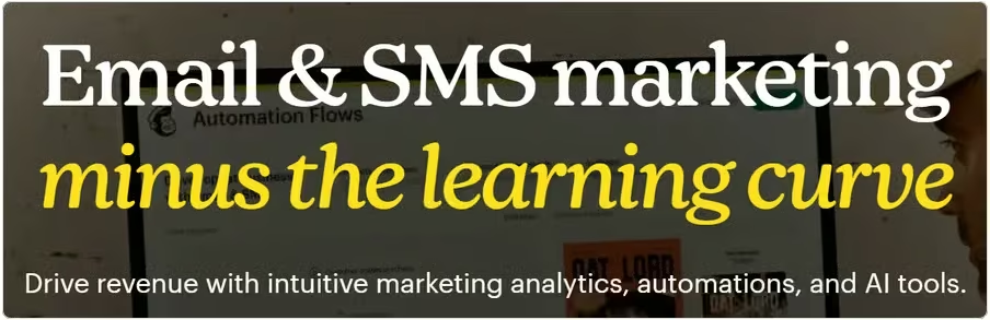
Mailchimp's headline reads "Email & SMS marketing minus the learning curve," and the category appears in the first four words, which means that a stranger knows immediately what kind of product this is while the promise of an easier experience rides along on the back of it. If I had to borrow one headline shape for a client, it would be this one, because it states what the product is first and only then explains why it is better or simpler than the alternatives.
HubSpot: Pass, on a Technicality
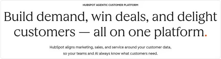
HubSpot's headline, "Build demand, win deals, and delight customers — all on one platform," could belong to twenty different companies if you read it in isolation, but just above it sits a small line in capital letters that says "HubSpot agentic customer platform," and that line does the boring but essential job of naming the product. This small line above a headline is called an eyebrow, and it is the reason the headline itself is allowed to be ambitious: the label lives in the eyebrow, so the big text can focus on the promise.
Webflow: Fail
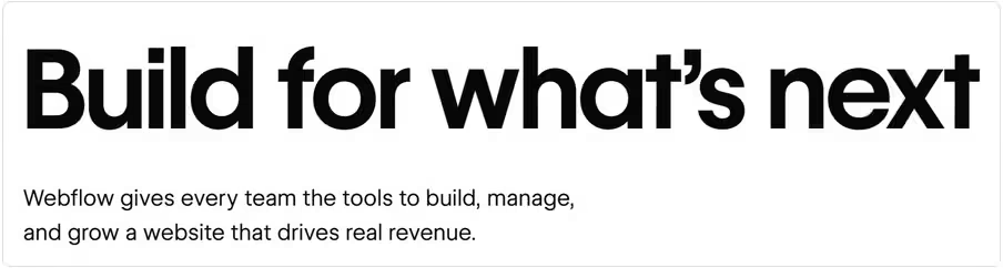
Webflow's headline, "Build for what's next," has four words and neither a product nor a category in them, so if you cover the logo it could just as easily belong to a venture fund, a construction company or a coding bootcamp. To be fair, the subheadline underneath does name the product when it talks about tools to build, manage and grow a website that drives real revenue, but the test starts with the headline, and a visitor who stops reading at the biggest line learns nothing at all. It hardly matters in this case, because nobody covers the logo: Webflow has spent more than a decade making sure that you already know what Webflow is, which means the brand itself acts as the label and the headline is free to be a mood.
A Startup Nobody Knows Yet: Fail
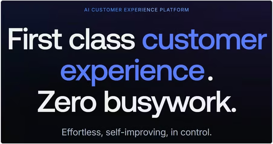
The startup's headline reads "First class customer experience. Zero busywork," and its subheadline adds "Effortless, self-improving, in control," which gives us two full lines of copy and still no clear answer to what the product is. The only element on the page that does explain it is the eyebrow, which says "AI customer experience platform," so the startup makes the same move as HubSpot and Webflow with one crucial difference: nobody knows this company, which means there is no famous logo to lean on when the headline stays vague.
Why Big Brands Can Break the Rule
This is the trap that catches so many founders and designers: you study the market leaders, you notice that their hero sections are full of slogans, and so you write a slogan of your own. What you miss is that the leaders are not using the headline to explain the product, because their name already does that job for them, while your name does not, at least not yet. A strong brand works as a shortcut in the visitor's mind, so that hearing "Mailchimp" fills in the category automatically, and until your company has earned that kind of recognition, your headline has to work as a label.
The same logic explains why web design matters so much for a business that is still building its reputation: for a company nobody knows, the website is often the first and only chance to say clearly what it does. Understanding who visits the page and what they are trying to solve comes before any wording, which is why the user centered design process starts with the audience and not with the layout.
I saw this clearly while working with Groundswell, a corporate social impact software company that brings employee giving, volunteering, grantmaking and corporate philanthropy into one platform. When I joined the project in February 2024 the website was still taking shape, so the first priority was to make the product easy to understand, and only after that foundation was in place could the site grow into the wider collection of product, solution and campaign pages the company needed.
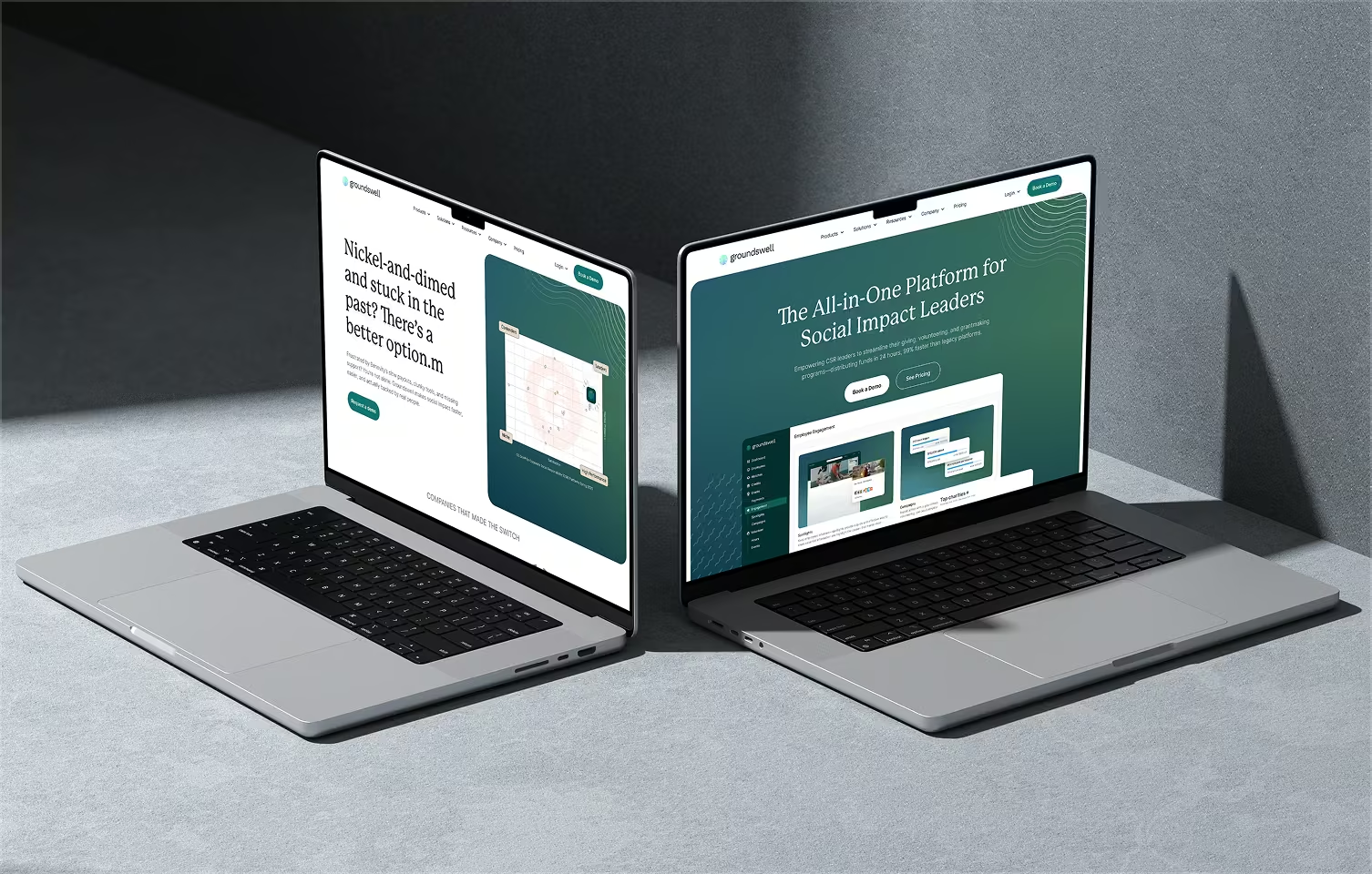
What started as roughly five hours of design work per week grew into a collaboration of more than two and a half years, during which the website expanded from a single homepage into more than 120 pages built on reusable templates, and the time needed to design and launch a new landing page dropped from about two weeks to a few days. The order is what matters here, because clarity came first and scale second, and you can read the full story, including the page templates and the information architecture behind them, in my write-up on the Groundswell design partnership.
How to Write a Landing Page Headline That Works as a Label
The rule I use on every project is that the headline and the subheadline together must add up to "what it is" and "who it's for." If you are a large, well-known company you can put "what it is" in the logo and play with the rest of the copy, but if you are not, you should put it in the headline, and even Mailchimp, which is certainly big enough to skip it, still does.
Three Headline Templates You Can Use Today
- Category plus benefit. This is the Mailchimp shape, in which you name what the product is and then say why it is easier or better, for example "Invoicing software that gets you paid in days, not weeks."
- Product plus audience. Here you say plainly what the product is and who it is for, for example "Project management for small design studios."
- Outcome plus mechanism. In this version the headline leads with the result and the subheadline names the product, for example "Cut support response time in half," followed by "AI customer service platform for growing e-commerce teams."
These examples are illustrations of each shape rather than real products, and the right choice depends on how well your audience already understands your category. If you want to go one step further and make the wording work for search as well, my keyword research and optimization and content creation and optimization services are built around exactly that balance between clear messaging and the phrases people actually type into Google.
The Eyebrow Trick for More Ambitious Headlines
If you would still like a bolder headline, you can do what HubSpot does and put the plain label in a small line above it, so that something like "AI customer experience platform" sits in the eyebrow while the large text carries the promise. The only condition is that the eyebrow stays visible on mobile and has enough contrast to be read, because a label that shrinks into the background stops doing its job, and typography choices like these are easier to get right when you look at good typography examples in web design.
Rewriting the Startup Headline
Here is one way to fix the startup from the examples above, with the caveat that I do not know the product in detail and am assuming it serves support and customer experience teams:
- Eyebrow: AI customer experience platform
- Headline: The AI customer experience platform that cuts the busywork
- Subheadline: Self-improving AI for support teams: faster answers, less manual work, and you stay in control.
The label is now in the headline, the audience is named, and the original promises about busywork and control are still there, which shows that clarity does not require giving up the personality of the copy. Good positioning has to come before any of this, though, so if you have not yet decided exactly who the product is for, start with my guide to product marketing and positioning. Once the message is clear, a focused landing page design gives it the space and hierarchy it needs, and a custom website design makes sure the same clarity carries through the rest of the site.
Landing Page Headline Checklist
Run through this list before you publish any hero section, and when you want a wider review of the whole page, continue with my website audit checklist, which covers SEO, speed and UX in one pass.
- A stranger can say what the product is after reading only the headline and the subheadline.
- The headline or the eyebrow names the category in plain words that your audience would actually use.
- It is clear who the product is for, either stated directly or obvious from the wording.
- The headline makes one promise instead of three, so that nothing competes for attention.
- There is no jargon and none of the empty buzzwords that could describe any company.
- The subheadline adds new information instead of repeating the headline in different words.
- Everything still reads well in two or three lines on a phone screen.
- The headline matches the page title and the meta description, so visitors arriving from search get what they expected.
- The button text follows naturally from the promise made in the headline.
Common Landing Page Headline Mistakes
Most headlines that fail the five-second test fail for one of a handful of reasons, and recognizing them makes your own rewrites much faster.
- Copying a leader's slogan. A line like "Build for what's next" works for Webflow because Webflow is already known, but for a company that nobody has heard of it is simply an empty sentence.
- Choosing clever over clear. A pun or a mood can be memorable, but only if people understand what is being sold, so clarity should always win the first draft.
- Using words with no noun. Terms such as "platform," "solution" and "all-in-one" say nothing until you tell visitors what the platform actually does and for whom.
- Hiding the label in small print. When the only line that explains the product is tiny or low in contrast, most visitors will never read it, so make it as visible as HubSpot makes its eyebrow.
- Writing a headline that breaks on mobile. A line that fits neatly on a desktop screen can turn into six lines on a phone, so check the tips in mobile web page design and the 12 key principles of good web page design before you finalize the layout.
- Redesigning before fixing the message. New fonts and colors will not help if the page still does not say what it is, so start with the main UX design principles and the 10 core design principles, and only then decide what to change visually.
- Sending traffic to a page that has not been tested. Before you spend time on promotion, such as the strategies in how to drive traffic to your website, make sure the headline passes the test, because more visitors to a confusing page simply means more people leaving confused.
How to Run the 5-Second Test on Your Own Landing Page
You can run the test on your own page in about ten minutes without any tools, and the only thing you need is a few people who have never heard of your company.
- Take a screenshot of your hero section and crop it so that only the headline and the subheadline are visible, with no logo, no navigation and no images.
- Show it to three to five people without explaining anything, and ask them what they think the company sells and who it is for.
- Write down their answers word for word, and note how long each person took to respond, because hesitation is as informative as a wrong answer.
- If they guess wrong or need longer than a breath, rewrite the headline with one of the templates above and test it again with new people.
If you would rather have a second pair of eyes on the page, I offer a UX audit that covers the hero section and everything below it, and if the whole page needs rethinking, a website redesign built with Webflow development lets you test new messaging quickly without waiting on a developer. Because the headline also feeds your page title and search snippet, it is worth aligning it with responsive, SEO-ready design and with properly written meta tags and schema markup, so that the same clear message appears in search results as on the page.
Want a Second Opinion on Your Headline?
If you need a partner to elevate your current website, your funnel, or to build a conversion-led experience from scratch, you can start with a quick brief and I will tell you what your hero section says to a stranger. You can also see how I approach this kind of work in more client projects.