Blog
Our blog

0min
|
Design
|
The Real Problem Isn’t Your Designer. Here’s Why.
Most founders have had at least one bad experience working with a designer. Sometimes more than one.
- The work doesn’t land.
- Progress feels slow.
- Revisions multiply.
- Frustration builds.
It’s easy to assume the designer is the problem.
In reality, design projects usually fail for reasons that have very little to do with talent and a lot to do with how the work is set up.
Design Isn’t Decoration
One of the most common disconnects happens at the very beginning.
If a designer is hired only to make things “look nice,” without being involved in users, goals, or strategy, the outcome will always be surface-level. Visual polish without problem-solving rarely performs well.
This matters because design directly affects how users experience a product. In fact, 88% of online consumers won’t return after a bad user experience. When design decisions aren’t grounded in real problems, the cost shows up not just internally, but in lost users.
Designers aren’t decorators. Real design work exists to solve problems, clarify intent, and support growth. When that role is misunderstood, disappointment is almost guaranteed.
Context Is the Foundation of Good Design
Designers don’t work in isolation and they can’t read minds.
Without clear information about the vision, constraints, audience, and objectives, designers are forced to guess. Guessing leads to misalignment, excessive revisions, and wasted time.
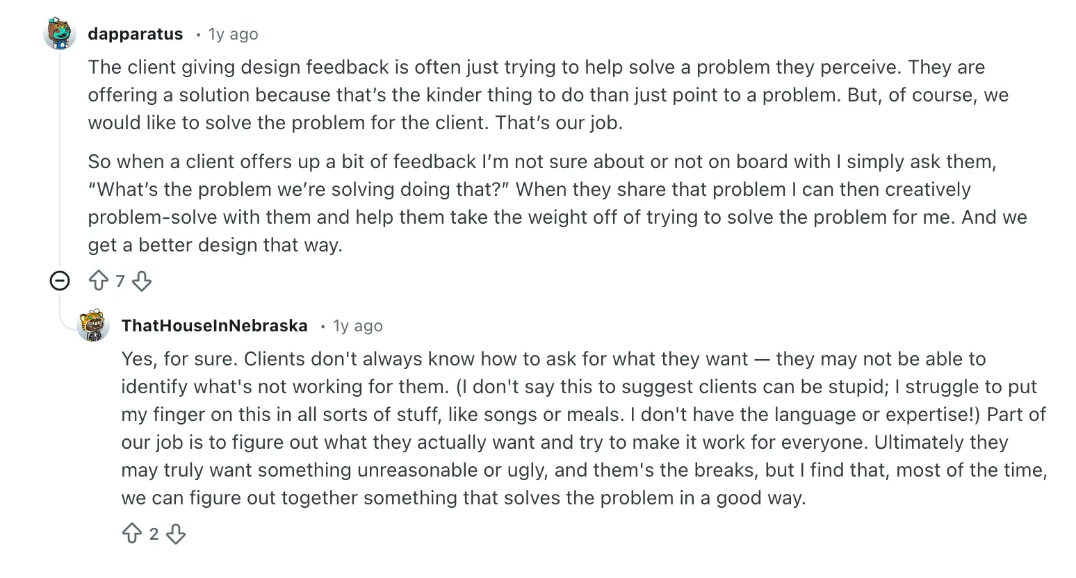
“The client giving design feedback is often just trying to help solve a problem they perceive.”
“When a client offers up feedback I’m not sure about, I ask them, ‘What’s the problem we’re solving by doing that?’”
A brief helps, but context is what turns design from guesswork into intention. When designers understand the underlying problem, feedback stops being about surface changes and starts becoming a shared effort to reach the right outcome.
“Clients don’t always know how to ask for what they want.”
“Part of our job is to figure out what they actually want and try to make it work for everyone.”
Unclear feedback isn’t the problem. Missing context is. When designers help translate instinctive reactions into clear intent, collaboration replaces friction.
Creative Freedom Still Needs Boundaries
“Creative freedom” often sounds like an open invitation, but without direction, it creates confusion.
Creative freedom doesn’t mean unlimited exploration. It means having room to think and test ideas within clear boundaries. When every detail is micromanaged or constantly rejected, the designer’s role shifts from problem-solver to executor.
At that point, design loses its value.
Design Works Best When It Starts Early
Design is not a finishing touch added at the end of a project.
It’s a strategic layer that influences product structure, messaging, usability, and user experience. When design is introduced too late, it’s asked to fix problems it didn’t create and can’t fully solve.
Bringing design in early prevents costly rewrites and rebuilds later.
Process Is Part of the Work
Good design takes time.
Research, exploration, and iteration are not delays. They are the work. Rushing through them leads to results that look acceptable but lack depth and longevity.
If depth is the goal, space must be part of the process.
Speed and Quality Are Not the Same
Moving fast can feel productive, but speed without understanding often sacrifices quality.
A designer who ships quickly without asking questions may deliver something that looks fine on the surface but performs poorly. Thoughtful designers slow down at the right moments to create work that actually lasts.
Undefined Success Creates Endless Revisions
When success isn’t defined, feedback becomes subjective.
If “done” and “good” aren’t clearly agreed on, every iteration feels incomplete. Designers can’t optimize for outcomes that haven’t been articulated.
Clear goals protect both sides and turn feedback into progress instead of noise.

This is where many design projects either gain clarity or start to unravel. When goals aren’t defined early, feedback drifts toward personal taste instead of measurable outcomes. Design becomes subjective not because it is, but because the target was never clearly set.
Too Many Opinions Dilute Direction
Design by committee rarely leads to strong outcomes.
When feedback comes from everyone, direction disappears. Opinions conflict, priorities blur, and momentum stalls. Good design needs trust and a clear decision-maker.
If trust doesn’t exist, the problem isn’t the design. It’s the relationship.
Investment Reflects Priorities
Design quality reflects how much it’s valued.
When design is treated as a cost to minimize, the results usually mirror that mindset. Quality design requires time, focus, and care.
Cheap design often gets revisited.
Good design compounds.
Why Design Gets Blamed
Design is visible and tangible, which makes it an easy target when something feels off.
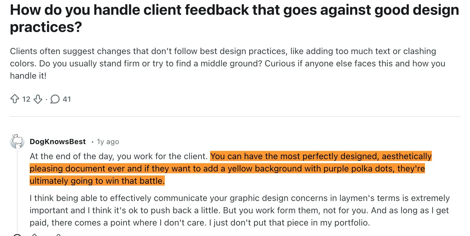
But most design problems are symptoms, not causes. They surface gaps in clarity, alignment, and decision-making that already exist.
Design doesn’t create those issues.
It reveals them.
Final Thought
If a design project feels harder than expected, it doesn’t mean the designer is the problem. It usually means something important wasn’t aligned early enough.
Design simply made it impossible to ignore.

0min
|
Website
|
No, Personal Websites Aren’t Dead. They’re More Important Than Ever
Every few years, the same idea comes back into the spotlight: personal websites are no longer necessary. The argument usually sounds familiar. Social platforms are everywhere. Publishing is instant. Audiences already exist inside platforms. Why bother maintaining your own website when everything can live somewhere else?
At first glance, this logic feels reasonable. The internet has changed, and so have the tools we use to participate in it. But equating convenience with replacement is a mistake.
Personal websites are not disappearing. Their role has shifted. And in many ways, that shift has made them more important, not less.

Why the Question Keeps Coming Up
The idea that personal websites are obsolete doesn’t come out of nowhere. It reflects real changes in online behavior.
Today, most discovery happens through:
- Social media feeds;
- Platform-based blogs and newsletters;
- Search results dominated by large platforms;
- Recommendations driven by algorithms.
Publishing on these platforms is fast and accessible. You can post content without thinking about hosting, updates, performance, or structure. For many creators and professionals, this feels like progress.
And in some ways, it is.
But what’s often missing from this conversation is the difference between using platforms and owning a space.
Platforms Solve Distribution, Not Identity
Social platforms are excellent distribution tools. They are designed to surface content, encourage interaction, and keep users engaged. They excel at reach and immediacy.
What they are not designed for is long-term identity.
On a platform:
- Your content exists within someone else’s system;
- Your visibility depends on shifting social algorithms;
- Your audience is mediated, not owned;
- Your presentation is limited by predefined formats.
Even if a platform works well today, you have no control over how it evolves tomorrow. Changes in policies, design, or priorities can significantly affect how your work is seen or whether it’s seen at all.
A personal website operates outside of this cycle.

The Strategic Value of Ownership
Ownership is the defining difference between a website and a platform presence.
When you have a personal website, you own:
- Your web domain;
- Your content;
- Your structure;
- Your messaging;
- The context in which your work is experienced.
This ownership allows you to shape your digital presence intentionally, rather than reactively.
It means your work is not optimized for engagement metrics alone, but for clarity, understanding, and trust. It allows you to think in terms of years, not posts.
What a Personal Website Represents Today
A personal website is no longer expected to do everything.
It doesn’t need to be:
- A constantly updated blog;
- A replacement for social platforms;
- A high-frequency content channel.
Instead, a modern personal website acts as a digital anchor.
It is the place people go when they want to:
- Understand who you are;
- See your work in context;
- Verify your credibility;
- Learn how to work with you.
In other words, it supports decision-making, not scrolling.
Search Is Still a Primary Behavior
Despite the dominance of feeds, people still search.
Clients search for:
- Names;
- Services;
- Portfolios;
- Expertise.
Recruiters search for:
- Experience;
- Background;
- Professional presence.
Collaborators search for:
- Alignment;
- Style;
- Values.
In all of these moments, a personal website plays an important role. It provides a controlled environment where your work is presented clearly and without distraction.

The Difference Between Reach and Presence
Reach is temporary. Presence is cumulative.
Social platforms are optimized for reach. Content spikes, fades, and is replaced. This can be powerful, but it is also volatile.
A website builds presence over time. It becomes a stable reference point that grows alongside your work. It does not depend on constant activity to remain relevant.
This distinction matters for anyone thinking long-term.
Why Personal Websites Are Not About Nostalgia
There is a tendency to frame personal websites as a relic of an earlier internet. This framing misses the point.
Having a personal website today is not about recreating the past. It is about adapting to the present with intention.
In an environment where:
- Attention is fragmented;
- Platforms are crowded;
- Trust is harder to establish.
A clear, well-structured website becomes a signal. It shows that you take your work seriously and that you are willing to invest in how it is presented.
The Role of Personal Websites in a Platform-First World
Personal websites do not compete with platforms. They complement them.
Platforms are where discovery often begins.
Websites are where understanding happens.
Social media can introduce you.
A website can explain you.
This relationship works best when the website acts as the central point everything else leads back to.
Why Personal Websites Still Make Sense
Personal websites continue to matter because they offer something increasingly rare online:
- Control over your narrative;
- Independence from algorithms;
- A stable, searchable presence;
- A long-term digital foundation.
They are not about vanity or tradition. They are about clarity and ownership.

Why I Still Build Personal Websites
Every brand deserves a space that reflects its voice and values.
When I design, I build from the ground up, creating websites that represent who you are, not just what you do. The goal is not decoration, but understanding. Not trends, but longevity.
A personal website should feel intentional. It should explain your story clearly.
And it should give people confidence in who you are and how you work.
If you’re not sure where to start, I can help.
As a professional UI/UX designer, I work with brands and individuals to shape websites that feel clear, intentional, and true to who they are.

0min
|
Website
|
Design
|
What Is a Website Form? How It Helps You Collect User Data
A website form is one of the simplest ways to interact with your visitors, yet it’s also one of the most powerful tools for collecting meaningful data. Whether someone wants to ask a question, request a quote, subscribe to your updates, or book a service, almost all interactions start with a form.
As a designer working with businesses across different industries, I see how often forms are underestimated. A form can seem like a small detail on a page, but it directly affects conversions, communication, and the quality of insights a business collects from its audience.
In this article, I’ll walk you through what a website form is, how it works, why it matters, and how different types of forms help you gather the right user data. I’ll also share best practices I follow when designing forms for clients.
What Is a Website Form?
A website form is an interactive element on a webpage that allows visitors to submit information. It can be as simple as an email field or as complex as a multi-step form with conditional fields, file uploads, and automated routing.
At its core, a form performs three tasks:
1. Collects information
Users enter their details - name, email, phone, preferences, files, or messages.
2. Sends the information somewhere
This could be your email, CRM, booking system, or internal dashboard.
3. Helps you process or act on that information
That might mean replying to a message, scheduling a meeting, sending a follow-up email, or analyzing the data for marketing insights.
A website form typically includes:
- Text fields
- Email fields
- Number fields
- Dropdown menus
- Radio buttons
- Checkboxes
- Date & time pickers
- File upload inputs
- Consent checkboxes (GDPR, privacy, etc.)
These fields are combined to fit the purpose of the form and the type of data you want to gather.
Types of Website Forms
Forms play different roles depending on what your business needs. Here are the most common types I use when building websites:
1. Contact Forms
For general inquiries and communication.
2. Quote Request Forms
Used by service providers who need details before giving a price.
3. Booking & Appointment Forms
Schedule calls, meetings, or in-person visits.
4. Newsletter Signup Forms
Collect emails for marketing campaigns.
5. Multi-Step Forms
Break longer processes into smaller “steps” to improve completion rates.
6. Surveys and Feedback Forms
Gather user opinions, satisfaction ratings, or product feedback.
7. Support or Ticket Submission Forms
Let users submit issues in an organized way.
8. Checkout or Order Forms
Used for selling products or services.
9. Registration Forms
For account creation, event signups, or membership systems.
How Website Forms Help You Collect User Data
Forms are one of the most reliable sources of first-party data - information users willingly share with you. This is extremely important today, especially with privacy changes and the fading relevance of third-party tracking.
Here’s the kind of data your forms can collect:
- Contact Information: Names, emails, phone numbers, essential for follow-ups.
- Business Insights: What users are searching for, their needs, their budget range, or their project details.
- Behavioral Data: Understanding what products or services people are most interested in.
- Marketing Segmentation: Forms help you separate leads into meaningful categories (e.g., “design inquiry,” “support,” “partnership”).
- Content Insights: If multiple people ask the same question, that’s a signal you should address it somewhere in your content or services.
- Purchase Intent: Forms like “Request a Quote” or “Book a Consultation” show strong sales intent.
In short: forms help you understand who your audience is and what they want, directly from the source.
How a Website Contact Form System Works
Behind every simple submit button is a workflow that ensures the form sends information properly. Here’s the general process:
1. The form is built
Using custom code or a CMS platform (Webflow, WordPress, Shopify, etc.).
2. Validation happens
The form checks if the user input is correct - valid email, required fields filled, etc.
3. The data is submitted
Once validated, the data travels to its destination:
- Your email
- CRM
- Database
- Project management tool
- Automation tool (e.g., Zapier)
4. Notifications are sent
Both you and the user may receive confirmation messages or auto-replies.
5. Data is stored or logged
Some systems keep a copy of all submissions in a dashboard for extra reliability.
6. Security layers protect the form
Tools like reCAPTCHA, spam filters, and honeypots prevent bot submissions.
7. Tracking measures performance
Using GA4 or Tag Manager, I can track:
- Form views
- Button clicks
- Successful submissions
- Drop-offs
This setup ensures your form works properly and your data flows where it needs to go.
Benefits of Using Website Forms
Website forms provide benefits for both the visitor and the business:
For visitors:
- Faster way to reach you
- Clear expectations
- Quick submissions
- Less searching for contact information
For you:
- Clean, structured data
- Easier lead qualification
- Automated workflows
- Insights directly from users
- Better conversion tracking
- Consistent communication
A single form can improve the efficiency of your entire communication funnel.
Best Practices for Creating Effective Website Forms
When I design forms for clients, these are the core principles I follow:
1. Keep it simple
Only ask for the information you need. Long forms reduce completions.
2. Make it visually clear
Use readable labels, proper spacing, and logical grouping.
3. Add inline error messages
Users should understand what went wrong immediately.
4. Optimize for mobile
Many submissions come from mobile devices, so the form layout must follow responsive design principles.
5. Provide a confirmation message
A thank-you page or success message reassures users their form worked.
6. Add security
CAPTCHA and anti-spam systems protect your inbox.
7. Set up proper email routing
Correct recipients, filters, and labeling ensure no message goes missing.
8. Track everything
Form submissions should be measured, otherwise, you can’t improve them.
These best practices make forms easier to use and more reliable.
Examples of Well-Designed Website Forms
1. Minimal Contact Form

Perfect for quick messages:
- Name
- Message
2. Multi-Step Lead Form

Ideal for more complex inquiries like project briefs.
3. Newsletter Signup Form

Just one input field, Email, delivering the highest conversion.
4. Quote Request Form
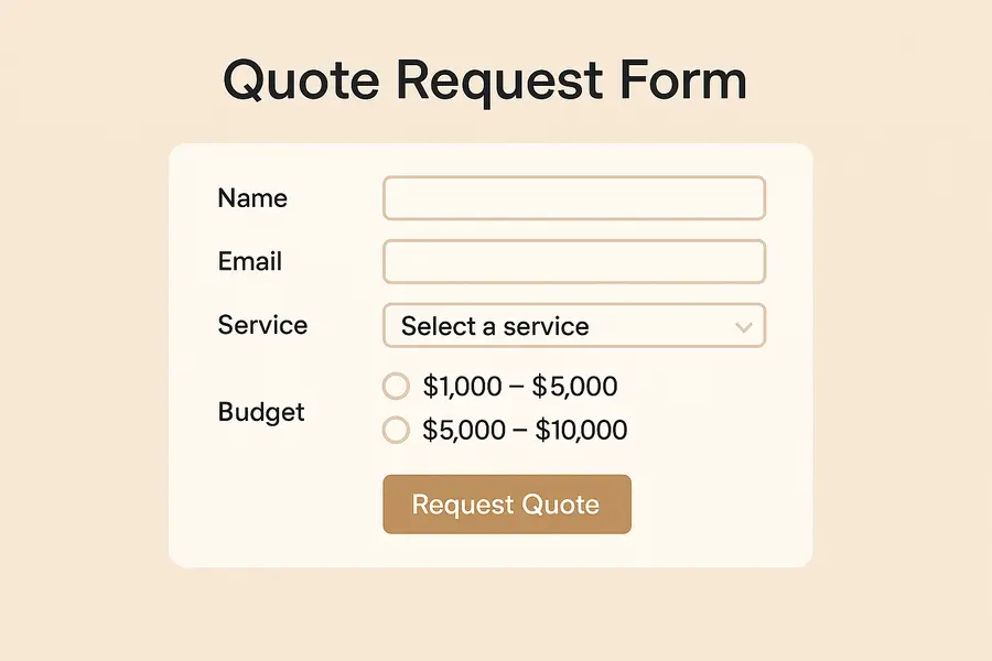
Includes conditional fields to collect only relevant data.
5. Appointment Booking Form
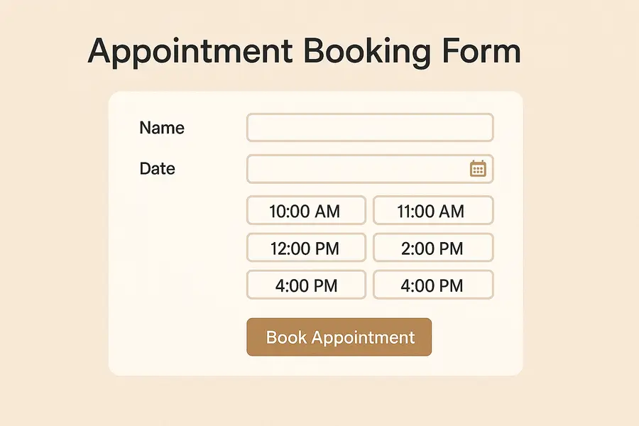
Allows users to see available time slots and schedule instantly.
When designed properly, these forms keep your communication channels organized and efficient.
FAQs
What is a form on a website used for?
To allow users to submit structured information directly through your website.
Do website forms collect personal data?
Yes, depending on the fields included. It’s important to comply with privacy laws.
How do I add a form to my website?
Through your website builder, plugins, or a custom-coded solution.
Are forms secure?
They can be secure when using captcha, SSL encryption, and server-side validation.
What’s the difference between a contact form and other forms?
A contact form is designed for communication; other forms may be for booking, checkout, or data collection.
To Sum Up
Website forms are essential tools for communication, data collection, and improving user experience. When built correctly, they help you understand your audience, generate leads, and streamline your workflows. Small mistakes, like poor routing, missing fields, or confusing layouts, can disrupt communication and lower conversions.
A good form feels seamless for the user and reliable for the business. That’s why thoughtful design, proper configuration, and correct tracking matter.
Need Help Creating or Optimizing Your Website Forms?
If you want to improve your website forms, fix issues with form submissions, or set up proper tracking and notifications, I can help.
I design clean, user-friendly forms and configure everything, from field structure to spam protection, CRM routing, and analytics tracking. Fill out a quick project brief, I’ll create something tailored and unique for your website.

0min
|
AI
|
Digital Marketing
|
Streamline Your Workflow with These AI Marketing Tools
In an era where marketing moves faster than ever, staying ahead means working smarter, not harder. That’s where AI marketing tools come in. These intelligent solutions analyze data, automate repetitive tasks, and even generate creative content, helping teams focus on strategy and results rather than routine work.
In an era where marketing moves faster than ever, staying ahead means working smarter, not harder. That’s where AI marketing tools come in. These intelligent solutions analyze data, automate repetitive tasks, and even generate creative content, helping teams focus on strategy and results rather than routine work.
From crafting targeted campaigns to optimizing performance across multiple channels, modern marketing tools powered by artificial intelligence have become essential for businesses looking to grow efficiently. In this post, we’ll explore how AI can streamline your workflow and highlight some of the most effective tools to add to your marketing stack.
Why Use AI in Marketing?
AI has transformed how marketers plan, execute, and measure their campaigns. Instead of spending hours on manual data analysis or repetitive tasks, teams can now rely on intelligent systems that handle much of the heavy lifting.
By using AI marketing tools, brands can identify customer trends faster, deliver personalized experiences, and allocate budgets more effectively. These tools help marketers make data-driven decisions while maintaining creativity and consistency across all channels.
With the support of advanced marketing automation tools, it becomes easier to manage campaigns, analyze audience behavior, and track performance in real time. The result is a more efficient workflow, improved accuracy, and stronger engagement with the right audience at the right time.
Best AI Marketing Tools to Try in 2026
Choosing the right AI marketing tools can redefine how your marketing team works every day. Whether your goal is to speed up content creation, automate repetitive tasks, or make better data-driven decisions, these platforms offer a mix of creativity and precision. Below are eight carefully selected tools that can help streamline your workflow and deliver measurable results.
1. Jasper
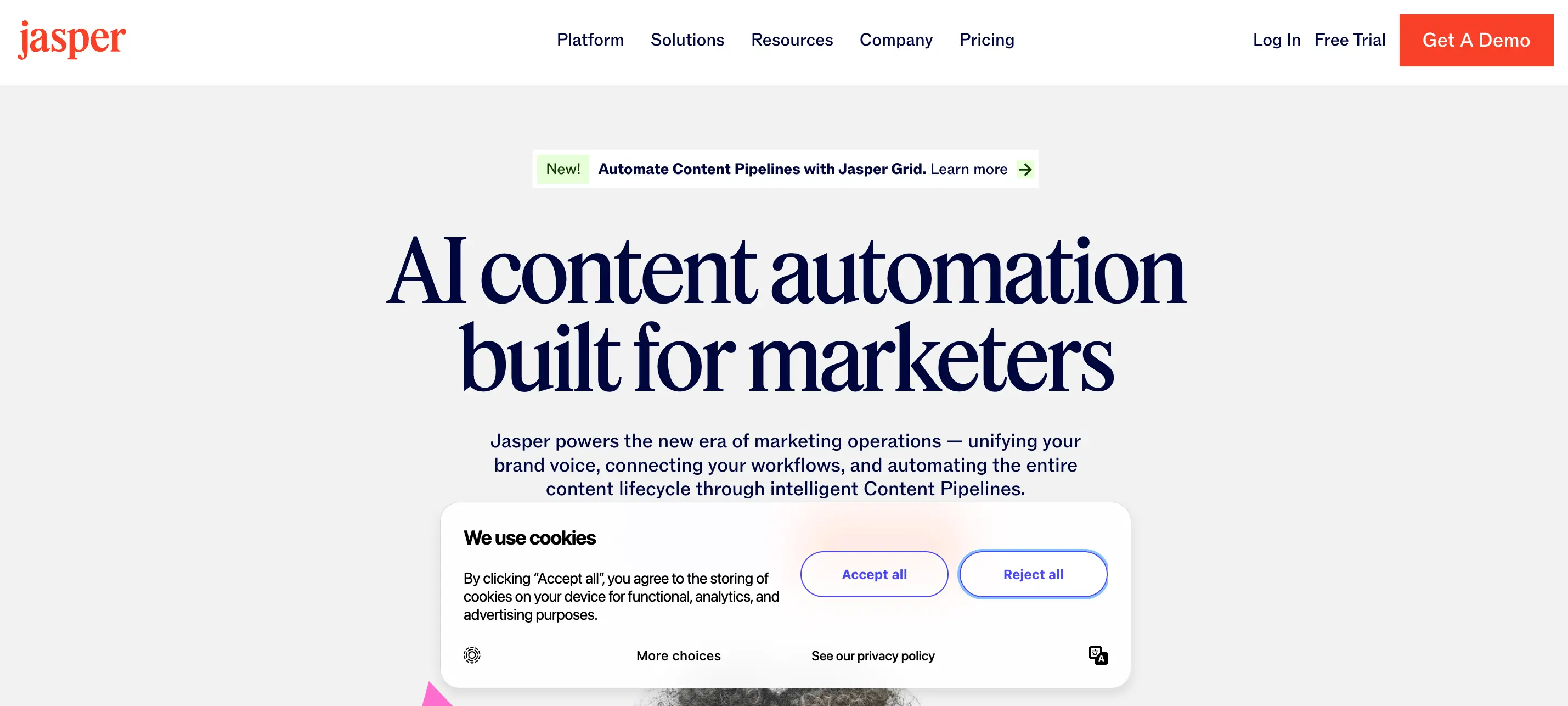
Jasper is one of the most advanced AI content generators available today. It helps marketers craft high-quality blog posts, ad copy, product descriptions, and emails in minutes. The tool adapts to your tone of voice and can generate content in multiple languages, making it suitable for global campaigns.
Jasper also allows users to create custom templates, collaborate across teams, and maintain brand consistency using its Brand Voice feature. It’s a great choice for businesses looking to scale content production without losing authenticity.
Key features:
- AI-powered long-form and short-form content creation
- Brand Voice for tone consistency
- Collaboration tools and document sharing
- Integration with SurferSEO and Grammarly
2. HubSpot AI

HubSpot’s built-in AI tools enhance every stage of the marketing journey, from lead generation to customer retention. The platform’s AI assistant helps draft emails, analyze data, and personalize user experiences automatically. It also predicts which leads are most likely to convert, helping teams prioritize their outreach.
As part of HubSpot’s marketing automation ecosystem, these features blend naturally with CRM, email, and analytics tools, reducing manual work and improving team coordination.
Key features:
- AI content generator for blogs, emails, and ads
- Predictive lead scoring
- Smart CRM integration and workflow automation
- A/B testing and performance analysis
3. Semrush
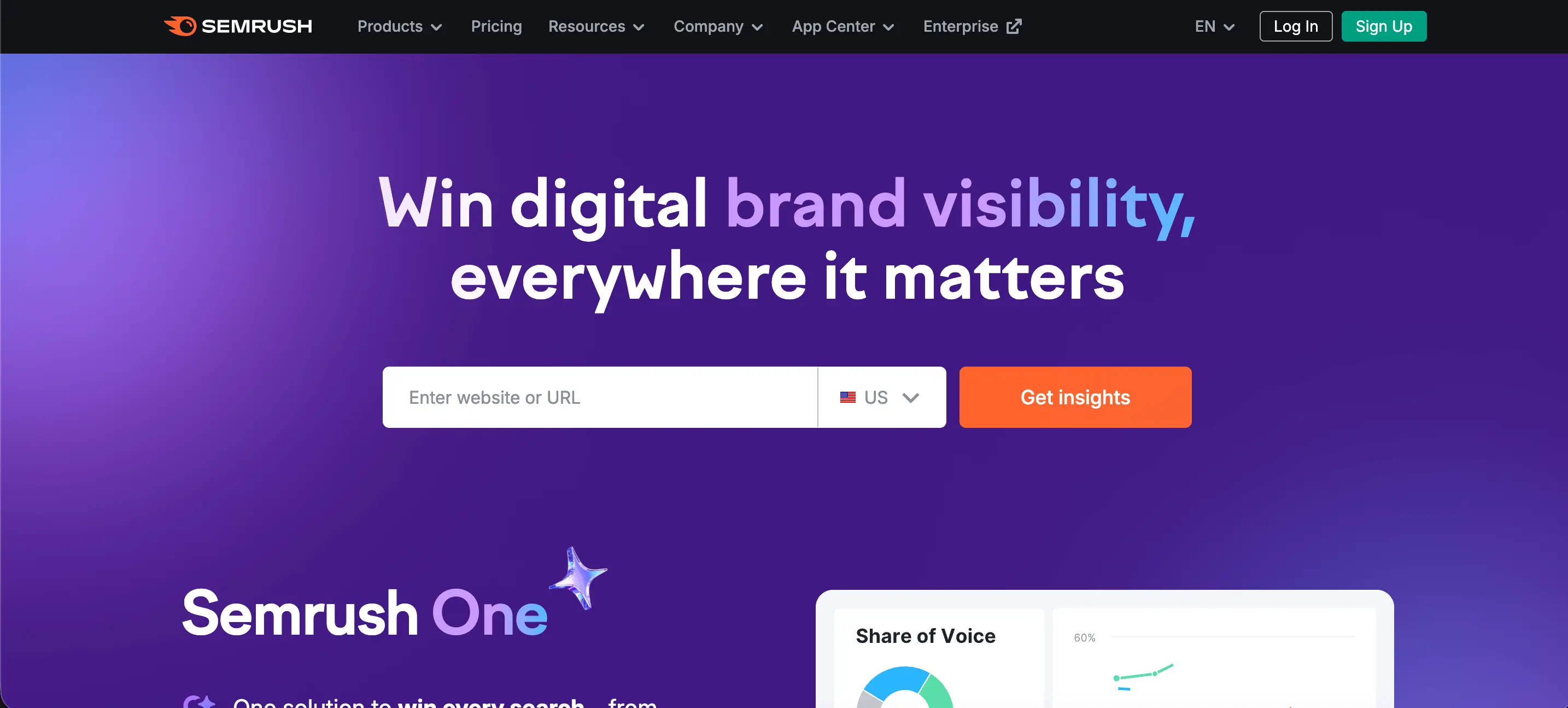
Semrush remains a cornerstone of SEO and competitive analysis. Its AI-driven insights help marketers discover keyword opportunities, track rankings, and analyze competitors’ performance. Beyond SEO, it supports PPC planning, social media tracking, and content audits.
With its expanding AI capabilities, Semrush now provides automated topic clustering and SERP intent detection, helping you create data-informed strategies that attract the right audience.
Key features:
- Keyword research and SERP analysis
- AI-based topic clustering and intent prediction
- Site audits and backlink tracking
- Competitor monitoring and market insights
4. SurferSEO

SurferSEO helps marketers create content that ranks better in search engines. It analyzes top-performing pages for a given keyword and recommends structure, length, and semantic phrases to include. The AI writing assistant integrates with tools like Google Docs, making it easy to optimize content while writing.
For SEO-focused teams, SurferSEO is an excellent companion that blends AI with real-time data, helping content creators make strategic choices without guesswork.
Key features:
- On-page optimization and keyword density tracking
- SERP-based content analysis
- Integration with Jasper, Google Docs, and WordPress
- Real-time SEO tool scoring and recommendations
5. Zapier AI
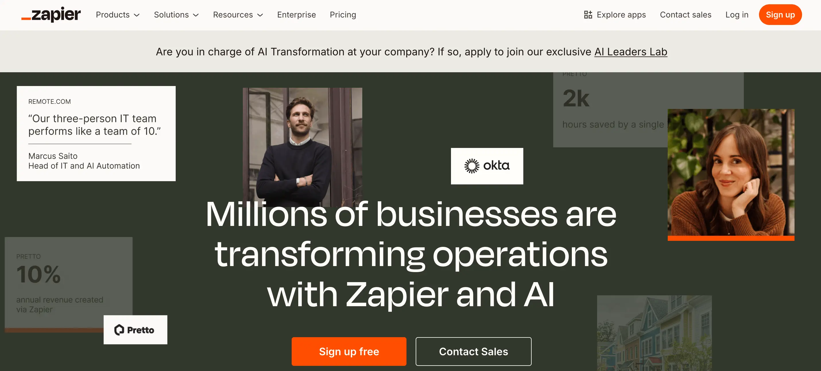
Zapier AI helps marketers automate tasks across different apps without coding. It connects tools like Google Sheets, Slack, HubSpot, and Mailchimp, allowing seamless data transfer and trigger-based workflows. The AI functionality now enables smart filtering, summarization, and task suggestions.
By automating routine marketing processes such as reporting or campaign updates, Zapier gives teams more time to focus on strategic planning and creative execution.
Key features:
- Cross-platform automation between 5,000+ apps
- AI-driven workflow suggestions
- Smart filters and task routing
- No-code interface
6. Brandwatch

Brandwatch is a leader in social listening and audience intelligence. It uses AI to analyze millions of online conversations, providing insights into brand sentiment, market trends, and consumer behavior. This allows marketers to respond faster to opportunities and potential PR risks.
By understanding real-time audience sentiment, companies can make data-backed decisions that strengthen their online reputation and guide campaign strategy.
Key features:
- Sentiment and trend analysis
- Competitor and influencer tracking
- Real-time alerts and reporting dashboards
- Data visualization for audience insights
7. Notion AI
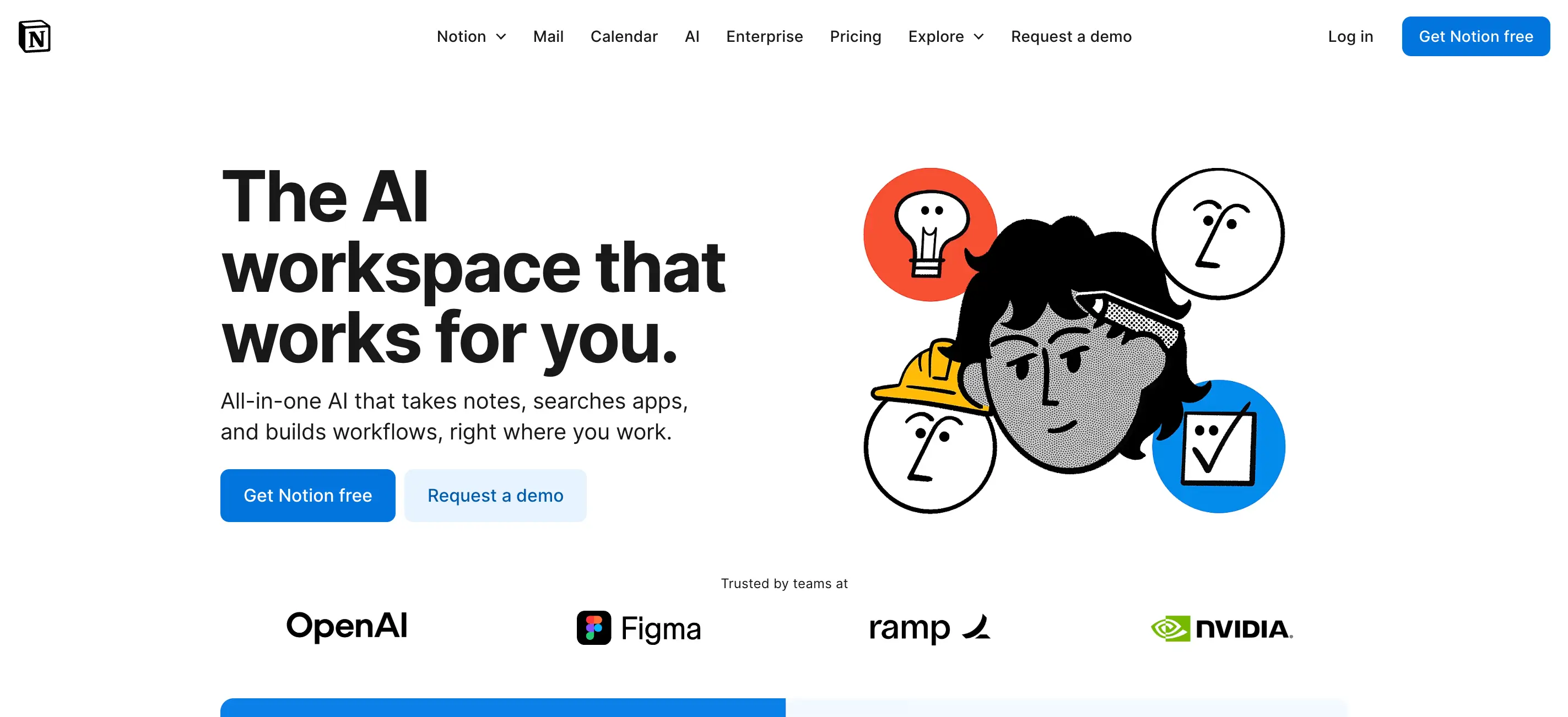
Notion AI combines organization and intelligence in one workspace. Marketers use it to brainstorm content, write meeting notes, summarize briefs, and even generate blog outlines. It helps teams stay aligned, turning raw ideas into actionable tasks within the same platform.
Its AI assistant can also analyze campaign summaries, rewrite content, or create templates that speed up documentation and planning.
Key features:
- Smart writing and summarization assistant
- Idea generation and task management
- Integrated workspace for teams
- Custom prompt templates
Together, these AI marketing tools form a comprehensive toolkit for content creation, automation, research, and analytics. Adopting even a few of them can dramatically improve productivity and help your team focus on high-impact creative work.
Choosing the Right Tools for Your Team
With so many AI marketing tools available, selecting the right ones depends on your goals, team size, and workflow. Some platforms excel at automation and analytics, while others specialize in creativity or collaboration. Before subscribing to any tool, consider how well it fits your daily operations and integrates with your existing systems.
Start by identifying the challenges your team faces most often. Do you need better reporting, faster content creation, or more precise targeting? Then evaluate each platform’s features, pricing, and compatibility with your marketing stack. Choosing tools that align with your processes will prevent overlap and maximize efficiency.
Tips for selecting the right AI tools:
- Assess your goals: Define whether your focus is lead generation, brand awareness, or customer retention.
- Compare integrations: Make sure the tool connects easily with your CRM, email, and analytics platforms.
- Test usability: Look for clean dashboards and intuitive workflows to reduce onboarding time.
- Check scalability: The best software grows with your team and adapts to new marketing channels.
- Combine insights: Pair creative tools with market research tools to gain a deeper understanding of your audience.
A thoughtful selection process ensures that the technology enhances your strategy instead of complicating it. The ideal toolkit will feel seamless, helping your team stay creative, informed, and focused on results.
Conclusion
AI marketing tools have reshaped how teams plan, create, and analyze their campaigns. By automating repetitive work, they help marketers focus on strategy, creativity, and growth.
Still, these tools deliver the best results when supported by a clear brand presence and a well-designed website. When your digital foundation is strong, every campaign and insight works more effectively.
If you want your marketing tools to work smarter, start with a website built to match their potential.

0min
|
News
|
AWS Outage 2025: What Happened and What It Means for Businesses
When Amazon Web Services (AWS) went down on October 20, the internet felt it instantly. From social media platforms and banking apps to e-commerce sites and streaming services — thousands of websites around the world experienced disruptions. The brief outage served as a stark reminder of how dependent the digital world has become on a few cloud giants.
What Happened
Data from ThousandEyes showed a cluster of connectivity issues in Virginia, the home of AWS’s US-EAST-1 region.This data center is one of AWS’s largest and oldest hubs, hosting countless applications and enterprise systems. The first signs of trouble appeared as intermittent connectivity issues, which soon spread across multiple services and regions.
As the morning unfolded, users around the world started reporting problems accessing platforms like Snapchat, Reddit, Venmo, and Slack, as well as several e-commerce and streaming services. Some websites displayed error messages, while others failed to load entirely.
Amazon later confirmed that the disruption was caused by a failure in a network-health monitoring subsystem, which impacted DNS resolution for its core services such as EC2 and DynamoDB. This breakdown created a domino effect, making it difficult for dependent services to communicate with AWS infrastructure.
By midday, AWS engineers had identified the source of the problem and began rerouting network traffic. Most services were restored later that day, though some users continued to experience slower performance as systems cleared the backlog of pending data requests.

The Scale of the Impact
The scope of the disruption was enormous. AWS underpins a large portion of the global internet, hosting everything from banking systems to entertainment platforms. When one region fails, the impact extends far beyond Amazon itself.
Industries affected:
- Finance: Delays in online payments and banking operations;
- Retail: Interrupted order processing and slow e-commerce transactions;
- Media: Delayed or stalled content streaming;
- IoT: Smart home and connected devices briefly stopped responding.
For small businesses, the outage meant lost website traffic and revenue. For larger enterprises, it caused operational setbacks and customer frustration. Even internal communication tools hosted on AWS were temporarily unavailable.
Although services were restored within hours, the incident revealed how one technical failure in a single data center can disrupt critical operations around the world.
Why These Outages Keep Happening
Outages like this one are not isolated accidents. They reveal how complex and interconnected modern cloud infrastructure has become. AWS runs millions of servers that power websites, mobile apps, payment systems, and enterprise tools around the world. When even one small component stops working correctly, the effects can spread faster than most people realize.
The latest incident started in US-EAST-1, AWS’s busiest data center region, which handles a large share of global internet traffic. Because so many critical systems rely on it, even a short disruption can have far-reaching consequences. In this case, the failure of a network monitoring system interrupted how services communicated with each other, causing a chain reaction across applications hosted on AWS.
The truth is that no cloud provider is completely immune to such failures. Last year, a software update error from cybersecurity firm CrowdStrike caused what The Guardian described as the largest outage in history, temporarily grounding flights and disrupting hospitals and businesses worldwide.
The more we depend on centralized systems, the more fragile they become when something goes wrong.
This outage reminded businesses once again that cloud technology, while powerful, is not invincible. It delivers speed, scalability, and efficiency, but those advantages come with a shared responsibility to plan for the moments when technology falters.
Lessons for Businesses
For most companies, cloud computing is the foundation of their operations. It allows teams to scale quickly, store massive amounts of data, and serve customers anywhere in the world. Yet the AWS outage showed how risky it can be to rely too heavily on one provider or one data center region.

When a service like AWS goes down, the consequences can extend far beyond a temporary inconvenience. E-commerce stores lose sales, financial platforms face delays, and internal systems that rely on cloud databases or APIs can stop functioning entirely. These risks make it essential for businesses to prepare long before an outage occurs.
Some practical steps include:
- Distribute resources across regions. Use multiple AWS regions or availability zones to reduce dependency on a single location.
- Adopt a multi-cloud strategy. Combining providers such as AWS, Google Cloud, and Azure can keep services online even if one fails.
- Create reliable backups. Store critical data in separate systems that remain accessible during downtime.
- Develop a communication plan. Inform customers and partners quickly when disruptions happen to maintain trust and transparency.
- Test disaster recovery processes. Regularly simulate outage scenarios to confirm that systems and teams can respond effectively.
Companies that build resilience into their infrastructure experience fewer long-term impacts when problems arise. The AWS outage may have been short, but it served as a reminder that redundancy, planning, and clear communication are what truly keep a business online.
Conclusion
The AWS outage on October 20 was brief, but its impact was impossible to ignore. In just a few hours, it disrupted everything from social networks and online stores to financial systems and customer service platforms. For many users, it was a reminder of how invisible yet essential cloud infrastructure has become to daily life.
For businesses, the lesson is clear. Cloud technology offers unmatched flexibility and power, but it also demands responsibility. Building systems with backups, spreading workloads across regions, and preparing for unexpected downtime are no longer optional; they are essential steps in maintaining stability and trust.
The internet’s strength lies in its ability to adapt and recover. As companies continue to innovate and grow in the cloud, resilience must become part of that innovation. Outages like this one may be temporary, but the lessons they leave behind are lasting.

0min
|
News
|
YouTube’s New UI Design: Is It Really That Bad for Users?
When YouTube rolled out its new web interface this month, it didn’t take long for users to notice, and react. Social media filled up with posts, memes, and heated debates about the redesign. Some praised the cleaner, more “modern” layout, while others called it a step backward, describing it as “Apple-style minimalism” that stripped away YouTube’s familiar feel.
The update introduces rounded corners, floating playback controls, and a glossy transparency effect across the interface — all aimed at creating a more immersive viewing experience. But as often happens with major redesigns, not everyone is impressed. Many longtime users feel the new look sacrifices usability for aesthetics.
So, is YouTube’s new UI really that bad, or are users just struggling to adapt to change? Let’s take a closer look at what’s new, why it’s sparking backlash, and what designers can learn from one of the most talked-about interface updates of the year.

What Changed in YouTube’s UI
YouTube’s redesign focuses on creating a cleaner and more immersive experience that fits modern interface trends. The update introduces a softer visual language with rounded corners, transparent overlays, and more spacing between elements.
Here are the main design updates users are noticing:
- Floating playback controls: The buttons for play, pause, and volume now appear as floating icons over the video instead of being fixed in the black control bar.
- Translucent backgrounds: Panels and buttons have a glass-like blur effect, making the interface look lighter and more fluid.
- Rounded corners and card-style sections: Video thumbnails, buttons, and even the player window follow a more rounded, unified shape.
- Simplified comment layout: The comment section feels more like a mobile app feed, with less separation between text and avatars.
- Consistent iconography and typography: The new typeface and icon style align with Google’s Material You design system, emphasizing minimal contrast and visual uniformity.
While the redesign clearly aims for a polished and unified aesthetic, it also changes how users interact with familiar elements. The new floating layout and transparency introduce a sense of depth, but some argue that they reduce visual clarity, especially in darker themes.
User Backlash: Why People Are Upset?
Despite YouTube’s intention to modernize its interface, much of the community response has been negative. Across Reddit, X, and design forums, users describe the update as “unnecessary,” “harder to navigate,” and “too glossy.” Many say it feels like a downgrade rather than an upgrade.
Here are the main frustrations users have shared:
- Loss of familiarity: Frequent viewers feel that the design no longer looks or feels like YouTube. Familiar button placements and contrast levels have shifted, creating confusion.
- Reduced readability: Transparent overlays and low-contrast icons make the interface harder to use, especially in dark mode or bright environments.
- Wasted space: Some complain about excessive padding and white space, which pushes useful content lower on the screen.
- Visual identity concerns: The “liquid glass” style resembles Apple’s and Google’s latest aesthetic, leading users to feel YouTube is losing its own unique brand character.
Beyond these visual issues lies a deeper emotional response. People grow attached to familiar interfaces because they become part of their daily routine. When that experience changes overnight, even small adjustments can trigger frustration. It’s not just about design preferences; it’s about user-centered design.

The Design Perspective: Why YouTube Might Be Right?
From a web design standpoint, YouTube’s update isn’t without logic. The platform has been moving toward visual consistency across devices, and this redesign aligns the desktop version with the cleaner, touch-friendly mobile interface.
The new layout focuses on minimal distractions, smoother animations, and visual depth that guides the user’s attention toward the content rather than the interface. Transparent layers and rounded edges give the site a softer, modern appearance that matches today’s design trends.
In essence, YouTube is trying to future-proof its interface. Whether users love it or hate it, the update reflects a broader industry shift toward simplicity and visual harmony.
Conclusion
YouTube’s new interface may not be perfect, but it is not a disaster either. The redesign reflects the ongoing tension between aesthetic innovation and user comfort. While many users miss the older look, others appreciate the refined layout and simplicity.
Over time, as people adapt, this update might feel less intrusive and more natural. For designers, it serves as a reminder that even small visual adjustments can spark strong emotional reactions, and that good design is not just about how it looks, but how it feels to the people who use it every day.
Design Your Next Success
Partner with me to create exceptional brand identity.