Crumb: Responsive UX/UI Redesign
This project involved a responsive UI/UX redesign of the Crumb website to improve clarity, interaction flow, and overall ease of use, with a focus on real user needs and meaningful interactions.
Website

Project Type:
Website Design
Project Duration:
4 months
Industry:
Pet Technology
The Challenge:
Steps
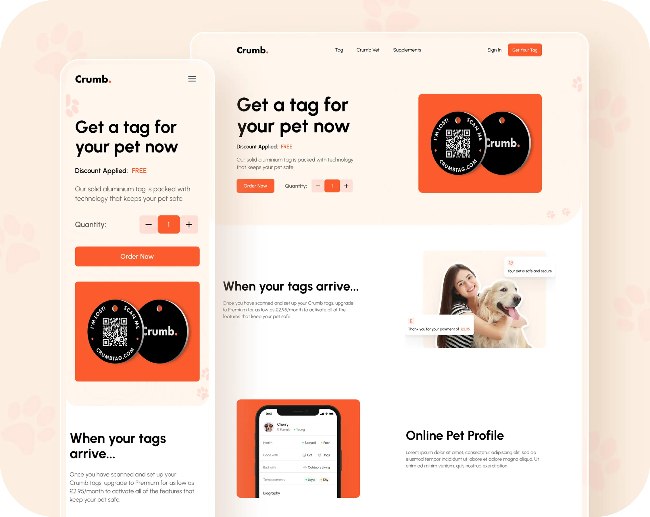
Responsive Layout System
Designed a fluid layout structure that adapts naturally across breakpoints, ensuring critical elements remain visible and actionable on phones, tablets, and desktops.
Hierarchy & Content Prioritization
Content blocks were designed for quick readability, helping users understand the product’s value at a glance. Key sections were arranged to lead users intuitively through important features and actions.
Visual Consistency
Defined spacing systems, typography scales, and component styles to create predictable and supportive UI rhythms, improving readability and trust.
Performance-Mindful Design
Avoided heavy graphical treatments; focused on lightweight UI that supports fast load times and responsive feedback.
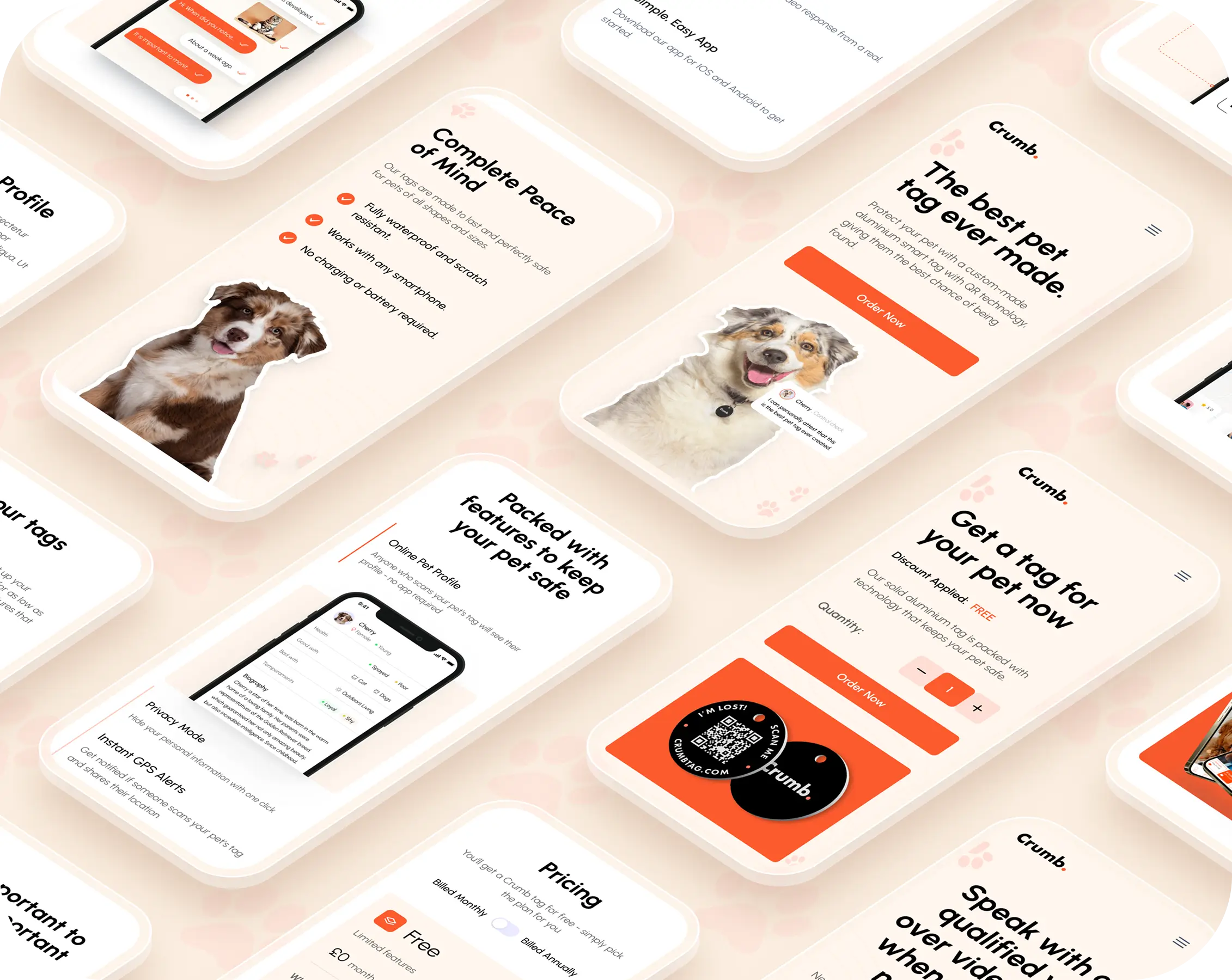
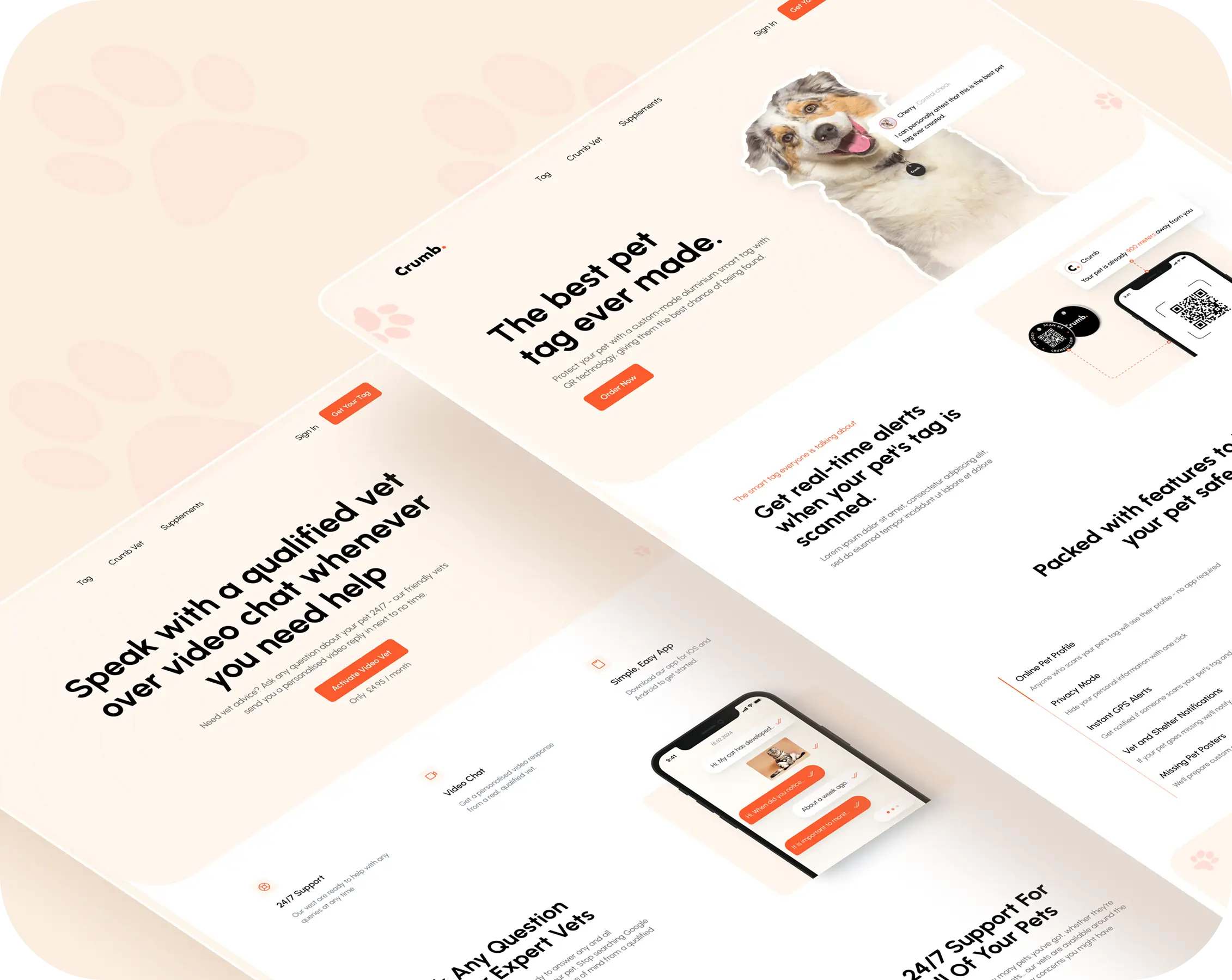
Gallery:
Project Gallery
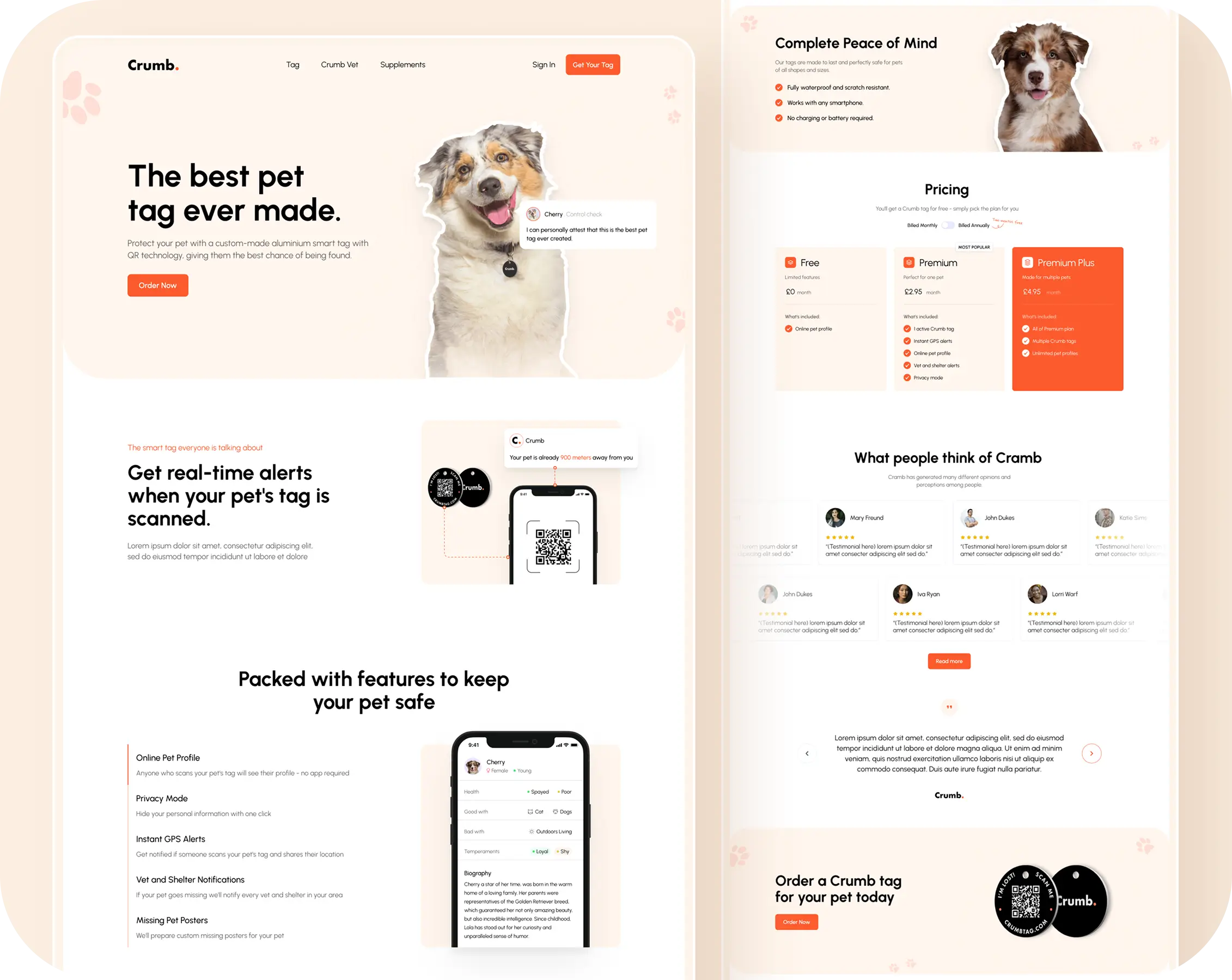

Key Features & Highlights:
- Fresh and Modern Design: The redesign introduced a clean, contemporary visual experience that feels engaging and visually aligned with Crumb’s brand.
- Clear and Confident Experience: Improved layout structure and visual balance help users understand content quickly and feel confident navigating the site.
- Effortless Navigation: Key information and actions are easy to locate, allowing users to move through the website naturally and without friction.
- Consistent Look and Feel: Unified spacing, typography, and UI elements create a cohesive experience across pages and screen sizes.
Testimonial:
Customer Review
Other

